Layout
<bk-layout></bk-layout>
Displays a menu, analogous to the micro-lc (version 2.0.0+) menu, which allows to navigate amongst plugins.
The Layout component is not supported by micro-lc version <2.0.0. micro-lc version 2.0.0+ (or a custom rendering engine) should be used.
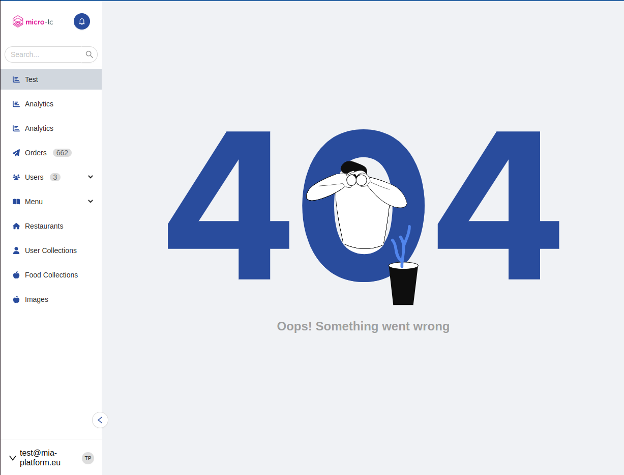
Since version 1.5.0, the collapse button is not inside the sidebar anymore but it is a floating button on the right bottom part of it as you can see from the images below.
How to configure
The Layout can be configured in a number of ways. To include items to the menu, menuItems property should be specified.
{
  "tag": "bk-layout",
  "properties": {
    "menuItems": [
      {
        "id": "orders",
        "label": {
          "en": "Orders",
          "it": "Ordini"
        },
        "type": "application"
      },
      {
        "id": "riders",
        "label": {
          "en": "Riders",
          "it": "Rider"
        },
        "type": "application"
      }
    ]
  }
}
Mode
Four modes are available, controlling how the menu is rendered. Generally, the Layout is composed of a top-bar and a side-bar
fixedSideBar- the top-bar includes components such as the logo and the user-menu
- the side-bar includes the menu items. The side-bar can be collapsed, but is always visible
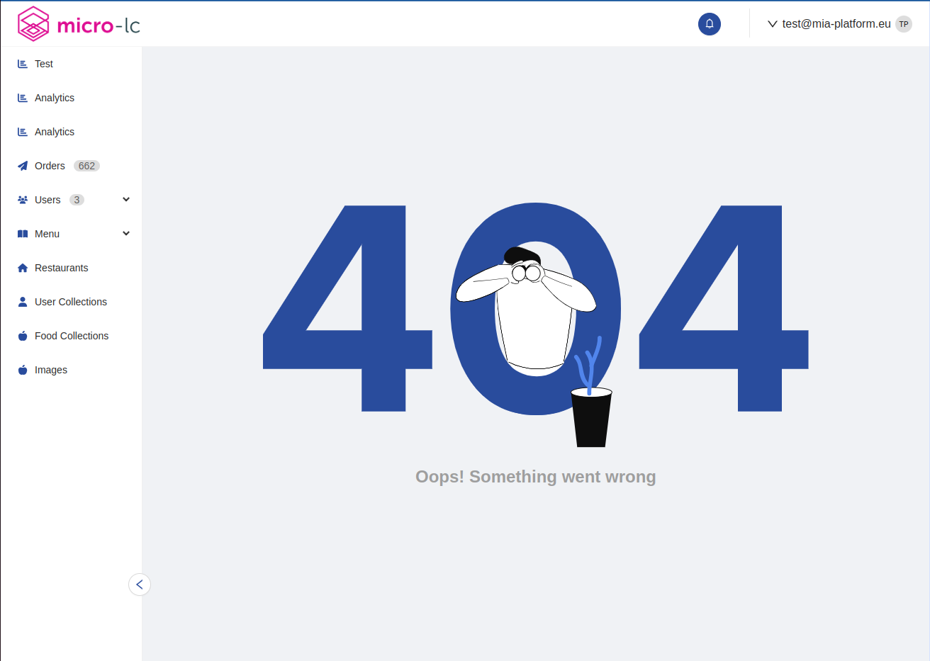
overlaySideBar- the top-bar includes components such as the logo and the user-menu
- the side-bar includes the menu items. The side-bar becomes visible and is hidden through a CTA
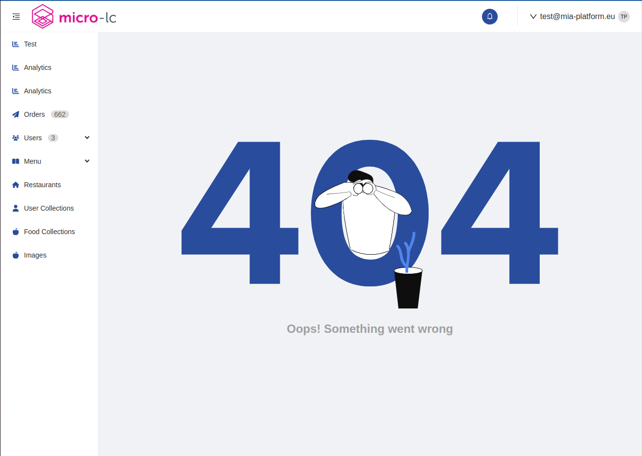
leftMenu- the whole menu is included in the side-bar, the top-bar is not rendered
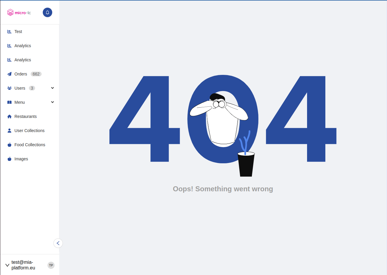
topBar- the whole menu is included in the top-bar, the side-bar is not rendered
Fixed side bar
Overlay side bar
Left menu
Top bar
Search bar
It is possible to add a search bar within the side bar setting the showSearchBar to true and it is available for every mode except the topBar.
The search is made comparing the searched value with the localized label of the menu item and with the tags, if specified. The search does not consider the upper case letters.
An example is available
Logo
An image can be rendered as a logo using property logo, which is an object with keys:
altText: alt-text of the imageonClickHref: link to which to navigate when the logo is clickedurl:- if
urlis initialized to a string, represents the URL of the image to use as logo - if
urlis initialized to an object with keyspathand (optionally)default, the logo source is retrieved by applyingpath(in JavaScript notation) to the current user's object-like representation. The user information is obtained during bootstrap using propertyuserInfoUrlas endpoint. An example is available.
- if
Help Menu
Property helpMenu accepts an object with key helpHref. The Layout uses it to render a button which redirects to a help page.
User Menu
The Layout fetches information about the currently logged user by calling the endpoint specified in property userInfoUrl.
A user-menu can be rendered inside Layout, by configuring property userMenu. The user menu allows to log-out and displays information about the logged user. The menu trigger can be configured using the property userMenuTrigger that accepts hover or click as value.
userMenu accepts keys:
logout: object with keysurl,method,redirectUrlrepresenting the call to execute to log-outuserPropertiesMapping: maps properties of the currently logged user to keysnameandavatar, which are displayed within the user-menu
An example is available.
Property userInfoUrl is available inside userMenu but is deprecated. Instead, apply property userInfoUrl directly to the properties of Layout.
For instance, from:
{
  "tag": "bk-layout",
  "properties": {
    "userMenu": {
      "userInfoUrl": "/user-info"
    }
  }
}
to
{
  "tag": "bk-layout",
  "properties": {
    "userInfoUrl": "/user-info"
  }
}
Head
The tab title and the fav icon can be specified with property head, which accepts an object with keys favIconUrl, title.
Menu Items
Items in the menu. These can be of two types, href or application:
hrefmenu items behave like links, navigating to a configurable page upon clickapplicationpages navigate to a plugin
Multiple menu items can be grouped into recursive structures, categories (collapsible) and groups (non-collapsible).
All types of menu item have internationalized labels LocalizedText.
Href
interface HrefMenuItem {
  /** Link's destination */
  href: string

  /** Icon of the menu item */
  icon?: string

  /** Unique identifier of the href */
  id: string

  /** Label of the menu item */
  label?: LocalizedText

  /** Specifies where to open the linked document */
  target?: '_blank' | '_self' | '_parent' | '_top'

  /** Type of the item: hyperlink to another page */
  type: 'href'

  /** Data to display next to the item label or http configuration to fetch it */
  badge?: string | HttpConfig

  /** Tags used for search */
  tags?: string[]
}
Application
interface ApplicationMenuItem {
  /** Icon to visualize */
  icon?: string

  /** Unique identifier of the corresponding micro-lc application  */
  id: string

  /** Label of the menu item */
  label?: LocalizedText

  /** Identifiers of micro-lc other applications that also correspond to the item */
  selectedAlsoOn?: string[]

  /** Type of the item: micro-lc application */
  type: 'application'

  /** Data to display next to the item label or http configuration to fetch it */
  badge?: string | HttpConfig

  /** Tags used for search */
  tags?: string[]
}
Category
interface CategoryMenuItem {
  /** Menu items included in the category */
  children?: MenuItem[]

  /** Icon to visualize */
  icon?: string

  /** Unique identifier of the category */
  id: string

  /** Label of the menu item */
  label?: LocalizedText

  /** Type of the item: collapsible sub-menu */
  type: 'category'

  /** Data to display next to the item label or http configuration to fetch it */
  badge?: string | HttpConfig

  /** Tags used for search */
  tags?: string[]
}
Group
interface GroupMenuItem {
  /** Menu items included in the group */
  children?: MenuItem[]

  /** Unique identifier of the group */
  id: string

  /** Label of the menu item */
  label?: LocalizedText

  /** Type of the item: non-collapsible group of items */
  type: 'group'

  /** Data to display next to the item label or http configuration to fetch it */
  badge?: string | HttpConfig

  /** Tags used for search */
  tags?: string[]
}
Badges
The badge property can be used to specify an extra value to be displayed next to the label within the corresponding item menu.
If badge is of type HttpConfig, it specifies the parameters of a REST call that is used by the Layout at bootstrap time to fetch the data to display.
Type HttpConfig is a subset of the supported configuration for Http Actions, accpeting keys
url: url to callmethod: REST method to usebody: body to attach to the callconfig: extra configurations, such as headers
Locale
The texts of the Layout can be customized through the property customLocale, which accepts an object shaped like the following:
type Locale = {
  collapse: LocalizedText
  logout: LocalizedText
}
where LocalizedText is either a string or an object mapping language acronyms to strings.
Examples
Example: Display a menu
The following configuration for the Layout component
{
  "tag": "bk-layout",
  "properties": {
    "mode": "fixedSideBar",
    "menuItems": [
      {
        "icon": {
          "library": "@fortawesome/free-solid-svg-icons",
          "selector": "faChartBar"
        },
        "id": "dashboards-analytics",
        "label": "Analytics",
        "type": "application"
      },
      {
        "icon": {
          "library": "@fortawesome/free-solid-svg-icons",
          "selector": "faPaperPlane"
        },
        "id": "ordersList",
        "label": {
          "en": "Orders",
          "it": "Ordini"
        },
        "type": "application",
        "badge": {
          "url": "/v2/orders/count?_st=PUBLIC,DRAFT",
          "method": "GET"
        }
      },
      {
        "icon": {
          "library": "@fortawesome/free-solid-svg-icons",
          "selector": "faUsers"
        },
        "id": "usersCategory",
        "label": "Users",
        "type": "category",
        "badge": "3",
        "children": [
          {
            "icon": {
              "library": "@fortawesome/free-solid-svg-icons",
              "selector": "faBiking"
            },
            "id": "ridersList",
            "label": "Riders",
            "type": "application",
            "badge": {}
          },
          {
            "icon": {
              "library": "@fortawesome/free-solid-svg-icons",
              "selector": "faUserTag"
            },
            "id": "customersList",
            "label": "Customers",
            "type": "application"
          }
        ]
      },
      {
        "icon": {
          "library": "@fortawesome/free-solid-svg-icons",
          "selector": "faAppleAlt"
        },
        "id": "food-collections",
        "label": "Food Collections",
        "type": "application"
      }
    ],
    "head": {
      "favIconUrl": "https://www.mia-platform.eu/static/img/favicon/apple-icon-60x60.png",
      "title": "Frontend"
    }
  }
}
renders a menu with items structured as follows (assuming english as browser language):
- Analytics
- Orders
- Users
  - Riders
  - Customers
Example: Search Bar
With the following configuration a search bar is visualized at the top of the side bar.
- The
ridersmenu item will be matched to any string that contains a part or all offattorini(from tags prop) andriders. - The
ordersListmenu item will be matched to any string that contains a part or all ofordinazioni(from tags prop) andorders. - The
categorymenu item will be matched to any string that contains a part or all ofcategory.
{
  "tag": "bk-layout",
  "properties": {
    "mode": "fixedSideBar",
    "showSearchBar": "true",
    "menuItems": [
      {
        "icon": {
          "library": "@fortawesome/free-solid-svg-icons",
          "selector": "faPaperPlane"
        },
        "id": "ordersList",
        "label": {
          "en": "Orders",
          "it": "Ordini"
        },
        "type": "application",
        "badge": {
          "url": "/v2/orders/count?_st=PUBLIC,DRAFT",
          "method": "GET"
        },
        "tags": ["ordinazioni"]
      },
      {
        "icon": {
          "library": "@fortawesome/free-solid-svg-icons",
          "selector": "faUsers"
        },
        "id": "usersCategory",
        "label": "Users",
        "type": "category",
        "badge": "3",
        "children": [
          {
            "icon": {
              "library": "@fortawesome/free-solid-svg-icons",
              "selector": "faBiking"
            },
            "id": "ridersList",
            "label": "Riders",
            "type": "application",
            "badge": {},
            "tags": ["fattorini"]
          }
        ]
      }
    ]
  }
}
Example: Dynamic Logo
With the following configuration
{
  "tag": "bk-layout",
  "properties": {
    "userInfoUrl": "/user-info",
    "logo": {
      "altText": "Logo",
      "url": {
        "path": "companyImg",
        "default": "./default-logo.png"
      }
    }
  }
}
and assuming the data fetched from /user-info is
{
  "name": "Sarah Cyprus",
  "companyImg": "https://logos.test/img/logo-1.png",
  "role": "admin"
}
a Layout is rendered with a logo image having source "https://logos.test/img/logo-1.png".
While with data fetched from /user-info having no "companyImg" key, like
{
  "name": "Sarah Cyprus",
  "role": "admin"
}
a Layout is rendered with a logo image having source "./default-logo.png", specified as default inside the logo property.
Example: User information
Assuming an instance of a Layout component to be configured like
{
  "tag": "bk-layout",
  "properties": {
    "userInfoUrl": "/user-info",
    "userMenu": {
      "logout": {
        "method": "POST",
        "url": "/logout"
      },
      "userPropertiesMapping": {
        "image": "avatar"
      }
    },
  }
}
and assuming the data fetched from /user-info is
{
  "name": "Sarah Cyprus",
  "image": "https://logos.test/img/avatar-1.png",
  "role": "admin"
}
then the user menu rendered by the Layout is composed of the label "Sara Cyprus" and the avatar image with source "https://logos.test/img/avatar-1.png".
The value to use for the avatar is mapped to the "image" key of the user information through userPropertiesMapping field of userMenu property.
Loggin out can be performed from the user-menu, which performs a POST call to endpoint "/logout".
API
Properties & Attributes
| property | attribute | type | default | description |
|---|---|---|---|---|
| userInfoUrl | user-info-url | string | - | URL called in GET to retrieve user data |
| mode | mode | Mode | "overlaySideBar" | controls how the menu is visualized |
| logo | - | Logo | - | logo to be visualized in the menu |
| menuItems | - | MenuItem[] | - | describes the items in the menu |
| helpMenu | - | HelpMenu | - | controls the help button on the menu |
| userMenu | - | UserMenu | - | controls the user information section of the menu |
| userMenuTrigger | - | hover | click | "hover" | controls the user menu trigger |
| head | - | Head | - | controls tab visualization options |
| sideBarWidth | side-bar-width | number | 200 | Width of the sidebar in pixels, if applicable |
| collapsedWidth | collapsed-width | number | 80 | Width of collapsed sidebar in pixels, if applicable |
| showSearchBar | - | boolean | false | Whether to show search bar |
Mode
type Mode = 'fixedSideBar' | 'overlaySideBar' | 'leftMenu' | 'topBar'
Logo
type Logo {
  /** Alternative text to display if the logo is not found  */
  altText?: string

  /** Link to navigate to when the logo is clicked */
  onClickHref?: string

  /** URL of the logo image, or path to get it from user-info */
  url?: string | {
    path: string
    default?: string
  }
}
MenuItems
type MenuItem = HrefMenuItem | ApplicationMenuItem | CategoryMenuItem | GroupMenuItem

interface HrefMenuItem {
  /** Link's destination */
  href: string

  /** Icon of the menu item */
  icon?: string

  /** Unique identifier of the href */
  id: string

  /** Label of the menu item */
  label?: LocalizedText

  /** Specifies where to open the linked document */
  target?: '_blank' | '_self' | '_parent' | '_top'

  /** Type of the item: hyperlink to another page */
  type: 'href'

  /** Data to display next to the item label or http configuration to fetch it */
  badge?: string | HttpConfig
}

interface ApplicationMenuItem {
  /** Icon to visualize */
  icon?: string

  /** Unique identifier of the corresponding micro-lc application  */
  id: string

  /** Label of the menu item */
  label?: LocalizedText

  /** Identifiers of micro-lc other applications that also correspond to the item */
  selectedAlsoOn?: string[]

  /** Type of the item: micro-lc application */
  type: 'application'

  /** Data to display next to the item label or http configuration to fetch it */
  badge?: string | HttpConfig
}

interface CategoryMenuItem {
  /** Menu items included in the category */
  children?: MenuItem[]

  /** Icon to visualize */
  icon?: string

  /** Unique identifier of the category */
  id: string

  /** Label of the menu item */
  label?: LocalizedText

  /** Type of the item: collapsible sub-menu */
  type: 'category'

  /** Data to display next to the item label or http configuration to fetch it */
  badge?: string | HttpConfig
}

interface GroupMenuItem {
  /** Menu items included in the group */
  children?: MenuItem[]

  /** Unique identifier of the group */
  id: string

  /** Label of the menu item */
  label?: LocalizedText

  /** Type of the item: non-collapsible group of items */
  type: 'group'

  /** Data to display next to the item label or http configuration to fetch it */
  badge?: string | HttpConfig
}

interface GroupMenuItem {
  /** Url to call */
  url: string

  /** Rest method to use */
  method: 'GET' | 'POST' | 'PUT' | 'PATCH' | 'DELETE'

  /** Body to attach to the call */
  body?: Record<string, any> | string | null

  /** Extra configuration, such as headers */
  config?: Omit<HttpClientConfig, 'body'>
}

type HttpConfig = {
  /** URL to call */
  url: string
  /** REST method to call */
  method: HttpMethods
  /** body of the REST call */
  body?: Record<string, any> | string | null
  /** further configuration */
  config?: Omit<HttpClientConfig, 'body'>
}

type HttpClientConfig = Omit<RequestInit, 'method'> & {
  /* search params to apply to the call */
  params?: string | Record<string, string> | string[][] | URLSearchParams
  /* wether or not the result should be sent back without any transformation (by default, response is either sent back as text or an object). If true, `downloadAsFile` is ignored. */
  raw?: boolean
  /* whether the result should be downloaded as file. Only supported for POST and GET calls. */
  downloadAsFile?: boolean
}
Where:
- LocalizedText is either a string or an object mapping language acronyms to strings
- RequestInit refers to the standard Typescript interface
HelpMenu
type HelpMenu {
  /** Link to the help page */
  helpHref: string
}
UserMenu
type UserMenu {
  /** Configuration needed to perform user logout */
  logout?: {
    /** Method used to perform the call to the URL specified in the 'url' property */
    method?: 'GET' | 'POST'

    /** URL to be redirected to after the logout. When missing, if the logout call replies with a redirect, then it will be followed */
    redirectUrl?: string

    /** URL called to log out the user. The method used is the one specified in the 'method' property */
    url?: string
  }


  /** @deprecated URL called in GET to retrieve user data */
  userInfoUrl: string

  /** Mapping between the properties returned from the user info URL call and the ones expected by the component */
  userPropertiesMapping?: Record<string, 'name' | 'avatar' | string>
}
Head
type Head {
  /** Url of the fav icon */
  favIconUrl?: string

  /** Title of the tab */
  title?: string
}
Listens to
None
Emits
None