Gallery
<bk-gallery></bk-gallery>
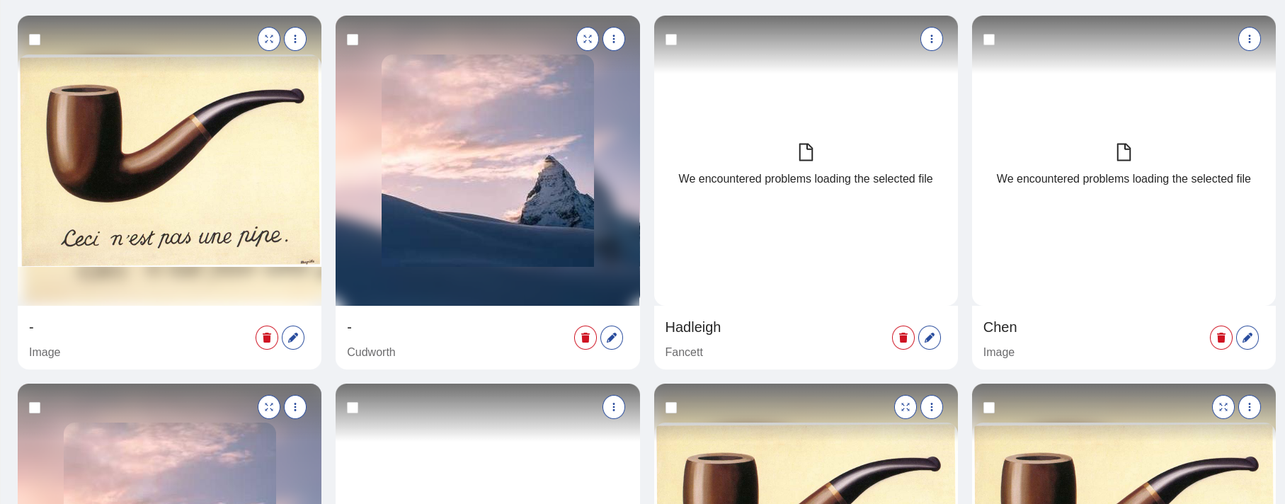
The Gallery allows to visualize image files within an adaptive grid, as well as other data.
Each item of the grid is composed of:
- readonly data
- title
- subtitle
- thumbnail
- preview
- actions (buttons, action menu, clickable image)
The thumbnail is immediately visible in the item, while the preview is displayed inside a modal.
The Gallery listens to display-data event to retrieve the data to visualize. Each element of the dataset is mapped to one grid item.
How to configure
The Gallery component should be provided with a value for property thumbnailSource that describes the path to reach the URL of the image to display
within the data item.
{
  "tag": "bk-gallery",
  "properties": {
    "thumbnailSource": "image.url"
  }
}
Appearance
Gallery Items
Gallery items are placed into a grid, which adapts to the screen size.
Each of the Gallery item can be configured in size using properties itemHeight and itemWidth, controlling height and width respectively.
If itemHeight is not specified, items adapt their height to their content.
Property itemWidth supports both numeric values (these are interpreted as pixels) or "small", "medium", "large".
This property controls the attempted width of each Gallery item, but may vary slightly due to the adaptive nature of the grid.
gutter property can be used to control the spacing around each Gallery item.
Preview Modal
Unless property disableExpand is set to true, the preview image of an item can be visualized inside a modal.
The modal can be configured in size using modalWidth and modalHeight, and a title can be specified with modalTitle (if not specified, the item title is used).
Data
Each Gallery item allows to visualize an image (thumbnail), a preview within a modal (preview) and two types of text (title and subtitle).
The properties that control how each item sets these options are:
thumbnailSourcepreviewSourcetitleSourcesubTitleSource
If not specified, the previewSource is set to be equal to thumbnailSource.
Upon listening to a display-data event, the Gallery component uses these properties to render one item per data row.
The properties titleSource, subTitleSource, thumbnailSource, and previewSource accept either a string or an object with keys path and default.
When set as a string, these properties should indicate the path within the data source from which to extract the required information.
Alternatively, if an object is used, the path key guides the property to the relevant data, while the default key provides a value to display if the path points to undefined values.
Additionally, thumbnailSource and previewSource also support key template. This is used to interpolate the extracted value within a string, through keyword file.
For instance, the following are all valid configurations for thumbnailSource:
{
  "thumbnailSource": {
    "path": "document.url",
    "default": "default/file.jpg",
    "template": "full/{{file}}"
  }
}
{
  "thumbnailSource": {
    "path": "document.url",
    "default": "default/file.jpg",
  }
}
{
  "thumbnailSource": "document.url"
}
Dynamic Context
The Gallery supports properties that allow dynamic configurations. By default, such properties are parsed with handlebars, injecting the following context:
Each action in the Gallery component has access to the following input data:
{
  thumbnail: ..., // source for thumbnail image of the item
  preview: ..., // source for preview image of the item
  title: ..., // title of the item
  subTitle: ..., // subtitle of the item
  context: ... // all data fields of Gallery item
  ... // all data fields of Gallery item
}
Actions
onImageClick, onTitleClick, onSubTitleClick and actions properties allow to add Back-kit Actions to the Gallery.
Callbacks
Properties onImageClick, onTitleClick, onSubTitleClick are expected to follow the Back-kit Action interface.
Their callbacks are executed upon clicking to the thumbnail, the title or the subtitle respectively.
The Gallery supports dynamic configurations in these properties. They are parsed with handlebars, injecting the context of the Gallery.
Buttons & Actions menu
Property actions, on the other hand, is an array of objects that have keys: iconId, content, danger, action.
The first two entries of actions are rendered as buttons (thus, a value for iconId should be specified).
The rest of the actions are rendered inside a popup menu within each Gallery item.
Dynamic configurations is available in actions property.
In particular, the action key of each entry of actions property is parsed with handlebars, injecting the context of the Gallery.
{
  "actions": [
    {
      "iconId": "fas fa-users",
      "action": {
        "type": "http",
        "config": {
          "url": "/url",
          "method": "POST",
          "body": {
            "field1": "{{thumbnail}}", // <- the source of the thumbnail image
            "field2": "{{name}}" // <- the "name" field of the data entry associated to the Gallery item
          }
        }
      }
    }
  ]
}
Checkbox
Each item can be selected through a checkbox, unless disableSelection property is set to true.
Selecting emits a selected-data-bulk event with all selected items.
Components like the Footer or the Bulk Actions react to selected-data-bulk events.
Locale
The texts of the Gallery can be customized through the property customLocale, which accepts an object shaped like the following:
type Locale = {
  modalClose: LocalizedText
  expandTitle: LocalizedText
  actionsMenuTitle: LocalizedText
  brokenFile: LocalizedText
  absentFile: LocalizedText
}
where LocalizedText is either a string or an object mapping language acronyms to strings.
Examples
Example: Basic Usage
The most basic way to use the Gallery component to visualize a dataset is to set properties thumbnailSource, previewSource, titleSource, subTitleSource.
A Gallery configured like the following:
{
  "tag": "bk-gallery",
  "properties": {
    "thumbnailSource": "avatar.url",
    "previewSource": "profileImageUrl",
    "titleSource": "name",
    "subTitleSource": "description"
  }
}
that receives a dataset like:
[
  {
    "name": "Bruce",
    "description": "I like football!",
    "avatar": {
      "fileName": "avatar1.jpg",
      "url": "/avatar/avatar1.jpg"
    },
    "profileImageUrl": "/profile/profile1.jpg"
  },
  {
    "name": "Emily",
    "description": "Nature enthusiast!",
    "avatar": {
      "fileName": "avatar2.png",
      "url": "/avatar/avatar2.png"
    },
    "profileImageUrl": "/profile/profile2.jpg"
  }
]
Then the Gallery displays two items,
one with:
- title equal to "Bruce"
- subTitle equal to "I like football!"
- thumbnail equal to
/avatar/avatar1.jpg - preview equal to
/profile/profile1.jpg
and the second one with;
- title equal to "Emily"
- subTitle equal to "Nature enthusiast!"
- thumbnail equal to
/avatar/avatar2.png - preview equal to
/profile/profile2.jpg
Example: Basic Usage
Assuming the following configuration for the Gallery component:
{
  "tag": "bk-gallery",
  "properties": {
    "titleSource": "objField.arrField.[0]",
    "subTitleSource": "objField.stringField",
    "thumbnailSource": "document"
  }
}
Upon receiving notification of the following data being fetched:
[
  {
    "objField": {
      "arrField": [
        "test"
      ],
      "stringField": "foo"
    },
    "document": "some/path.jpg"
  }
]
The Gallery renders a single item with
- title equal to "test"
- subTitle equal to "foo"
- thumbnail equal to "some/path.jpg"
- preview equal to "some/path.jpg"
Since previewSource is not specified, the preview is same as the thumbnail.
Example: Gallery with default values
Properties titleSource, subTitleSource, thumbnailSource, previewSource can be set to an object with path and default keys.
Key path is used to reach the desired data within the fields of the data element associated to the Gallery item,
while default provides a fallback value in case the path is not resolved.
For instance, a Gallery configured like:
{
  "tag": "bk-gallery",
  "properties": {
    "titleSource": "objField.arrField.[0]",
    "subTitleSource": "objField.stringField",
    "thumbnailSource": "document",
    "previewSource": {
      "path": "objField.preview",
      "default": "default/file.jpg"
    }
  }
}
That renders the following simplified data:
[
  {
    "objField": {
      "arrField": [
        "test"
      ],
      "stringField": "foo"
    },
    "document": "some/path.jpg"
  }
]
results is a single item with
- title equal to "test"
- subTitle equal to "foo"
- thumbnail equal to "some/path.jpg"
- preview equal to "default/file.jpg"
Example: Gallery with complex image source
Properties thumbnailSource, previewSource can be set to an object with a path, default, template keys.
pathis used to reach the desired data within the fields of the data element associated to the Gallery itemdefaultprovides a fallback value in case the path is not resolvedtemplateinterpolates the extracted value within a string, through keywordfile
For instance, a Gallery configured like:
{
  "tag": "bk-gallery",
  "properties": {
    "thumbnailSource": {
      "path": "document",
      "default": "default/file.jpg",
      "template": "full/{{file}}"
    }
  }
}
That renders the following simplified data:
[
  {
    "objField": {
      "arrField": [
        "test"
      ],
      "stringField": "foo"
    },
    "document": "some/path.jpg"
  }
]
results in a single item having thumbnail equal to "full/some/path.jpg".
In case path is unresolved, default is utilized. Key default is not interpolated inside template.
For instance, assuming the same input data and configuration:
{
  "tag": "bk-gallery",
  "properties": {
    "thumbnailSource": {
      "path": "unk",
      "default": "default/file.jpg",
      "template": "full/{{file}}"
    }
  }
}
the resulting thumbnail is "default/file.jpg" and not "full/default/file.jpg
Example: Add callback to clickinging image
The Gallery allows to specify Back-kit Actions to be executed upon clickinging a Gallery image, title, or subtitle.
For instance, the following configuration for the Gallery:
{
  "tag": "bk-gallery",
  "properties": {
    "thumbnailSource": "image.url",
    "onImageClick": {
      "type": "event",
      "config": {
        "events": {
          "label": "selected-data",
          "payload": "{{rawObject context}}"
        }
      }
    }
  }
}
with the following underlying data:
[
  {
    "name": "Roasted Chicken",
    "description": "Very tasty!",
    "calories": 650
  },
  {
    "name": "Salad",
    "description": "Healthy dish",
    "calories": 150
  },

]
renders two Gallery items that, upon being clicked on its thumbnail, emit a selected-data event with payload equal to the object representation of its associated data element.
Clicking on the image of the first element, the Gallery emits a selected-data event with payload:
{
  "name": "Roasted Chicken",
  "description": "Very tasty!",
  "calories": 650
}
rawObject is a helper keyword that prevents "context" from being stringified in the payload of the event.
Example: Action with dynamic context
The Gallery allows to insert buttons to its items to perform custom actions.
For instance, the following configuration for the Gallery:
{
  "tag": "bk-gallery",
  "properties": {
    "thumbnailSource": "image.url",
    "actions": [
      {
        "iconId": "fas fa-users",
        "action": {
          "type": "http",
          "config": {
            "url": "/add-recipe",
            "method": "POST",
            "body": {
              "image": "{{thumbnail}}",
              "name": "{{name}}"
            }
          }
        }
      }
    ]
  }
}
with the following underlying data:
[
  {
    "image": {
      "name": "chicken.jpg",
      "url": "file-storage/chicken.jpg",
    },
    "name": "Roasted Chicken",
    "description": "Very tasty!"
  }
]
renders one Gallery item with a button that, upon clicking, executes a POST call to the endpoint /add-recipe, with body:
{
  "image": "file-storage/chicken.jpg",
  "name": "Roasted Chicken"
}
API
Properties & Attributes
| property | attribute | type | default | description |
|---|---|---|---|---|
thumbnailSource | - | TemplateXPath | - | source path to thumbnail image |
previewSource | - | TemplateXPath | - | source path to preview image (if not specified, thumbnailSource is used) |
titleSource | - | XPath | - | source path to title text |
subTitleSource | - | XPath | - | source path to subtitle text |
disableSelection | disable-selection | boolean | false | whether to disable the possibility to select Gallery items |
actions | - | GalleryAction | GalleryAction[] | - | available actions per Gallery item |
onImageClick | - | Action | - | action to execute on image click |
onTitleClick | - | Action | - | action to execute on title click |
onSubTitleClick | - | Action | - | action to execute on subtitle click |
disableExpand | disable-expand | boolean | false | whether to disable the possibility of viewing the image inside a modal (preview) |
modalWidth | modal-width | number | string | - | width of the preview modal |
modalHeight | modal-height | number | string | - | height of the preview modal |
modalTitle | modal-title | string | - | title of the preview modal (if not specified, the item title is used) |
gutter | gutter | number | 20 | gutter of Gallery items (vertical and horizontal spacing among Gallery items) |
primaryKey | primary-key | string | "_id" | key used for indexing Gallery items |
itemHeight | item-height | number | string | - | height of Gallery items. If not specified, items adapt to their content |
itemWidth | item-width | number | "small" | "medium" | "large" | "medium" | attempted width of Gallery items |
XPath
type XPath = string | {
  path?: string
  default?: LocalizedText
}
where LocalizedText is either a string or an object mapping language acronyms to strings.
TemplateXPath
type TemplateXPath = XPath | {
  path?: string
  default?: LocalizedText
  template: string
}
where XPath is either a string or an object with keys path and default
where LocalizedText is either a string or an object mapping language acronyms to strings.
GalleryAction
type GalleryAction = {
  iconId?: string,
  content?: string,
  danger?: boolean,
  action: Action
}
Listens to
| event | action |
|---|---|
| display-data | receives data to display |
Emits
| event | action |
|---|---|
| configurable event | properties like actions, onImageClick allow the Gallery to emit custom events |
| selected-data-bulk | notifies about a change in the items selected through checkboxes |