Frontend structure
The Microfrontend Composer allows to configure multiple micro-lc services. The user can switch among services using the selector in the page header.
The first section of the configurator targets the general structure of the frontend. It is divided into five tabs:
- pages, where you can overview the frontend structure and quickly adding or removing pages,
- layout, where you can configure the frontend layout in a no-code fashion,
- settings, where frontend global and shared settings reside,
- webserver configuration, where settings regarding the underlying server are made accessible, and
- translations, where you can view and edit the translations of different labels for different languages,
- advanced, from which it is possible to review and edit the raw configuration.
Pages
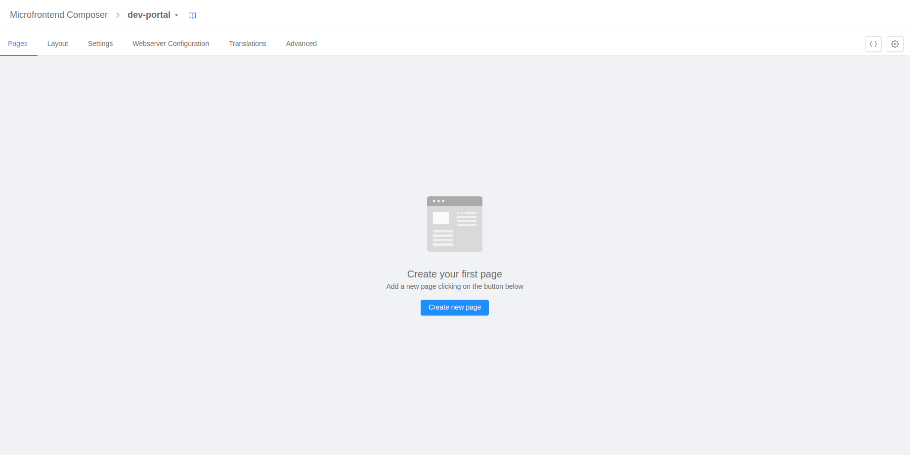
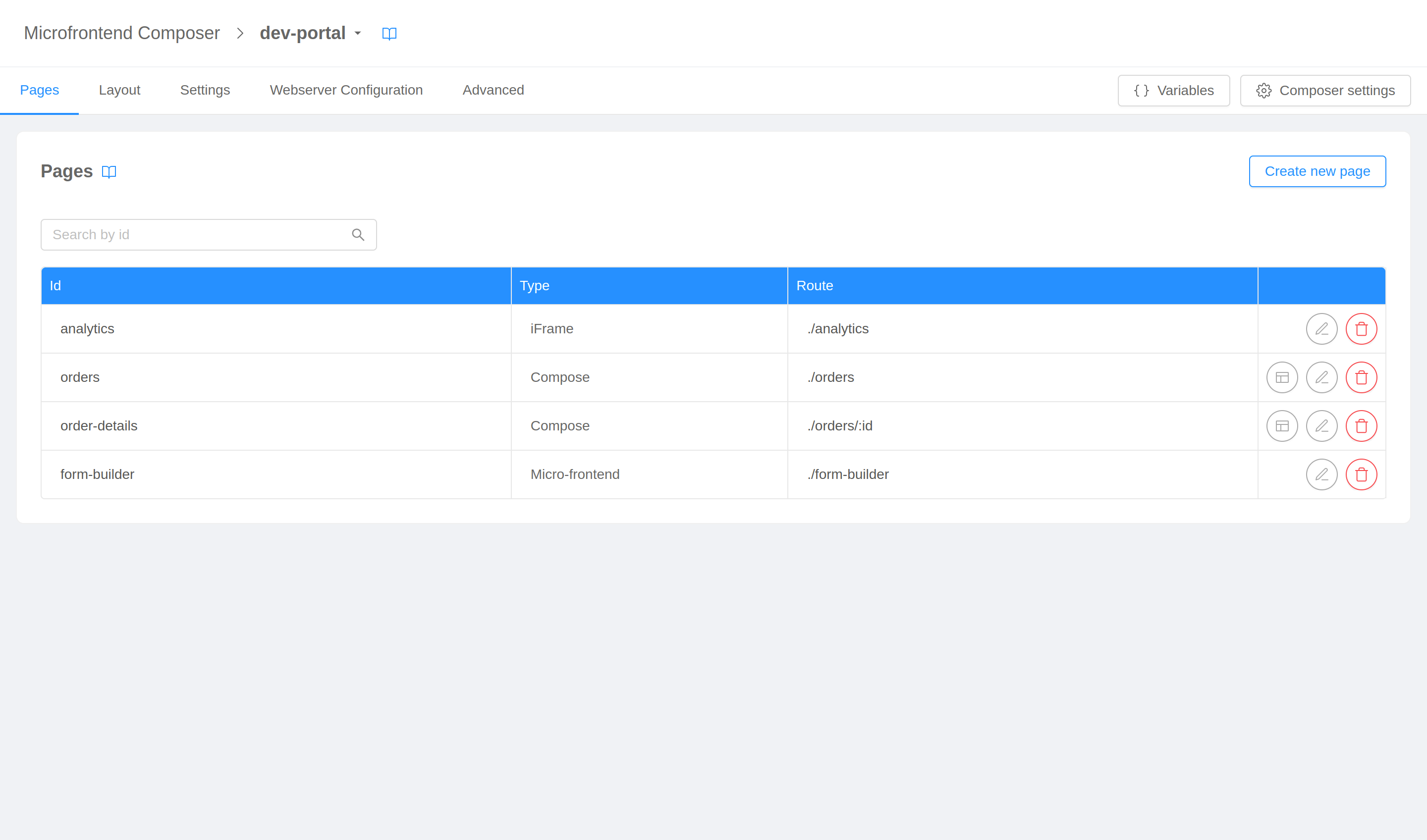
The first tab is Pages, it allows you to view, create, modify, and delete the pages (i.e., micro-lc applications) composing your frontend.
Create new page
Clicking on the Add new page button will open the page creation wizard, which will lead to the page setup thought two steps, page details and page options.
Page details
On the first step of the wizard you will be asked to specify some basic details regarding the page.
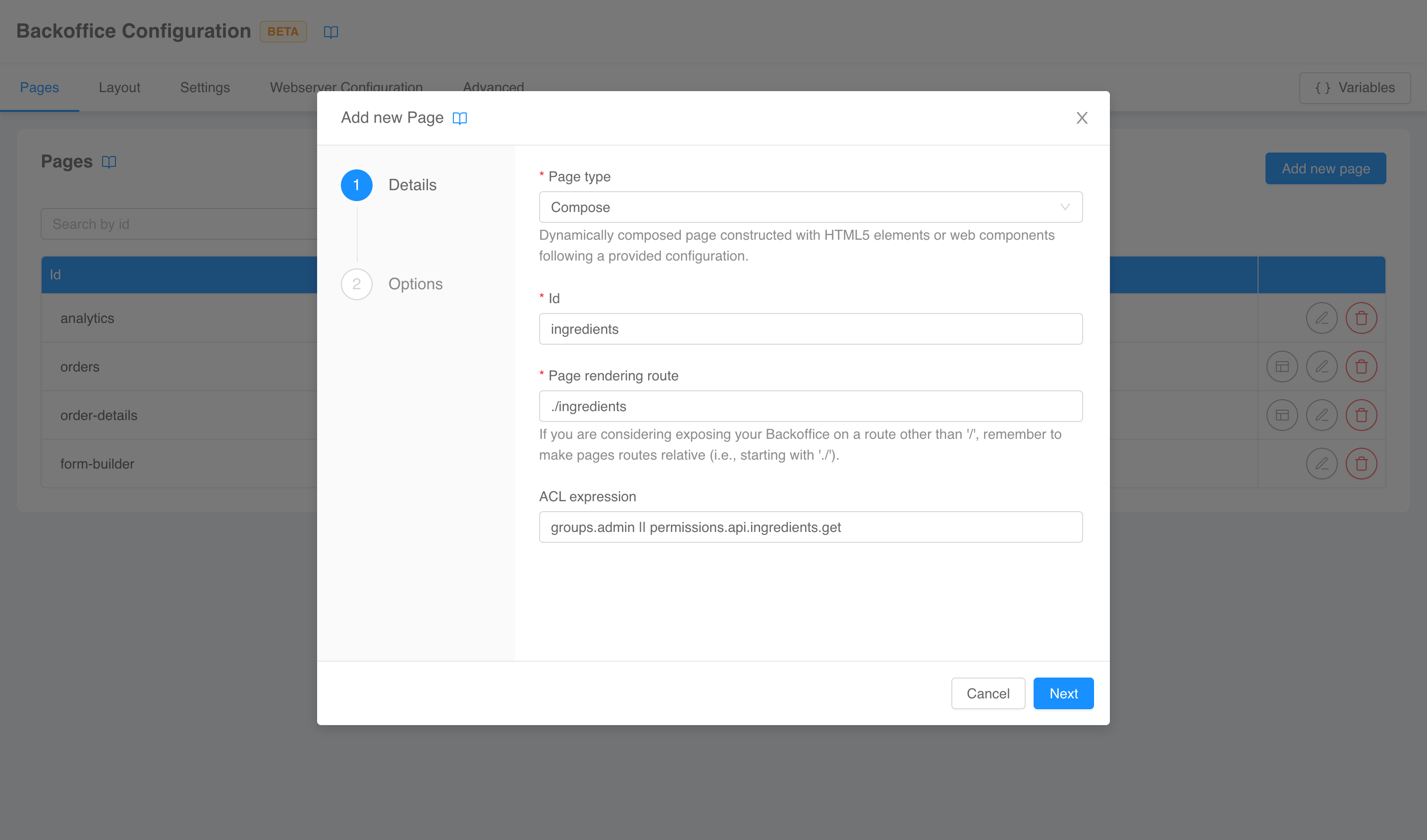
The requested fields are:
- page type: the type of the new page chosen among
- compose: a dynamically composed page constructed with HTML5 elements or web components following a provided configuration;
- micro-frontend: a framework-agnostic component directly managed by the orchestrator, which needs to be supplied with the assets entry point;
- iFrame: an HTML page embedded in an iframe tag with full strict encapsulation;
- id: the unique identifier of the page;
- page rendering route: the path on which the page will be rendered;
- acl expression: an optional logical expression evaluated against user's groups and permissions to determine whether they can view the page.
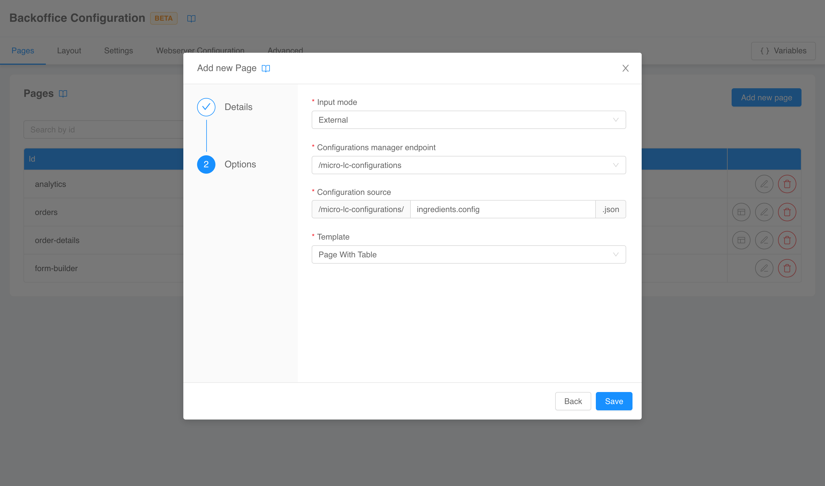
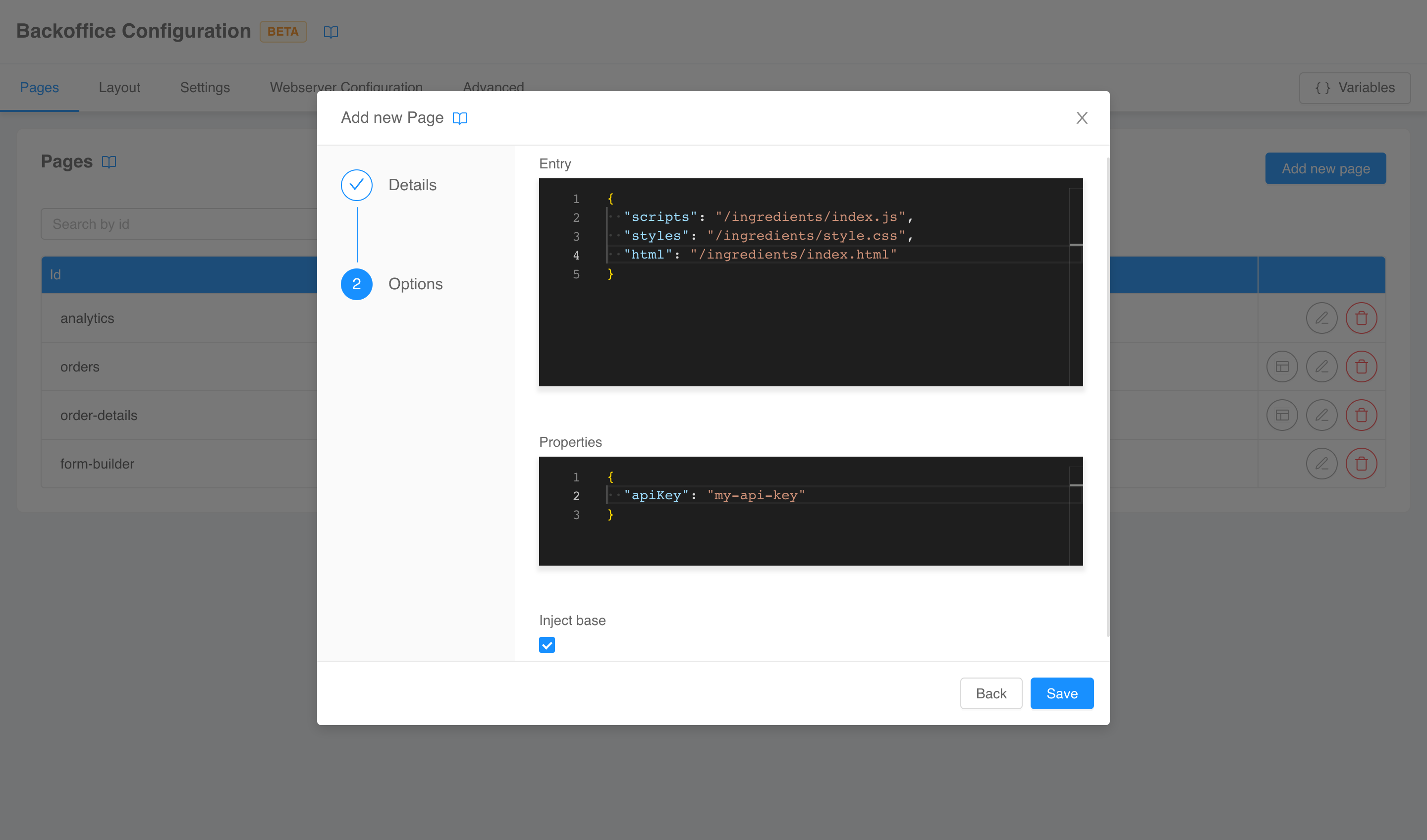
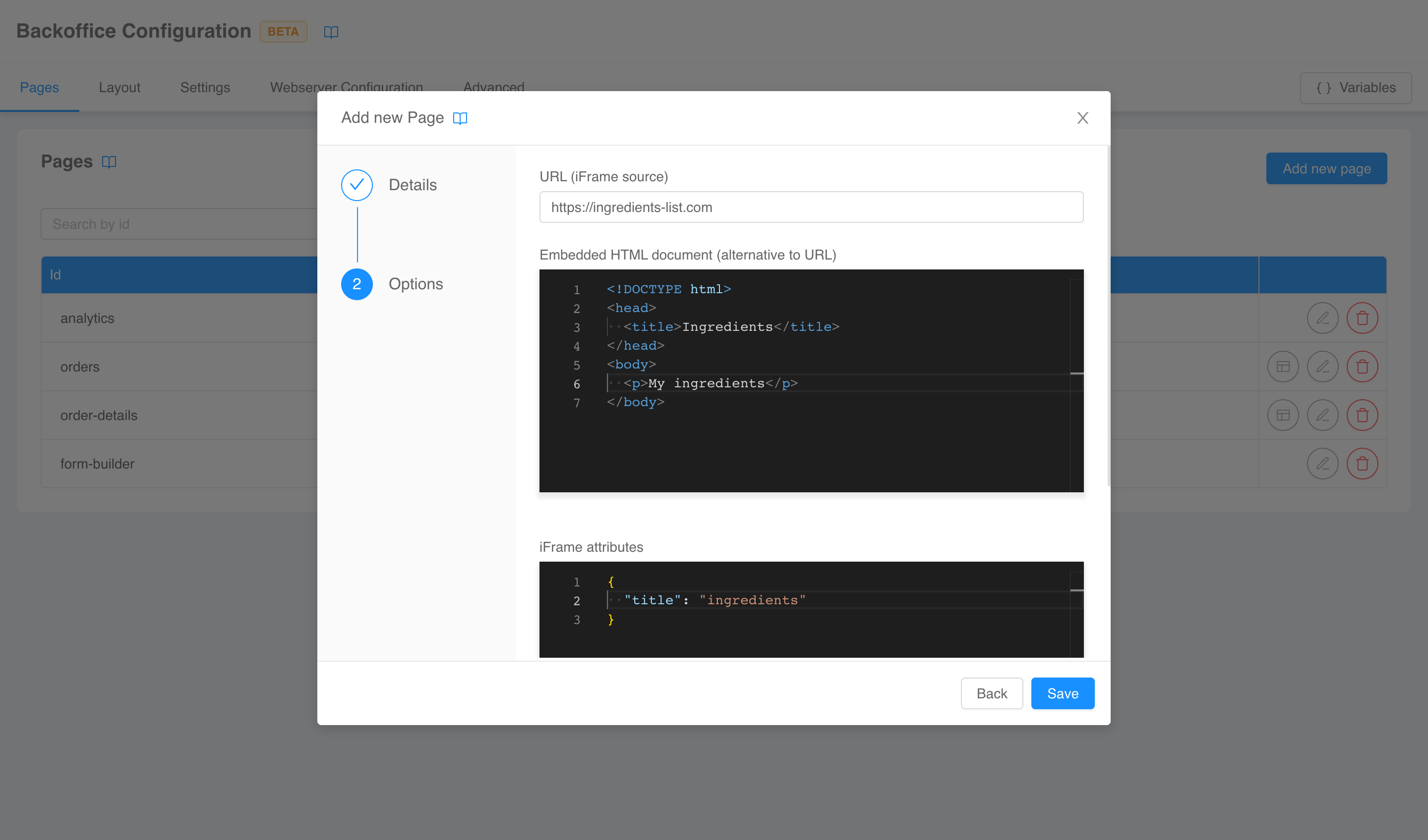
Page options
The second and last step is a type-specific form for page options.
For compose pages, available fields are:
- input mode: whether the page configuration is saved inline (inline option) or in a separate file (external option);
- configurations manager endpoint (only if input mode is external): endpoint from which the configuration file can be fetched;
- configuration source (only if input mode is external): name of the file containing the page configuration;
- fetch config on mount (only if input mode is external): whether the configuration should be fetched at each application mount;
- template (only if input mode is external): a configuration template carrying a pre-defined, pre-arranged set of components.
For micro-frontend pages, available fields are:
- entry: a JSON object carrying information regarding the entry points of the micro-frontend;
- properties: a JSON object of properties to inject in the micro-frontend;
- inject base: a flag stating whether a
<base>tag has to be injected in the micro-frontend.
The editors will help you writing configurations hinting the correct properties JSON schemas.
For iFrame pages, available fields are:
- source: the URL of the page to embed;
- source document: an inline HTML document to embed (overriding source);
- attributes:
<iframe>HTML tag valid attributes written in a JSON object fashion.
The editors will help you writing configurations hinting the correct properties JSON schemas.
Edit page
The buttons placed in the last column of the page table allows you to interact with existing pages.
From left to right, available actions are:
- edit page (only for compose pages): to open the section for compose pages configuration;
- edit details: to re-open the page creation wizard in edit mode;
- delete: to delete the page.
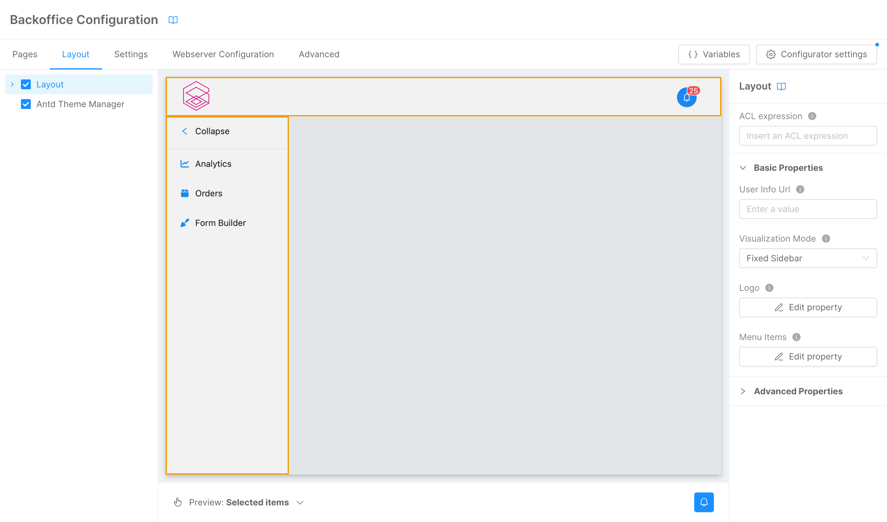
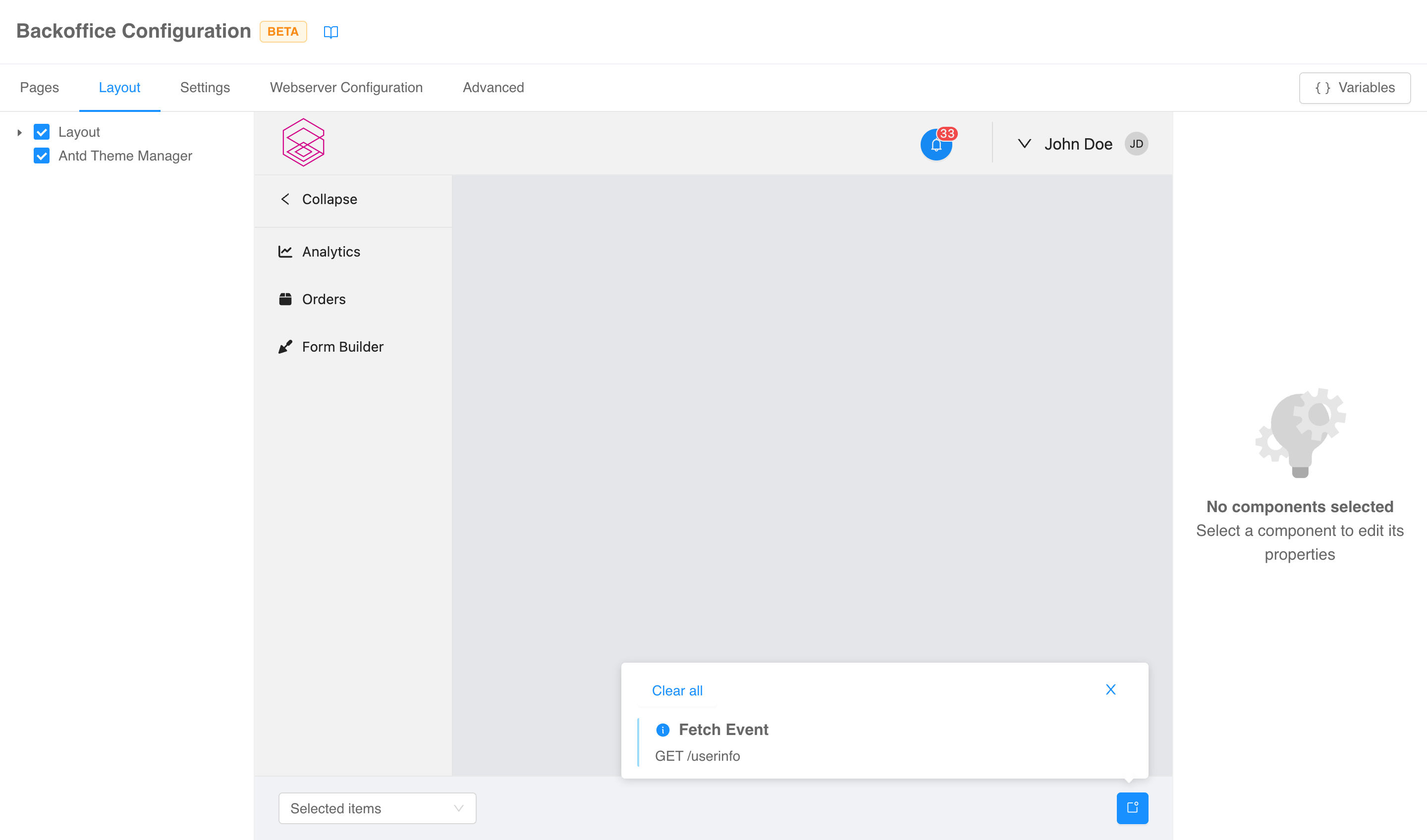
Layout
Through the Layout tab you can configure your frontend layout components in a no-code fashion.
In this tab, the configurator is divided into three sections:
- a left menu that lists the components composing the layout,
- a central live, interactive preview, and
- a right menu where single component properties can be configured.
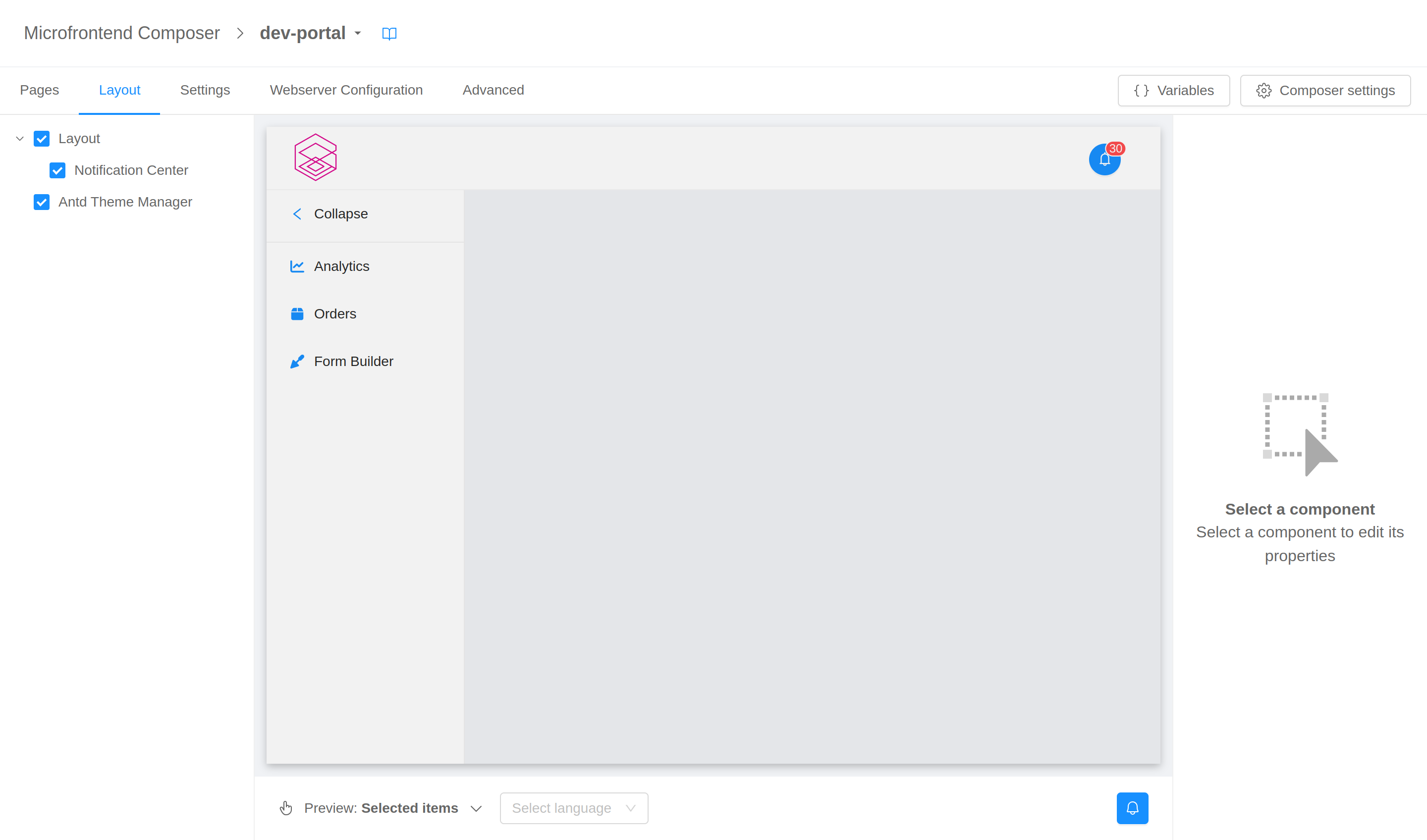
Components list
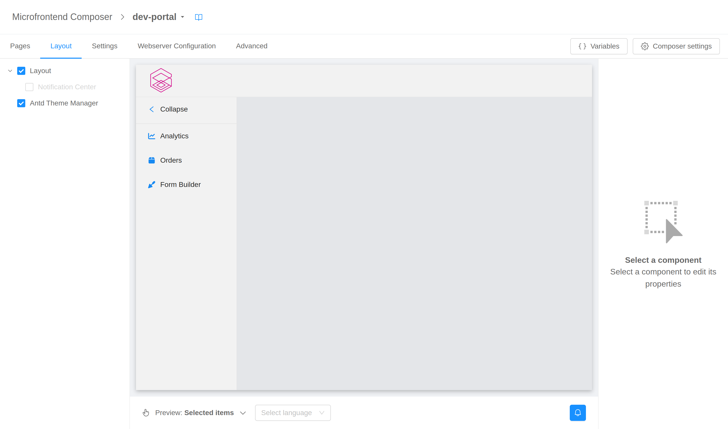
The drawer on the left of the page shows a list of all the custom components (i.e., not-standard HTML tags) used in the layout configuration. The items will be nested according to the actual DOM tree.
The only standard HTML tags allowed to be shown in the left menu are <header>, <main>, <aside>, and <footer>. These tags – which are containers with a semantic meaning – may help structuring the components tree.
Selecting an item from this list will highlight the corresponding component in the central preview and show its properties for editing in the right drawer.
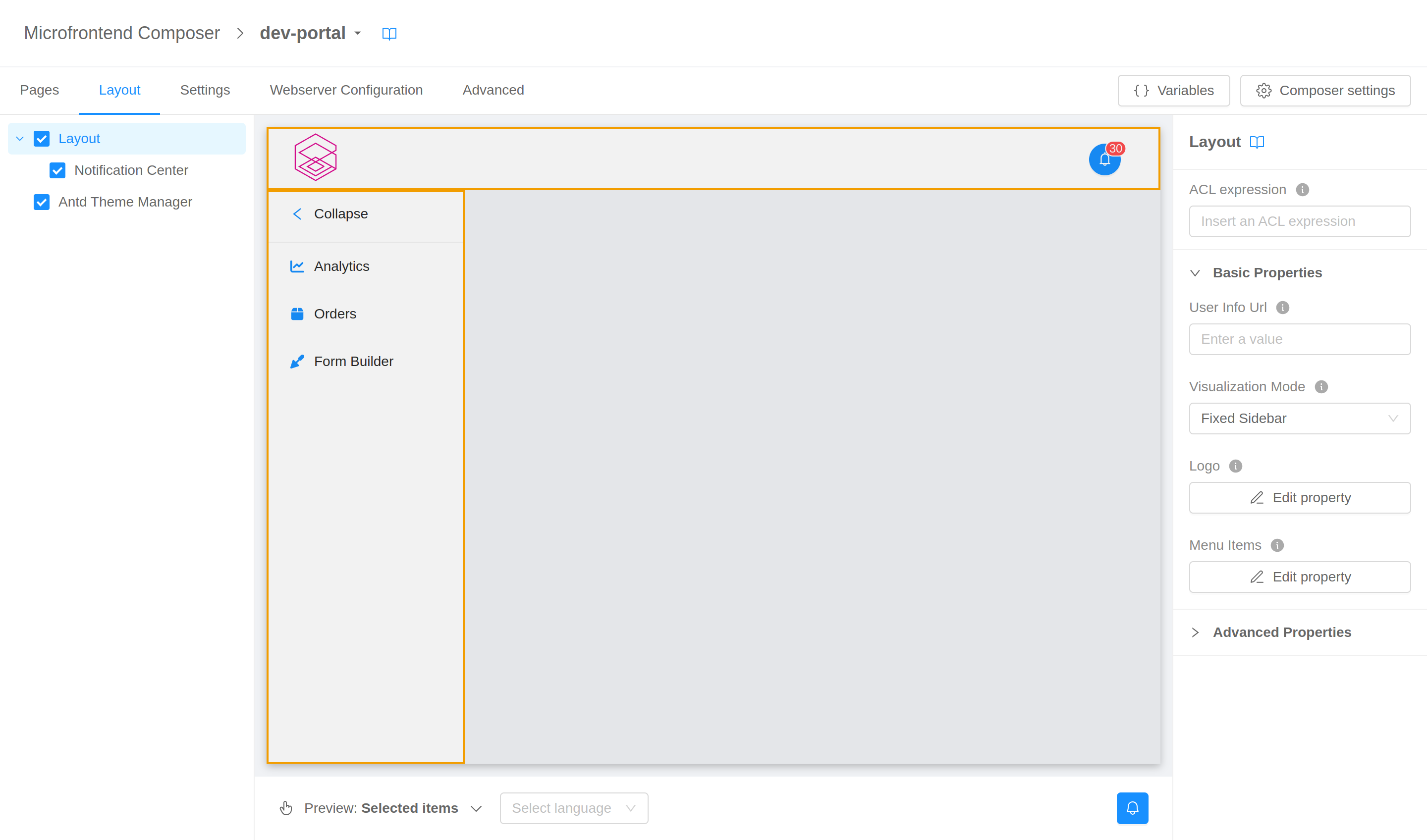
Components can be hidden from the page unchecking the box on their left. Keep in mind that components will just be hidden, and not removed from the DOM (technically speaking a display: none styling will be applied to them). To remove components from the page entirely you have to resort to the advanced configuration.
Live preview
The center of the page shows a live preview of what the final layout will look like.
The preview has two modes, one where you can interact with the page as you would do with the final frontend, and one where an overlay is placed on top of the page allowing you to select components in page without triggering their normal click behavior. You can switch between this two modes with the selector in the bottom left corner of the preview (or with key keyboard shortcut CTRL + Space).
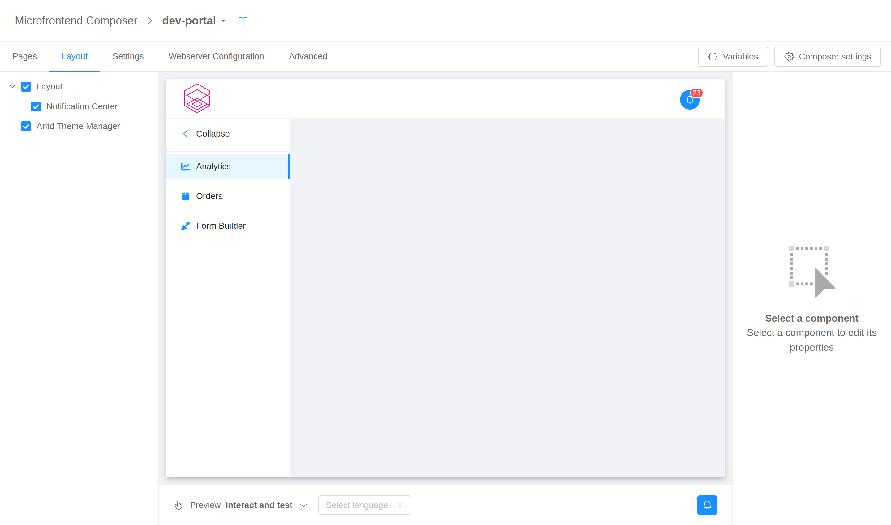
In "select" mode, a click on a component will highlight it, select it in the left menu, and show its properties for editing in the right drawer.
In the bottom bar you can also select the language to be used for translations: if none is selected the user's browser default will be used.
Since the preview is a real, functioning frontend, components may fire calls to backend or Web APIs (e.g., navigation events or local storage accesses). To avoid disrupting the configuration flow, these events are caught and mocked. You will receive notifications regarding them – alongside with any error that may occur in page – in the notification center in the bottom right corner of the preview.
Components properties editor
The drawer on the right of the page allows you to view and edit the properties of the components in page through a system of forms.
When a component is selected (through the left menu or the preview), the right menu will show its properties possibly divided into basic and advanced for an easier consultation.
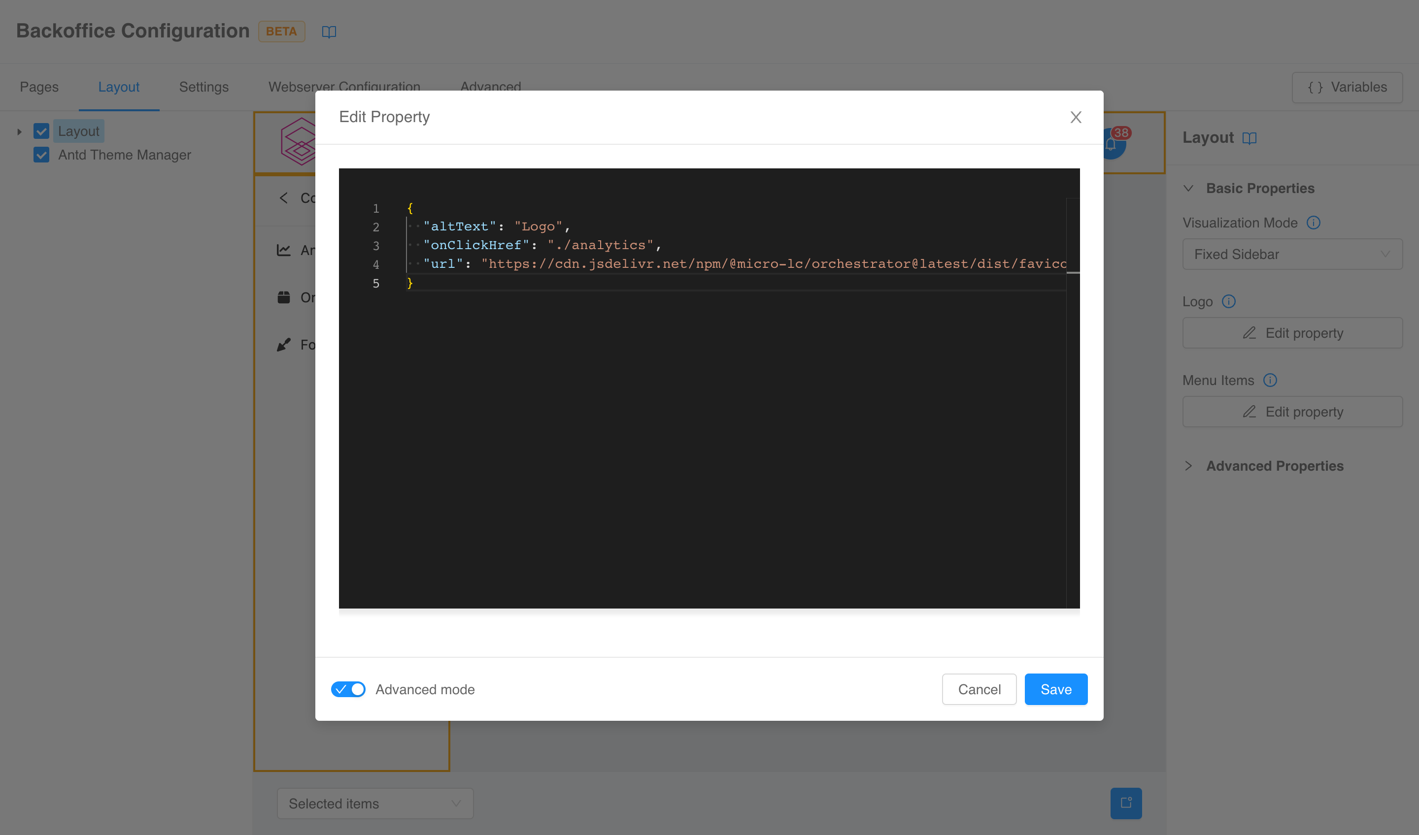
Different properties will have different means of editing – depending on the type of the property itself –. From a high-level point of view, they can be divided into primitive properties, which can be edited directly from the menu, and non-primitive properties, for which a modal will be spawned.
Some properties will be marked as Shared. This means that it is possible to assign them a common reusable property of the same type. In order to do so, create a Shared Property in the Shared Properties section.

Modals have the option to turn on an Advanced mode that will make available a code editor to edit the property.
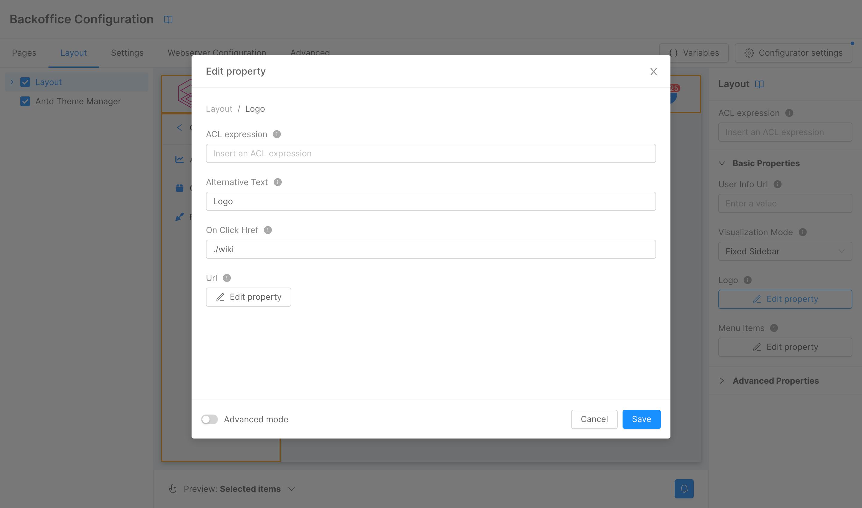
ACL expression
Components will also have a special property called aclExpression, which can be used to control whether certain portions of the configuration are removed based on a logical expression evaluated against user's groups and permissions.
The property is configurable at two levels.
-
On a component level from the properties form itself to limit the presence of the whole component definition.
For example, with the following configuration
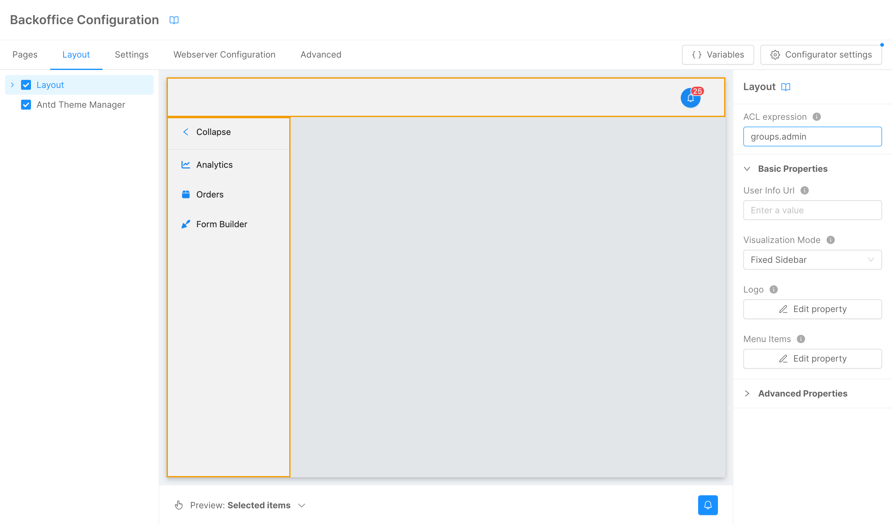
the layout component will not be included if the configuration is not fetched by a user with the admin group.
-
On a property level for all the properties (and sub-properties) of type
object.For example, with the following configuration
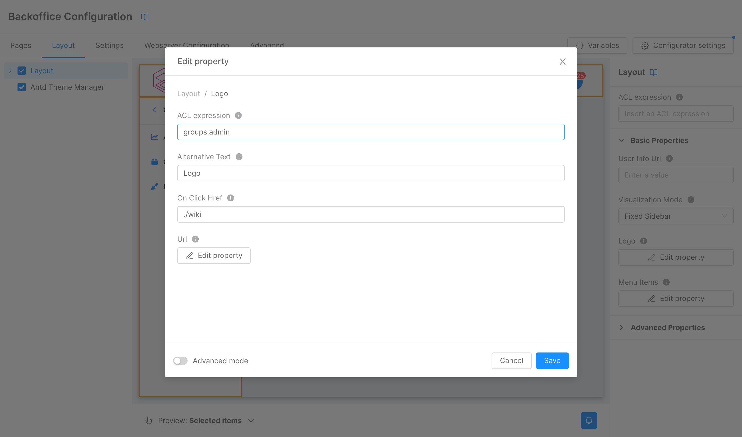
the property
logoof the layout will not be included if the configuration is not fetched by a user with the admin group.
Settings
The Settings tab collects several frontend global settings. The default configurations in most cases should be sufficient, so it will probably not be necessary to use this section.
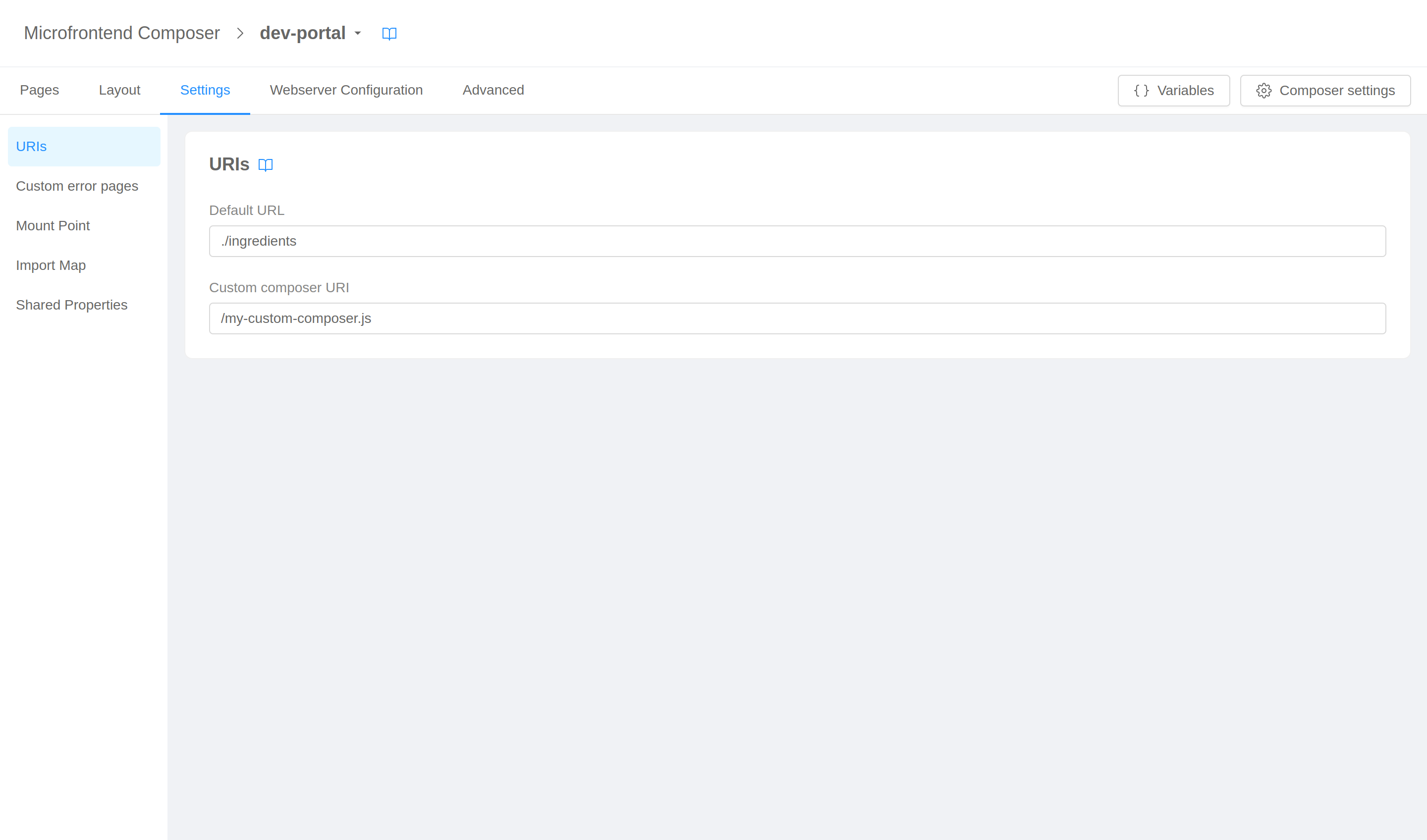
URIs
The URIs section allow you to configure the default landing URL, and the URI of a custom composer.
Custom error pages
In this section you can configure personalized error pages for 4xx and 5xx errors.
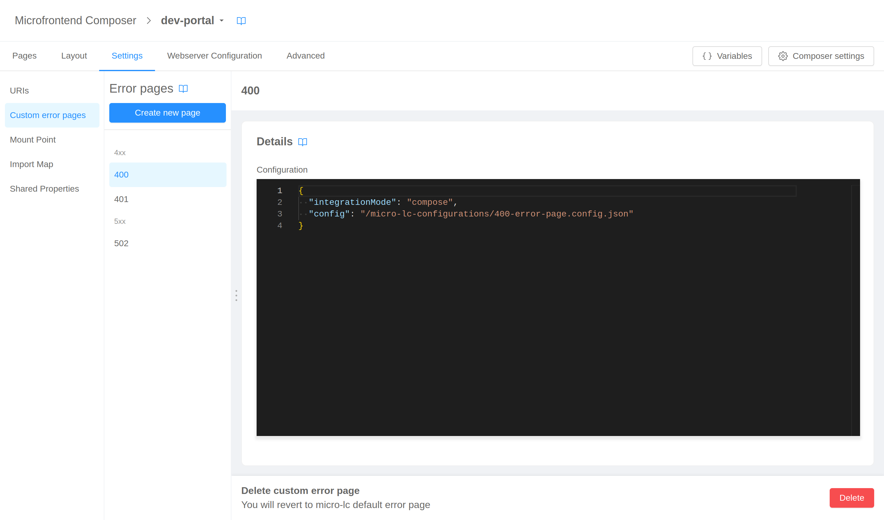
For each page you need to provide the status code and the configuration.
The editors will help you writing configurations hinting the correct properties JSON schemas.
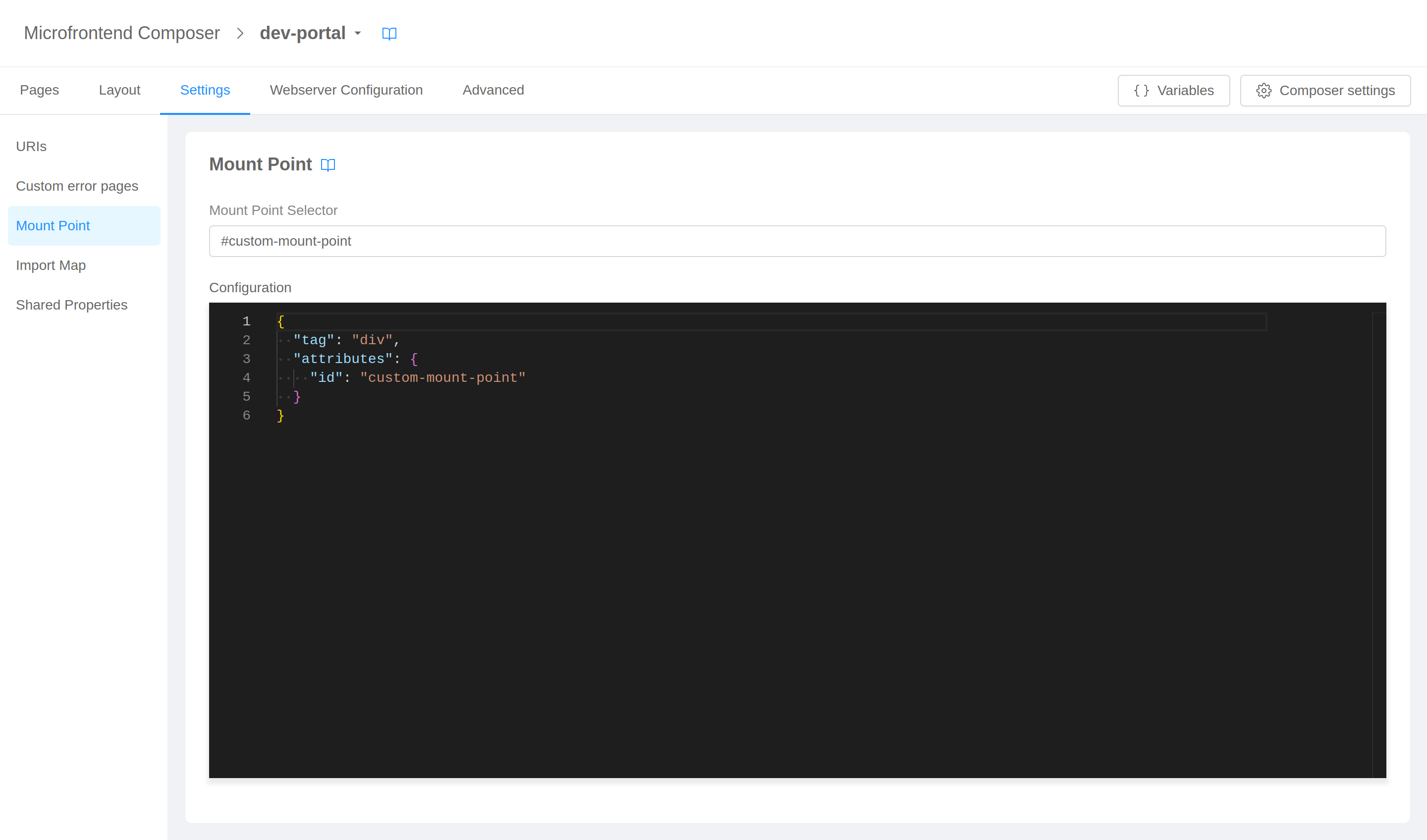
Mount point
This section is dedicated to the personalization of micro-lc mount point, both in terms of selector and of configuration.
The editors will help you writing configurations hinting the correct properties JSON schemas.
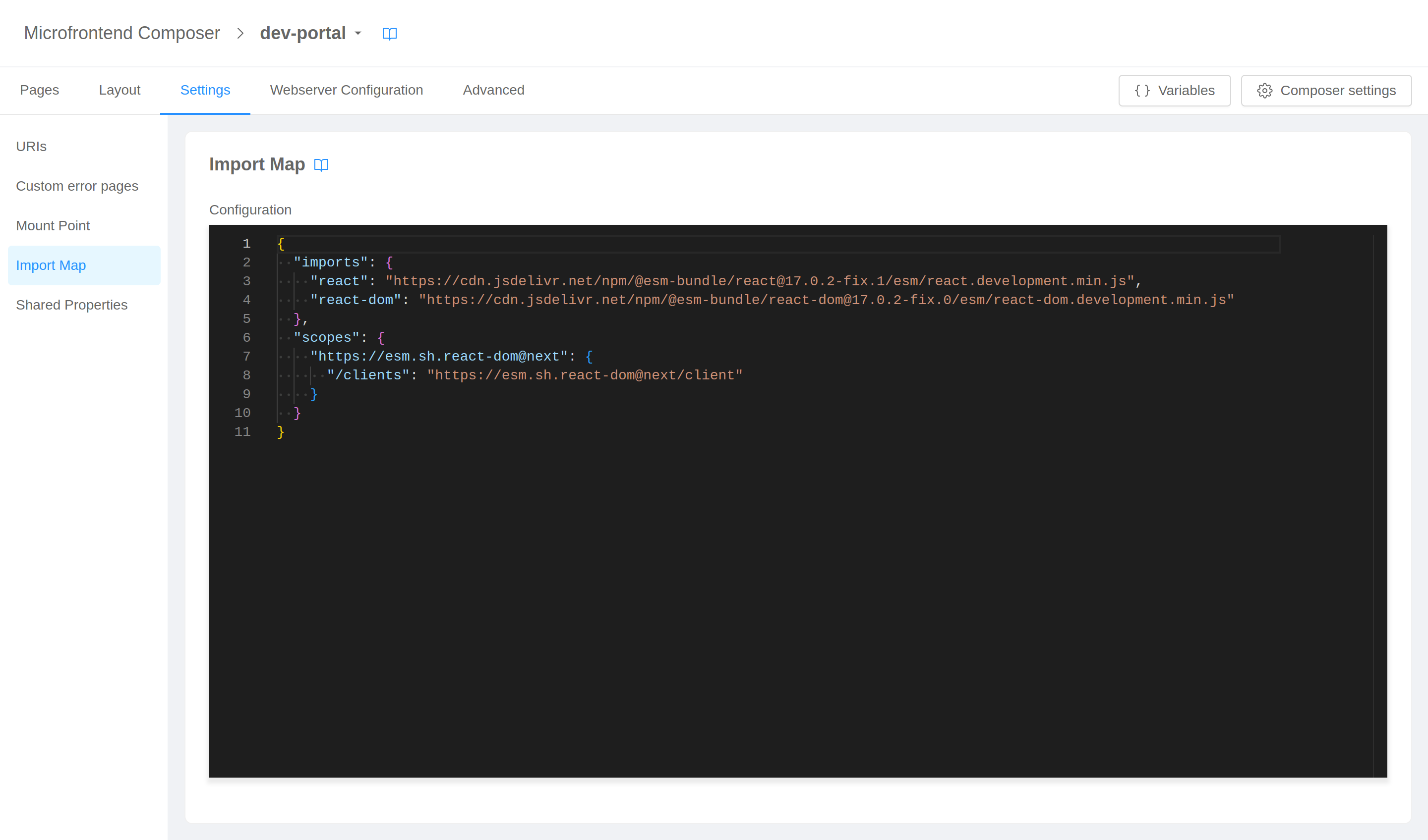
Import map
Here you can specify a global import map.
The editors will help you writing configurations hinting the correct properties JSON schemas.
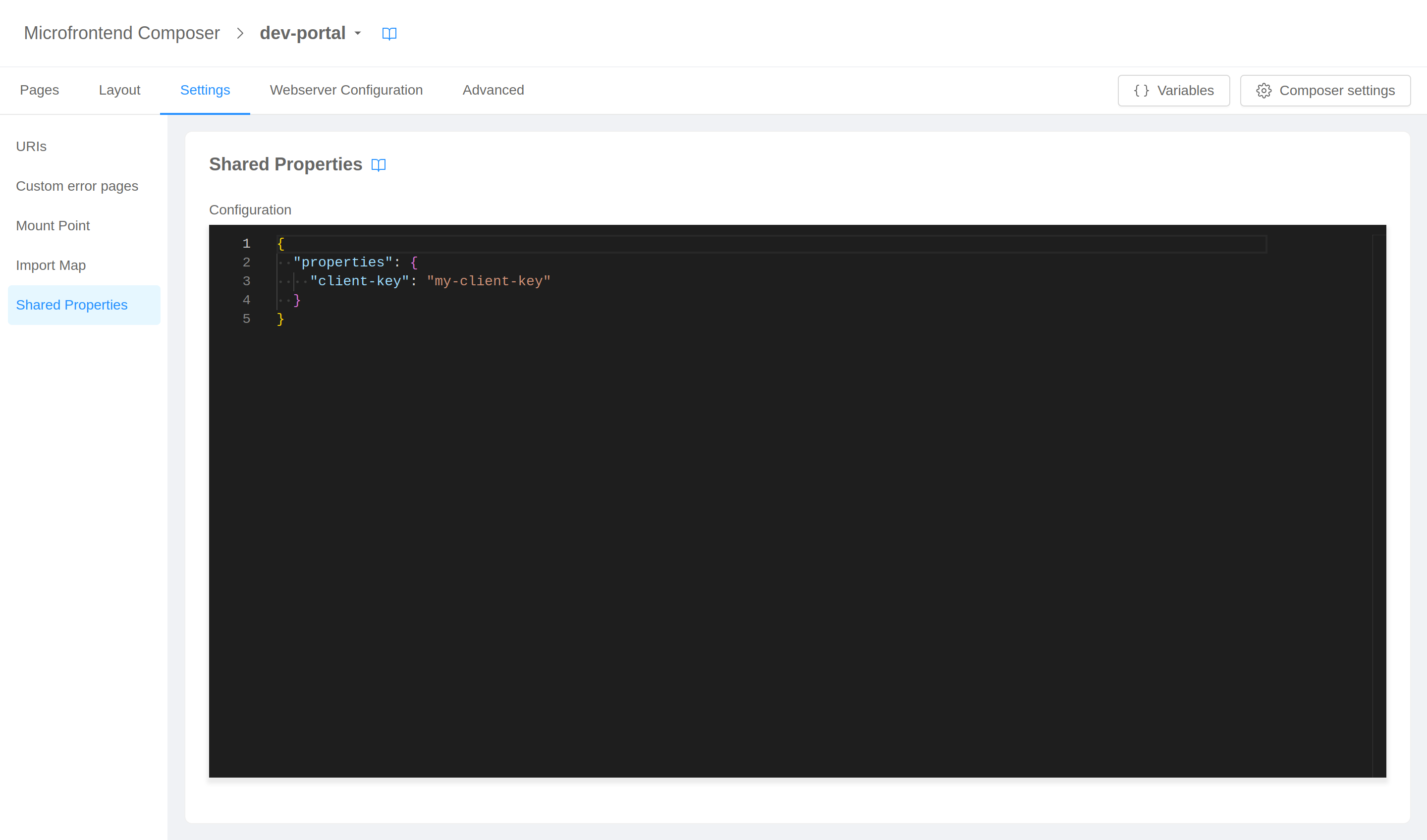
Shared properties
In this final section you can define global shared properties for frontend page.
The editors will help you writing configurations hinting the correct properties JSON schemas.
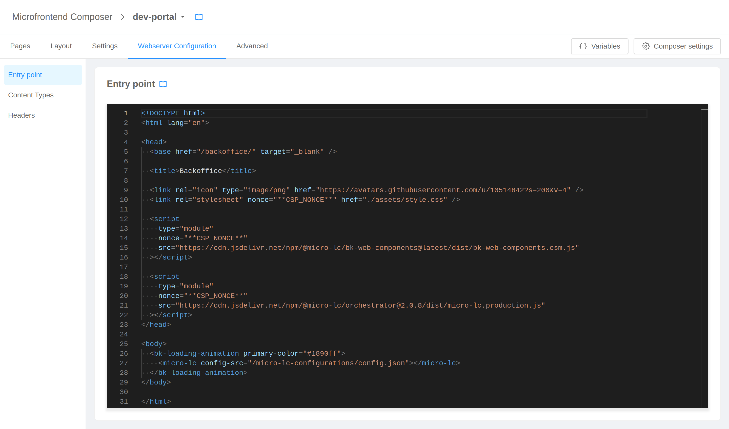
Webserver configuration
The Webserver Configuration tab gives you access to the configuration of the service responsible for serving frontend static files and configurations.
Entry point
Here you can find the HTML file used as entry point for the frontend allowing you to fine tune how micro-lc web component is configured.
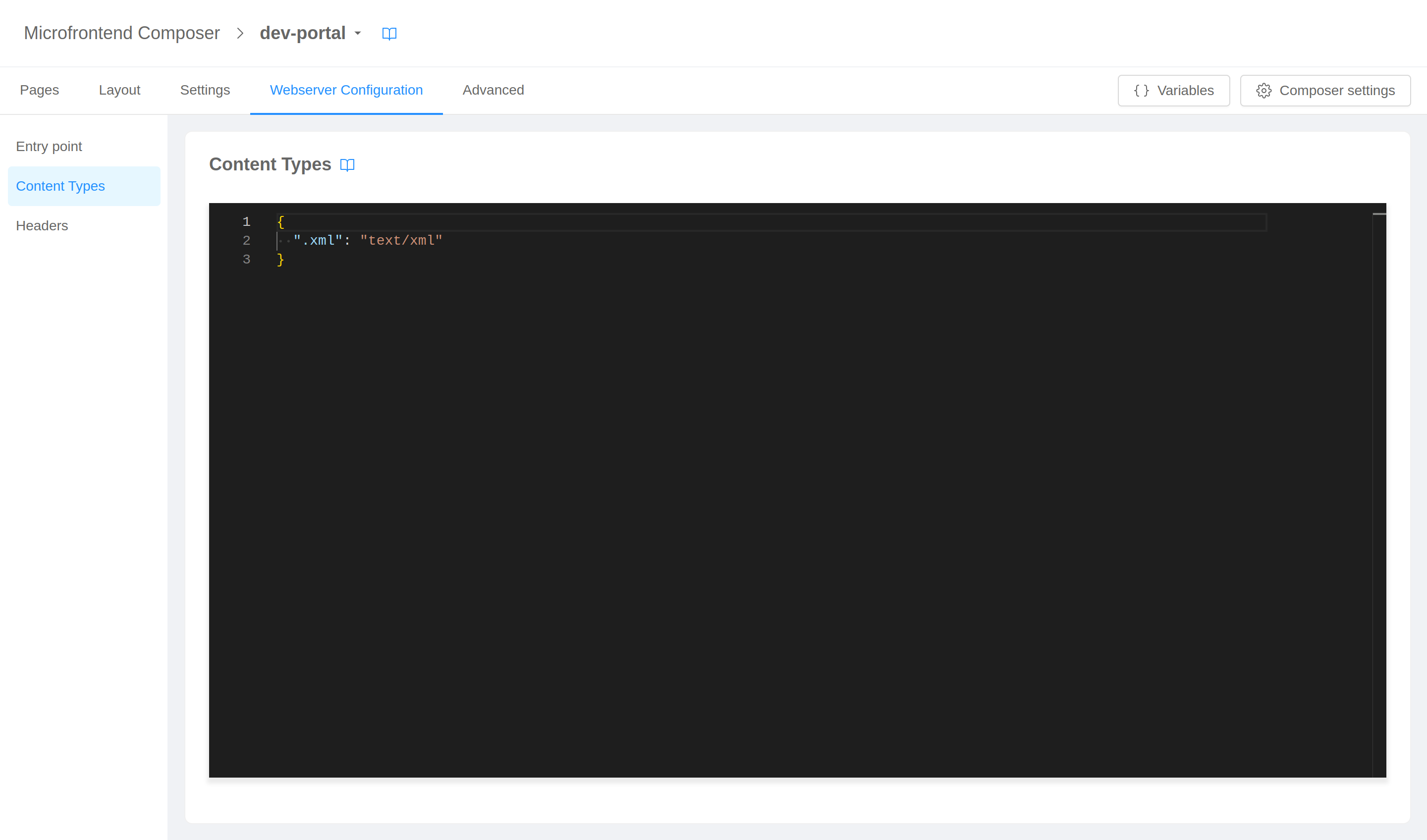
Content types
From this section you can tell the service which content type to use when serving files with specific extentions.
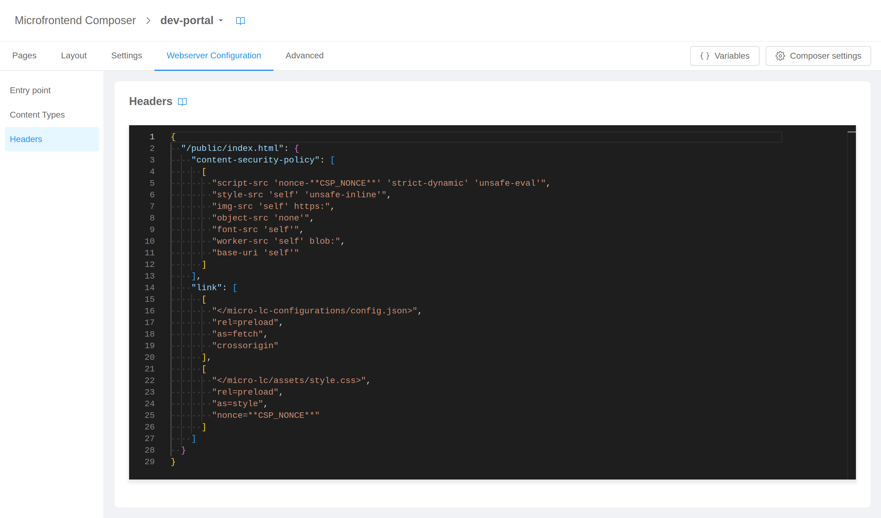
Headers
This section allows you to specify additional headers to include in static files responses.
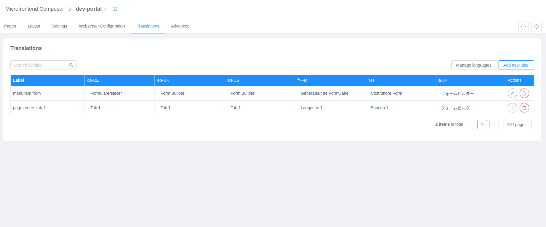
Translations
This feature is available for micro-lc's Middleware service starting from version 3.1.0. Versions interpolated using variables are not supported, thus the feature will be disabled.
The Translations tab gives you access to the table for configuring the labels and their translations. It allows you to view, create, modify, and delete languages and labels.
The legacy translation mode is an object with language ids as keys and the translations as values. The new translation configuration mode translates on the backend side all the labels which are simple strings.
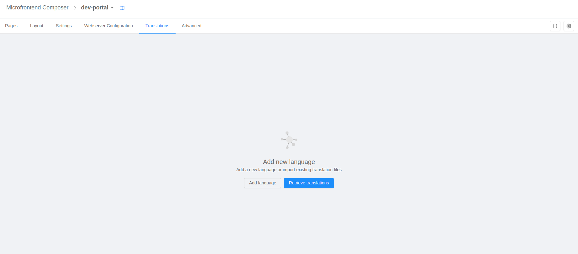
Import of existing translation files
If a translation configuration file already exists, it is possible to import it before using the translator configurator by clicking on the Retrieve translations button.
Once the import is complete, a table of all the labels and their translations will appear.
Add or delete a language
It is possible to add a new language from the first page by clicking on the button Add language or from the table page by clicking on the Manage languages button. Once you have clicked on one of these buttons, a modal will appear allowing you to add or delete a language in a select box.
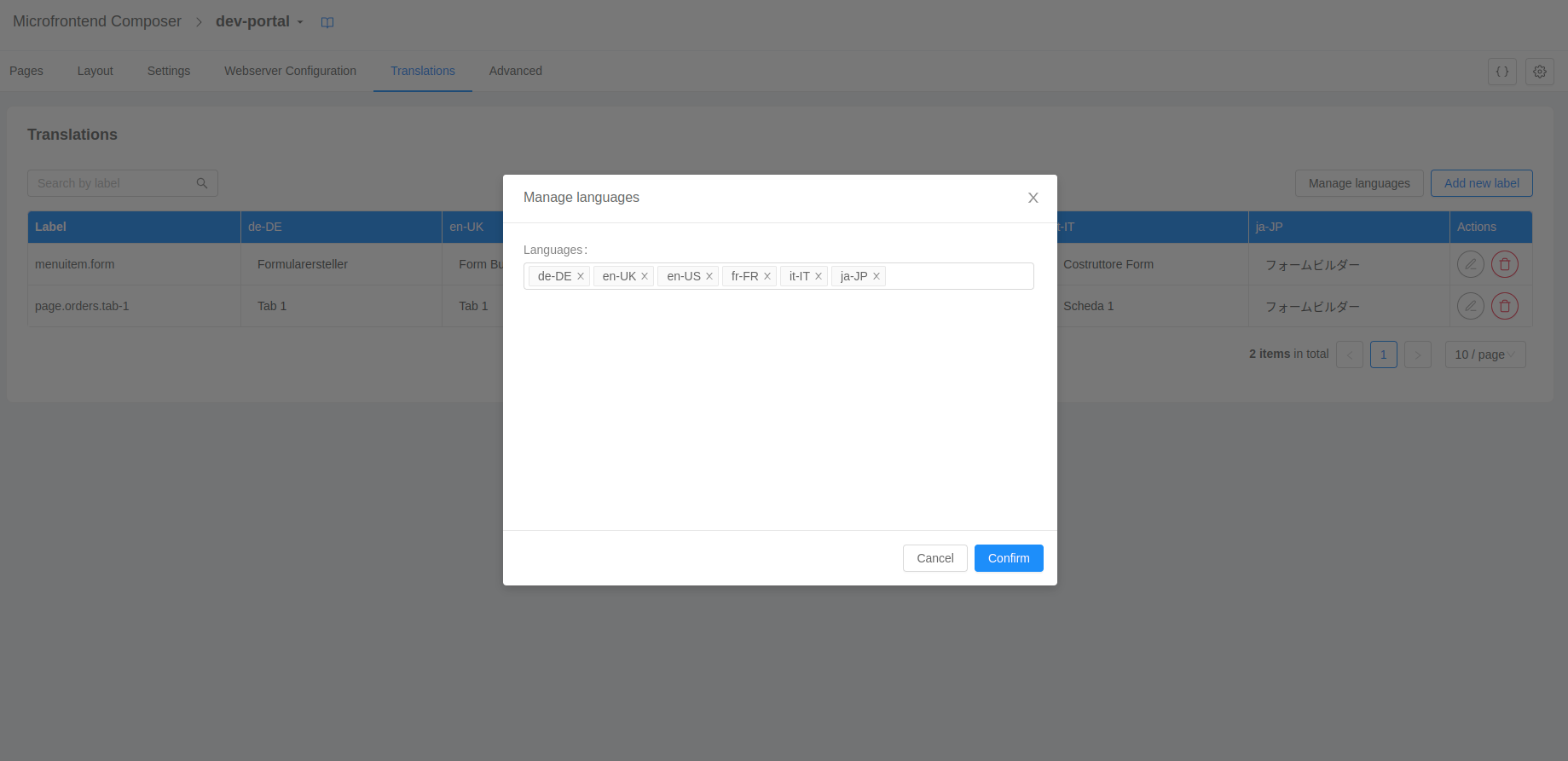
Once you have clicked on the confirm button the table will reflect the changes you have made.
Add label
It is possible to add a new label by clicking on the Add new label button. Once you have clicked the button, a modal will appear allowing you to add a new label and its translation for each language you have.
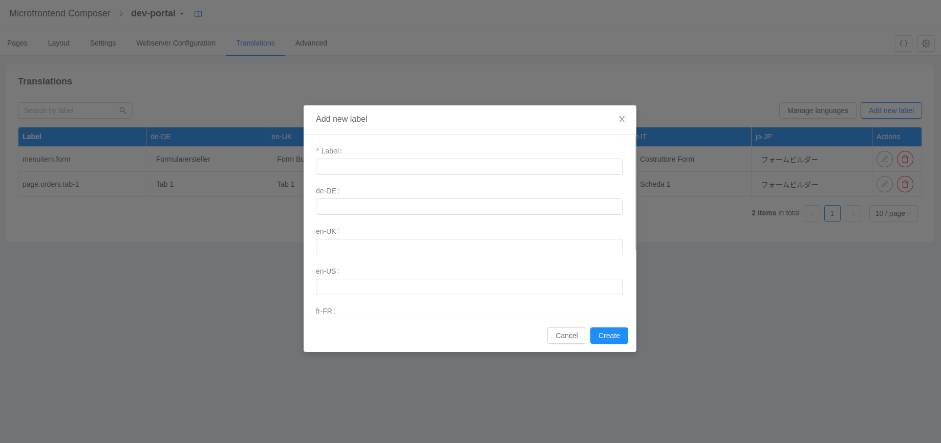
Once you have clicked on the create button the table will reflect the changes you have made.
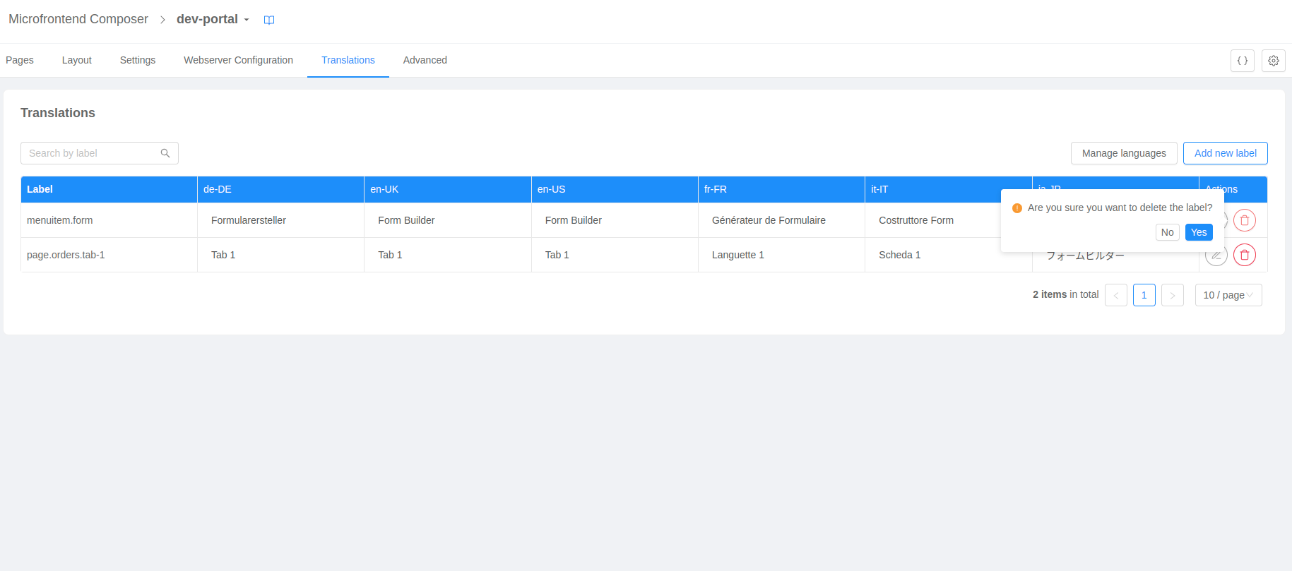
Delete of a label
It is possible to delete an existing label by clicking on the delete button on each row of the table. Once you have clicked on the button, a pop-up will appear asking you to confirm for the deletion of the label.
Editing of a label and its translations
It is possible to edit an existing label and its translations by clicking on the edit button on each row of the table. Once you have clicked on the button, a drawer will appear on the right hand side allowing you to edit the label and its translation value.
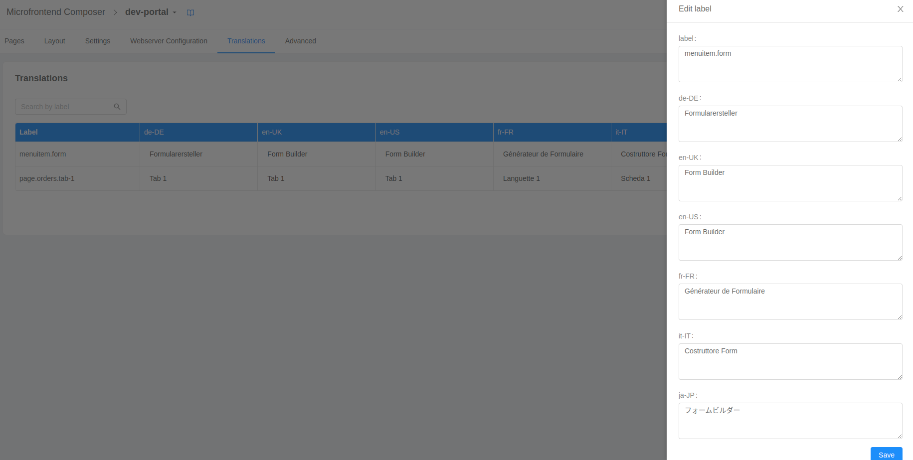
Once you have clicked on the Save button the table will reflect the changes you have made.
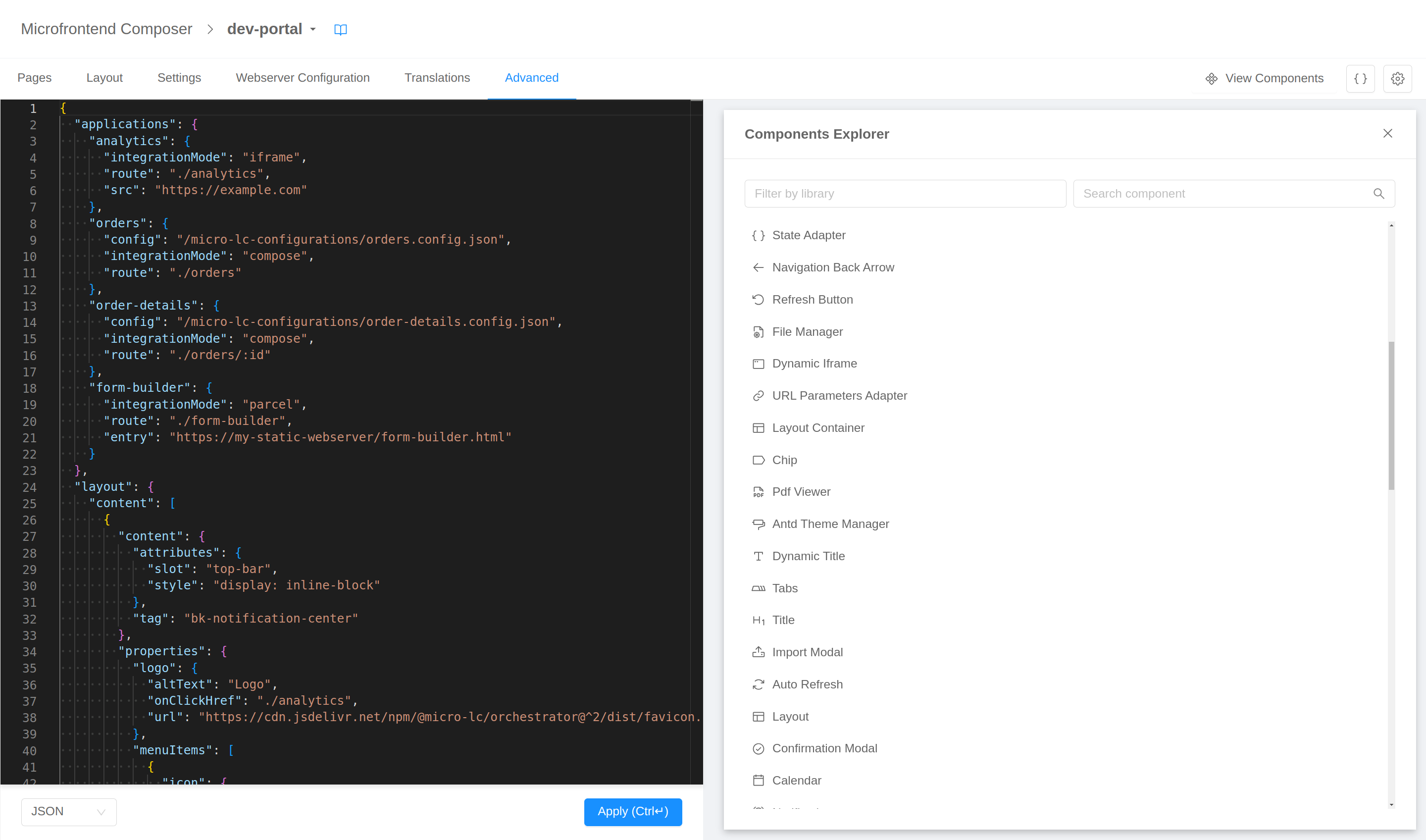
Advanced configuration
The Advanced configuration tab is built to give the highest degree of configurability, providing access to the final JSON configuration. In this visualization the page is divided in two section, a code editor on the left and a live preview on the right.
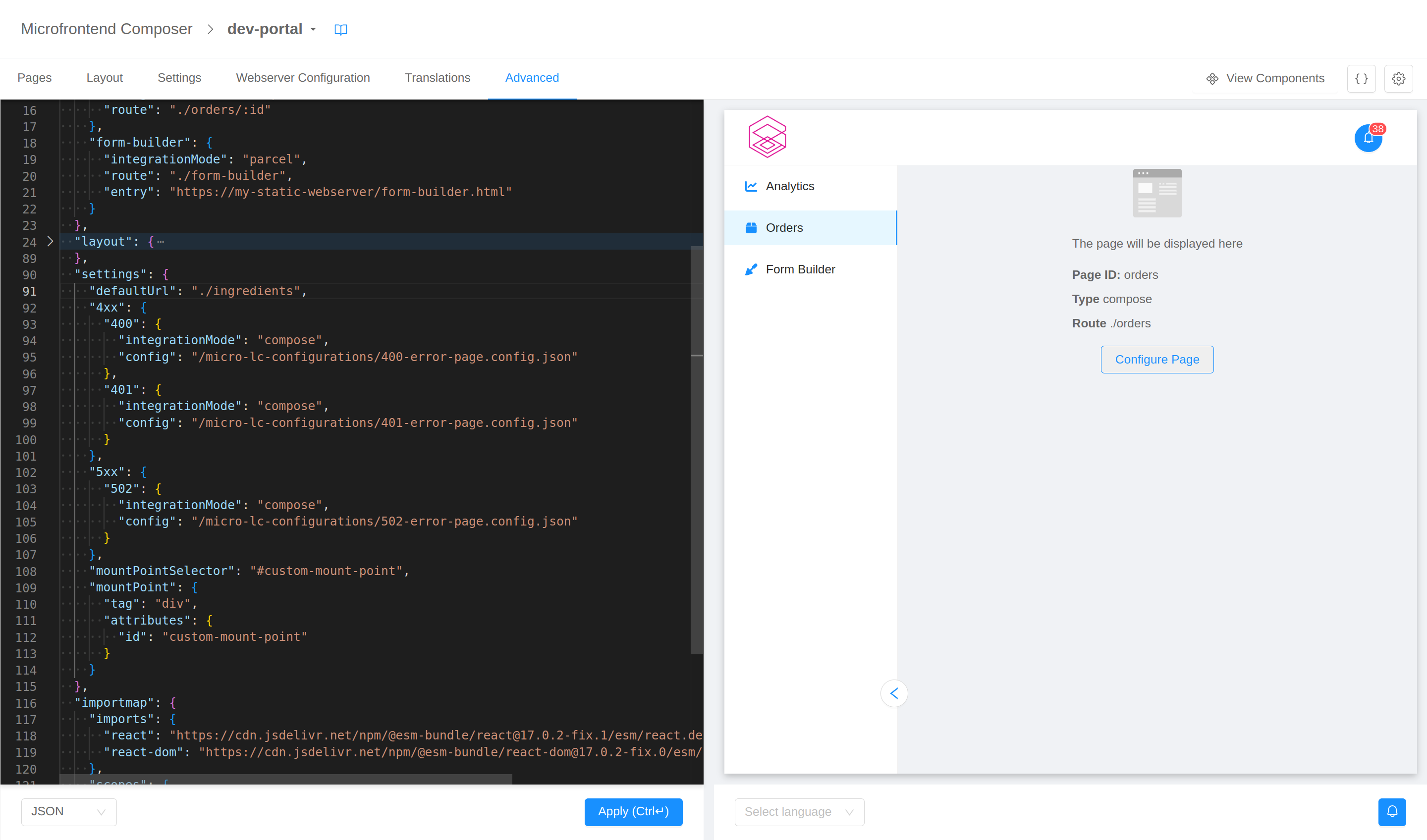
The editor on the left is where the configuration can be viewed and edited. It supports both JSON and YAML with the possibility to switch (and convert the content) using the selector in the bottom left corner.
The editor will help you writing the configuration hinting the correct JSON schema and validating the content live.
The updates made with the editor are not immediately reflected in the preview on the right: only after the "Apply" button is clicked the modification are saved and the preview is refreshed and aligned with the configuration.
Any modification made with the editor will not be saved unless the "Apply" button is clicked.
In the bottom bar you can also select the language to be used for translations: if none is selected the user's browser default will be used.
Since the preview is a real, functioning frontend, components may fire calls to backend or Web APIs (e.g., navigation events or local storage accesses). To avoid disrupting the configuration flow, these events are caught and mocked. You will receive notifications regarding them – alongside with any error that may occur in page – in the notification center in the bottom right corner of the page.
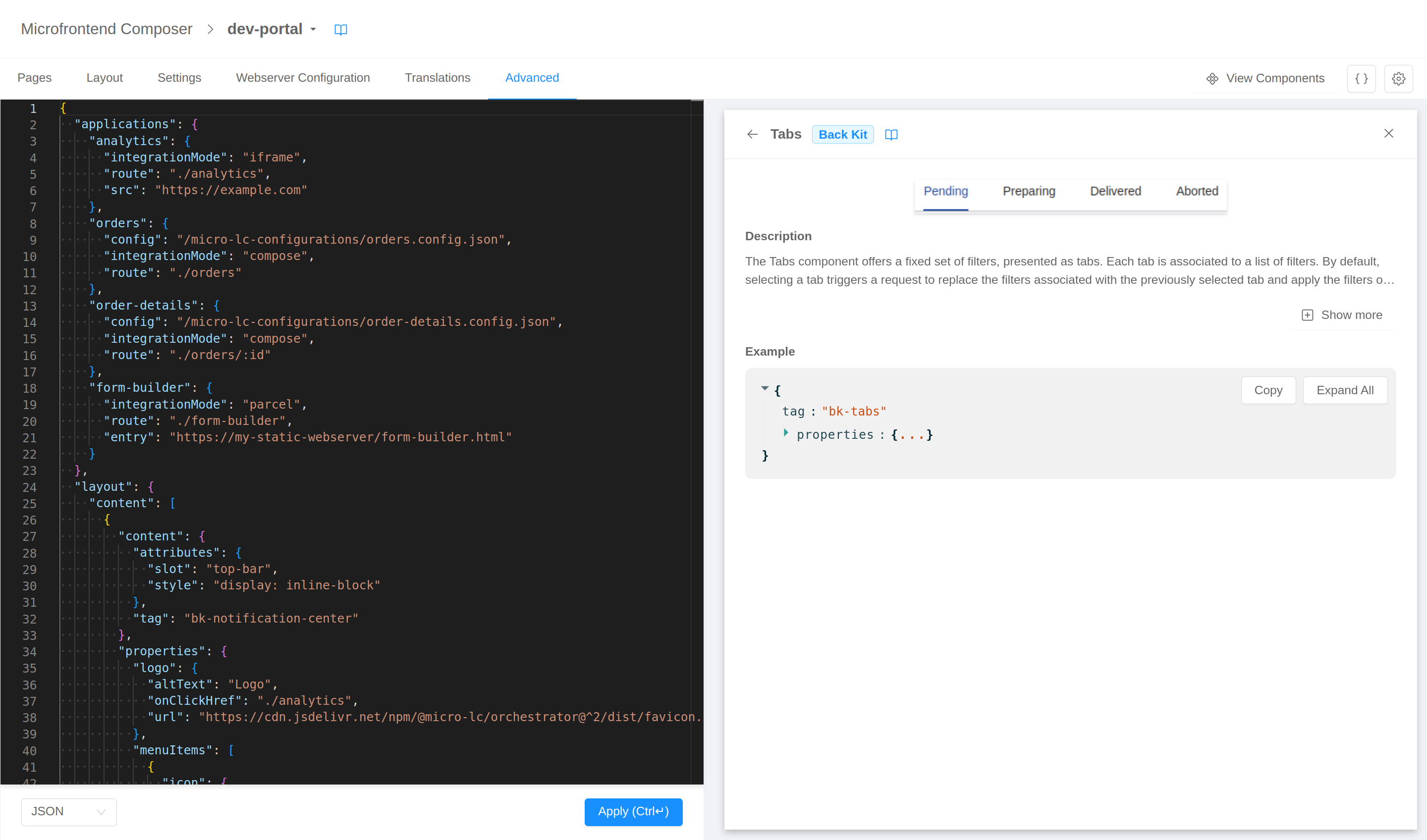
Components Explorer
The "View Components" button on the top right opens an overlay on top of the preview that shows a list of available custom elements. The list will include custom elements exposed by the libraries defined in the layout.sources array and those used in the configuration.
This component provides a library-based filter and a text search in order to quickly find the custom elements.
Clicking on a custom element it displays a page with its details. Depending on what information the library exposes, the possible details showed are:
- preview image
- description (markdown supported)
- example
- documentation link