Form Card
This component is deprecated. The Dynamic Form Card should be used instead.
<bk-form-card></bk-form-card>
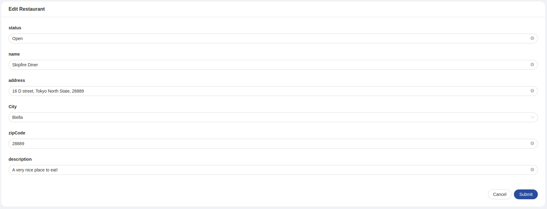
The Form Card renders a card containing a form to edit or create items described by the dataSchema.
How to configure
For a basic usage of the Form Card, providing a data-schema to interpret the structure of the data to handle is sufficient. Several customizations can be applied to the provided data-schema that tune how the data is handled by the component. Particularly, but not limited to, every field supports a set of options specific for forms.
{
  "tag": "bk-form-card",
  "properties": {
    "dataSchema": {
      "type": "object",
      "properties": {
        "_id_": {
          "type": "string",
          "formOptions": {
            "hidden": true // no input is rendered for _id field, but the Form Card still holds its value in the internal representation of the form values
          }
        },
        "__STATE__": {
          "type": "string",
          "default": "PUBLIC",
          "enum": [ // enum string fields are rendered as select fields
            "PUBLIC",
            "DRAFT",
            "TRASH"
          ]
        },
        "name": {
          "type": "string"
        },
        "price": {
          "type": "number"
        }
      }
    }
  }
}
The components operates in two different modes:
- insert: submitting the form signals the need for an item creation. Configurable by setting property
formKindto "add". - edit: submitting the form signals the need for an item creation. Configurable by setting property
formKindto "edit" (default).
If formKind is not specified, the Form Card operates in edit mode.
When newly fetched data becomes available through a display-data event, the Form Card initiates its field. The component extracts values from one of the elements within the received data and interprets them based on its data-schema. The dataIndex property governs the selection of which data element to use for this purpose by specifying its index. By default, the card selects the first element (corresponding to dataIndex value 0) for this process
Modes
When the component reacts to the display-data event and property formKind is set to "add", the form initializes its fields with values specified in the payload of the event.
In this mode, upon clicking on the submit button of the footer, the Form Card signals the request to push a new item to a CRUD collection, emitting the event create-data with payload extracted from the object representation of the form values.
A component such as the CRUD Client could pick up on the create-data event.
If the form contains files, the component emits a create-data-with-file event, which signals the need to upload files to a file storage service on top of pushing the item to a CRUD collection.
A component like the File Manager could listen to this event.
A transactionId is added to the meta field of the emitted event to handle possible errors.
Edit
When the component reacts to the display-data event and property formKind is set to "add", the form initializes its fields with the values specified in the payload of the event.
By clicking on the submit button, the Form Card signals the request to update an item in the CRUD collection, emitting the event update-data with payload providing the fields to change in the item. The item to update is identified by its _id field, which is a predefined field of Mia Platform's CRUD Service collections.
A component such as the CRUD Client could pick up on the update-data event.
If the form contains files, the component emits a update-data-with-file event, which signals the need to upload files to a file storage service on top of updating the item in the CRUD collection.
A component like the File Manager could listen to this event.
A transactionId is added to the meta field of the emitted event to handle possible errors.
After submission
When done filling up the form, usually the Form Card requests data update or creation (via an update-data or create-data event) according to the operating mode.
Usually an http-like client takes care of these operations.
It is often useful to perform other tasks upon successful creation or editing.
The prop afterFinishEvents allows to append events or pushState navigation instructions.
This feature can be configured by providing to afterFinishEvents
- a string, which will pipe an event using its value as label
- an array of strings, launching multiple events in the given order
- an event,
{
  label: string
  payload: Record<string, any>
  meta?: Record<string, any>
}
- an array of events,
- a single
pushStatecontext, which is a generic object data and an optional URL to perform navigation
{
  data: any
  url?: string
}
if data is an object and current window.history.state is an object, they are merged with priority to data's keys
Form context can be used into the events/pushState sent after submission using handlebars notation.
Each event payload and both pushState arguments are parsed with handlebars injecting the following context
{
  values: Record<string, any>
  response: Record<string, any>
}
where values is the form values and response contains an object representation of the content of the payload of the success event linked to the form submission request.
Integrate custom labels
Custom labels can be specified as LocalizedText as card title, CTA button label, require confirm message. Such labels can be scoped based on whether the form is in edit or create mode.
{
  "tag": "bk-form-drawer",
  "properties": {
    "customLabels": {
      "create": {
        "title": {
          "en": "Add new order",
          "it": "Aggiungi nuovo ordine"
        },
        "ctaLabel": {
          "en": "Submit",
          "it": "Submit Order"
        },
        "unsavedChangesContent": {
          "it": "Chiudendo ora si perderà l'ordine non salvate, procedere?",
          "en": "Closing now will discard new order, do you want to continue?"
        },
        "saveChangesContent": {
          "it": "Verrà creato un nuovo ordine, procedere?",
          "en": "A new order will be created, continue?"
        }
      },
      "update": {
        "title": {
          "en": "Order detail",
          "it": "Dettaglio ordine"
        },
        "ctaLabel": {
          "en": "Update Order",
          "it": "Salva Ordine"
        },
        "unsavedChangesContent": {
          "it": "Chiudendo ora si perderanno tutte le modifiche non salvate all'ordine, procedere?",
          "en": "Closing now will discard changes to the order, do you want to continue?"
        },
        "saveChangesContent": {
          "it": "Verrà creato un nuovo ordine, procedere?",
          "en": "A new order will be created, continue?"
        }
      }
    }
  }
}
Not all keys need to be specified, as customLabels is merged with default labels.
For instance, the following is a valid configuration of customLabels:
{
  "tag": "bk-form-drawer",
  "properties": {
    "customLabels": {
      "create": {
        "title": {
          "en": "Add new order",
          "it": "Aggiungi nuovo ordine"
        }
      },
      "update": {
        "title": {
          "en": "Order detail",
          "it": "Dettaglio ordine"
        }
      }
    }
  }
}
Locale
The texts of the Form Card can be customized through the property customLocale, which accepts an object shaped like the following:
type Locale = {
  title: LocalizedText
  ctaLabel: LocalizedText
  cancelLabel: LocalizedText
  unsavedChangesContent: LocalizedText
  saveChangesContent: LocalizedText
  form: {
    validationMessages:{
      default: LocalizedText,
      required: LocalizedText,
      enum: LocalizedText,
      whitespace: LocalizedText,
      date:{
        format: LocalizedText,
        parse: LocalizedText,
        invalid: LocalizedText
      },
      types:{
        string: LocalizedText,
        method: LocalizedText,
        array: LocalizedText,
        object: LocalizedText,
        number: LocalizedText,
        date: LocalizedText,
        boolean: LocalizedText,
        integer: LocalizedText,
        float: LocalizedText,
        regexp: LocalizedText,
        email: LocalizedText,
        url: LocalizedText,
        hex: LocalizedText,
        file: LocalizedText
      },
      string:{
        len: LocalizedText,
        min: LocalizedText,
        max: LocalizedText,
        range: LocalizedText
      },
      number:{
        len: LocalizedText,
        min: LocalizedText,
        max: LocalizedText,
        range: LocalizedText
      },
      array:{
        len: LocalizedText,
        min: LocalizedText,
        max: LocalizedText,
        range: LocalizedText,
        unique: LocalizedText
      },
      pattern:{
        mismatch: LocalizedText
      }
    },
    datePicker: {
      lang: {
        locale: LocalizedText,
        placeholder: LocalizedText,
        rangePlaceholder: {
          start: LocalizedText,
          stop: LocalizedText
        },
        today: LocalizedText,
        now: LocalizedText,
        backToToday: LocalizedText,
        ok: LocalizedText,
        clear: LocalizedText,
        month: LocalizedText,
        year: LocalizedText,
        timeSelect: LocalizedText,
        dateSelect: LocalizedText,
        monthSelect: LocalizedText,
        yearSelect: LocalizedText,
        decadeSelect: LocalizedText,
        monthBeforeYear: 'true' | 'false',
        previousMonth: LocalizedText,
        nextMonth: LocalizedText,
        previousYear: LocalizedText,
        nextYear: LocalizedText,
        previousDecade: LocalizedText,
        nextDecade: LocalizedText,
        previousCentury: LocalizedText,
        nextCentury: LocalizedText
      },
      timePickerLocale:{
        placeholder: LocalizedText
      }
    },
    filePicker:{
      drawerTitle: LocalizedText,
      filePickerTitle: LocalizedText,
      dragAndDropCaption: LocalizedText,
      ctaLabel: LocalizedText
    },
    objectEditor:{
      editorView: LocalizedText,
      tableView: LocalizedText
    },
    editor:{
      editorView: LocalizedText,
      rawView: LocalizedText
    },
    htmlEditor: {
      preview: LocalizedText,
      html: LocalizedText
    },
    geopoint:{
      latitude: LocalizedText,
      longitude: LocalizedText,
      phLatitude: LocalizedText,
      phLongitude: LocalizedText
    },
    element: LocalizedText,
    elements: LocalizedText,
    true: LocalizedText,
    false: LocalizedText
  }
}
where LocalizedText is either a string or an object mapping language acronyms to strings.
API
Properties & Attributes
| property | attribute | type | default | description |
|---|---|---|---|---|
afterFinishEvents | - | ConfigurableEvents | - | events or state push to concatenate after successful finish action has been performed |
allowAutoDisableDeps | allow-auto-disable-deps | boolean | false | if true, dependent lookup and multilookup select fields are automatically disabled in case of no options |
customLabels | - | FormCardLocale | - | custom localized texts shown as CTA buttons labels |
dataSchema | - | ExtendedJSONSchema7Definition | - | data schema describing the fields of the collection to filter |
enableSubmitOnFormUntouched | enable-submit-on-form-untouched | boolean | false | boolean to enable footer call-to-action even if no field within the form has been touched |
formKind | - | "add" | "edit" | "edit" | data management strategy when setting initial values from displayData: add or edit (default) |
liveSearchItemsLimit | live-search-items-limit | number | 10 | max items to fetch on regex live search |
liveSearchTimeout | live-search-timeout | number | 5000 | live-search timeout |
readonlyOnView | readonly-on-view | boolean | false | upon marking this prop as true, on selecting a record, the form will be displayed as readonly, with no possibility to edit |
editorHeight | editor-height | string | number | - | height of object/array editor |
header | - | CardSchema.header | - | Card header |
CustomLabels
type CustomLabels = {
  title?: LocalizedText
  ctaLabel?: LocalizedText
  saveChangesContent?: LocalizedText
  cancelLabel?: LocalizedText
}
where LocalizedText is either a string or an object mapping language acronyms to strings.
Listens to
| event | action |
|---|---|
| display-data | initializes the form to create or update an item, potentially applying default fields from data schema or data provided in the payload of the event |
| success | notifies correct data update as a result of form submission |
| error | notifies that something went wrong during form submission |
Emits
| event | description |
|---|---|
| configurable event | property afterFinishEvents allows to emit custom events |
| require-confirm | triggered when trying to save the form with unsaved data |
| create-data | requests data creation |
| update-data | requests data update |
| create-data-with-file | requests data creation and file upload |
| update-data-with-file | requests data update and file upload |