Confirmation Modal
<bk-confirmation-modal></bk-confirmation-modal>

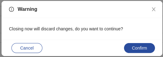
The Confirmation Modal prompts the user for confirmation on certain actions. A dialog box is rendered through a modal with two buttons, one for confirming and one for canceling the action.
The Confirmation Modal becomes visible upon listening to a require-confirm event, and uses the event payload to populate its state as follows:
title: the title of the modal.content: the text content of the modal.okText: the text content of the "Confirm" button.cancelText: the text content of the "Cancel" button.onOk: the callback to execute on confirm. Note: this key cannot be set through configuration. UseconfigOkkey instead.onCancel: the callback to execute on cancel. Note: this key cannot be set through configuration. UseconfigCancelkey instead.configOk: a "tag"-"properties" pair to mount a custom component in place of the default confirmation button. Usually, mounted components are instances of the Button component.configCancel: a "tag"-"properties" pair to mount a custom component in place of the default cancel button. Usually, mounted components are instances of the Button component.
How to configure
The Confirmation Modal does not require any configuration.
{
  "tag": "bk-confirmation-modal"
}
The size of the dialog box body can be set with properties width and height, which are defaulted to '520px' and '50px'.
How to require confirmation for an action
Components that allow to emit configurable events (for instance, the Button) may be used to spawn the Confirmation Modal by emitting a require-confirm event.
Doing so, event payload keys configOk and configCancel should be specified to configure the confirm and cancel buttons, while keys onCancel, onOk, okText and cancelText should not be specified, since they are supposed to always be set programmatically.
Components mounted using configOk and configCancel are automatically set to close the modal upon clicking, and the Confirmation Modal injects its properties headers and credentials to their properties.
Mounting custom components as confirmation/cancel buttons in the modal allows to require confirmation from the user before executing a Back-kit Action. An example is available.
Generally, to require confirmation for Back-kit Action, a configuration like the following:
{
  "tag": "bk-button", // the component performing the action that requires confirmation
  "properties": {
    "action": {
      ... // <------ the action that requires confirmation
    }
  }
}
should become:
{
  "tag": "bk-button", // the component performing the action that requires confirmation
  "properties": {
    "action": {
      "type": "event",
      "config": {
        "events": {
          "label": "require-confirm",
          "payload": {
            "title": "Confirmation Required",
            "content": "Continue?",
            "configOk": { // it is the "confirm" button of the Confirmation Modal to actually perform the desired action
              "tag": "bk-button",
              "properties": {
                "content": "OK",
                "action": {
                  ... // <------ the action that requires confirmation
                }
              }
            }
          }
        }
      }
    }
  },
  {
    "tag": "bk-confirmation-modal"
  }
}
The Button is now only responsible for spawning the Confirmation Modal and instructing it of the action to perform upon confirmation, while it is the the "confirm" button of the modal to actually perform the desired action.
Particularly:
The triggering component (usually a Button) should emit a require-confirm event with a payload that includes a configOk key with a tag-properties pair describing a Button that, upon click, performs the desired action.
The Confirmation Modal listens to the require-confirm and becomes visible. The "confirm" button of the modal is spawned using the configOk field of the event payload.
This way, when the user confirms, it is the confirmation button to perform the desired action.
Note that the Confirmation Modal closes automatically upon clicking any of its buttons.
Locale
The texts of the Confirmation Modal can be customized through the property customLocale, which accepts an object shaped like the following:
type Locale = {
  title: LocalizedText
  content: LocalizedText
  okText: LocalizedText
  cancelText: LocalizedText
}
where LocalizedText is either a string or an object mapping language acronyms to strings.
Examples
Example: Require confirmation for a DELETE request
The following snippet of configuration shows a Button configured to perform a DELETE request to a given endpoint when clicked.
{
  "tag": "bk-button",
  "properties": {
    "content": "Delete",
    "action": {
      "type": "http",
      "config": {
        "url": "orders/old-orders",
        "method": "DELETE"
      }
    }
  }
}
In order to require confirmation for this action, it is possible to have the Button spawn the Confirmation Modal instead of performing the REST call, delegating it to the "confirm" button of the modal.
{
  "tag": "bk-button",
  "properties": {
    "content": "Delete",
    "action": {
      "type": "event",
      "config": {
        "events": {
          "label": "require-confirm",
          "payload": {
            "title": {
              "en": "Delete orders?",
              "it": "Rimuoveree ordini?"
            },
            "content": {
              "en": "Are you sure you want to delete these orders?",
              "it": "Sei sicuro di voler rimuobere gli ordini?"
            },
            "configCancel": {
              "tag": "bk-button",
              "properties": {
                "content": "No",
                "type": "ghost"
              }
            },
            "configOk": {
              // confirmation button performs the actual action
              // `configOk` has the same piece of configuration as the initial `bk-button`
              "tag": "bk-button",
              "properties": {
                "content": "Ok",
                "action": {
                  "type": "http",
                  "config": {
                    "url": "orders/old-orders",
                    "method": "DELETE"
                  }
                }
              }
            }
          }
        }
      }
    }
  }
}
The button emits a require-confirm event. The Confirmation Modal listens to it and becomes visible, using the payload of the event to populate its state.
In particular, the configOk key of the event payload is used to build the confirmation button. In this case, it is a button that performs the same DELETE call that was previously performed directly by the button.
The cancel button does not perform any action: if clicked, the modal closes and the endpoint is not called.
API
Properties & Attributes
| property | attribute | type | default | description |
|---|---|---|---|---|
height | height | string | '50px' | height of the modal body |
width | width | string | '520px' | width of the modal body |
Listens to
| event | action |
|---|---|
| require-confirm | displays a Confirmation Modal with buttons for the user to confirm or cancel the triggering of certain actions |
Emits
| event | description |
|---|---|
| configurable event | on confirm or on cancel, it can forward events that were specified in the payload of the triggering event as the callback for the relative button |