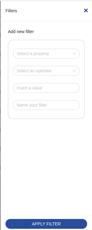
Filter Drawer
<bk-filter-drawer></bk-filter-drawer>

The Filter Drawer allows to compile a filter and signal the need for it to be applied on top of the already applied filters. In particular, submitting the Filter Drawer injects the compiled filter into the payload of an add-filter event, which is listened by components such as the Filters Manger.
The Filter Drawer becomes visible whenever the request to provide support for applying filters is signaled. That is, whenever events filter or change-filter are received. The change-filter event allows to carry an object representation of a filter in its payload that is used by the Filter Drawer to initialize its fields.
How to configure
For its most basic usage, the Filter Drawer requires a data-schema describing the fields of the collection to filter.
{
  "tag": "bk-filter-drawer",
  "properties": {
    "dataSchema": {
      "type": "object",
      "properties": {
        "_id": {"type": "string"},
        "name": {"type": "string"}
      }
    }
  }
}
Filters Options
Data-schema supports options that are specific for how the data should be interpreted within the context of data filtering.
In particular,
hiddencontrols whether the property should not be available to be selected for compiling a filteravailableOperatorscontrols what operators should be available for the given property. Note that the type of each property also limits the available operators
Lookup fields (writable views)
The Filter Drawer renders the filter value field as a select or a multi-select for fields described inside the data-schema as having type object or array and format lookup.
Options for such fields will be dynamically fetched from the endpoint specified in basePath property, using the /lookup route provided by the CRUD Service to writable views (version 6.9.0 or higher) , which returns a list of objects.
Each option fetched like this should have at least a label field, which is used as display value inside the form, and a value field which is used as unique identifier for such option.
If you use the _id field as value in your lookups, remember to set its type as string.
Locale
The texts of the Filter Drawer can be customized through the property customLocale, which accepts an object shaped like the following:
type Locale = {
  title: LocalizedText
  description: LocalizedText
  ctaLabel: LocalizedText
  propertyPlaceholder: LocalizedText
  operatorPlaceholder: LocalizedText
  valueInputPlaceholder: LocalizedText
  valueSelectPlaceholder: LocalizedText
  namePlaceholder: LocalizedText
  propertyRequired: LocalizedText
  operatorRequired: LocalizedText
  valueRequired: LocalizedText
  valueLabelMap: {
    between: {
      start: LocalizedText
      stop: LocalizedText
    },
    notBetween: {
      start: LocalizedText
      stop: LocalizedText
    }
  },
  validationMessages: {
    array: LocalizedText
    file: LocalizedText
    object: LocalizedText
  },
  operators: {
    equals: LocalizedText
    exists: LocalizedText
    doesNotEqual: LocalizedText
    contains: LocalizedText
    startsWith: LocalizedText
    endsWith: LocalizedText
    before: LocalizedText
    beforeOrEqual: LocalizedText
    on: LocalizedText
    notOn: LocalizedText
    after: LocalizedText
    afterOrEqual: LocalizedText
    is: LocalizedText
    isNot: LocalizedText
    greater: LocalizedText
    greaterOrEqual: LocalizedText
    less: LocalizedText
    lessOrEqual: LocalizedText
    includesSome: LocalizedText
    includesAll: LocalizedText
    includesExactly: LocalizedText
    doesNotInclude: LocalizedText
    between: LocalizedText
    notBetween: LocalizedText
    hasLengthEqual: LocalizedText
    hasLengthGreaterEqual: LocalizedText
    hasLengthLessEqual: LocalizedText
  },
  datePicker: {
    lang: {
      locale: LocalizedText
      placeholder: LocalizedText
      rangePlaceholder: {
        start: LocalizedText
        stop: LocalizedText
      },
      today: LocalizedText
      now: LocalizedText
      backToToday: LocalizedText
      ok: LocalizedText
      clear: LocalizedText
      month: LocalizedText
      year: LocalizedText
      timeSelect: LocalizedText
      dateSelect: LocalizedText
      monthSelect: LocalizedText
      yearSelect: LocalizedText
      decadeSelect: LocalizedText
      monthBeforeYear: 'true' | 'false'
      previousMonth: LocalizedText
      nextMonth: LocalizedText
      previousYear: LocalizedText
      nextYear: LocalizedText
      previousDecade: LocalizedText
      nextDecade: LocalizedText
      previousCentury: LocalizedText
      nextCentury: LocalizedText
    },
    timePickerLocale:{
      placeholder: LocalizedText
    }
  },
  true: LocalizedText
  false: LocalizedText
}
Examples
Example: Basic Usage
Through a Filter Drawer configured like:
{
  "tag": "bk-filter-drawer",
  "properties": {
    "dataSchema": {
      "type": "object",
      "properties": {
        "name": {"type": "string"},
        "price": {"type": "number"}
      }
    }
  }
}
it is possible to create a filter on property "name" and a filter on property "price". After selecting the desired property, the Filter Drawer allows to select an operator for the filter among those that are compatible with the property type. Finally, a value can be provided. The kind input field to provide the value changes according to the type and format of the selected property, as well as the operator. Upon submission, the resulting filter is propagated through the payload of an add-filter event. For instance,
{
  "label": "add-filter",
  "payload": {
    "property": "name",
    "operator": "contains",
    "value": "Smith"
  }
}
Example: Filters options
With a Filter Drawer configured like:
{
  "tag": "bk-filter-drawer",
  "properties": {
    "dataSchema": {
      "type": "object",
      "properties": {
        "name": {
          "type": "string",
          "filtersOptions": {
            "hidden": true
          }
        },
        "price": {
          "type": "number",
          "filtersOptions": {
            "availableOperators": ["equals", "doesNotEqual"]
          }
        }
      }
    }
  }
}
Due to the value of filtersOptions fields in the data-schema, it is possible to compile a filter only for property "price", and only based on operators "equal" and "doesNotEqual".
API
Properties & Attributes
| property | attribute | type | default | description |
|---|---|---|---|---|
dataSchema | - | ExtendedJSONSchema7Definition | - | data-schema describing the fields of the collection to query |
liveSearchItemsLimit | live-search-items-limit | number | 10 | max items to fetch on regex live search |
liveSearchTimeout | live-search-timeout | number | 5000 | live-search timeout |
rootElementSelector | root-element-selector | string | - | root element to append the drawer to |
width | width | string | - | width occupied by the component |
editorHeight | editor-height | string | number | - | height of object/array editor |
basePath | - | string | - | endpoint to use to fetch lookup options |
Listens to
| event | action |
|---|---|
| filter | claims the drawer, closing concurrent ones, to enter a new filter |
| change-filter | enters filter edit mode |
| lookup-data | receives lookup data |
| loading-data | sets the component to loading state |
Emits
| event | description |
|---|---|
| add-filter | when done filling the form, notices deployment of a new filter |