Form Wizard
<bk-form-wizard></bk-form-wizard>
The Form Wizard is an extension of the Dynamic Form Modal that allows to split data insertion / editing into multiple steps. Each step consists of a form or an accordion of forms and allows to fill-in / edit a subset of the data properties. Navigation through wizard steps is possible through buttons displayed inside the footer of the modal. Upon reaching the last step, it is possible to submit the wizard, which signals the need for an item creation / update, with data obtained by aggregating form values from each of the wizard steps.
How to configure
For basic usage of the Form Wizard Providing a data-schema to interpret the structure of the data to handle is sufficient. Several customizations can be applied to the provided data-schema that tune how the data is handled by the component. Particularly, but not limited to, every field supports a set of options specific for forms.
Additionally, by default, the From Wizard analyzes the provided data-schema to automatically configure each step of the wizard. All fields that are not nested objects or nested arrays are displayed as a form in the first step of the modal. Each of the following steps is composed of a single nested object or array field, the fields of which are editable through a form.
{
  "tag": "bk-form-wizard",
  "properties": {
    "dataSchema": {
      "type": "object",
      "properties": {
        "_id": {
          "type": "string"
        },
        "__STATE__": {
          "type": "string"
        },
        "name": {
          "type": "string"
        },
        "price": {
          "type": "number"
        },
        "color": {
          "type": "object",
          "dataSchema": {
            "type": "object",
            "properties": {
              "red": {"type": "number"},
              "green": {"type": "number"},
              "blue": {"type": "number"}
            }
          }
        },
        "variants": {
          "type": "array",
          "items": {
            "type": "object",
            "properties": {
              "shape": {"type": "string"},
              "size": {"type": "string"}
            }
          }
        }
      }
    }
  }
}
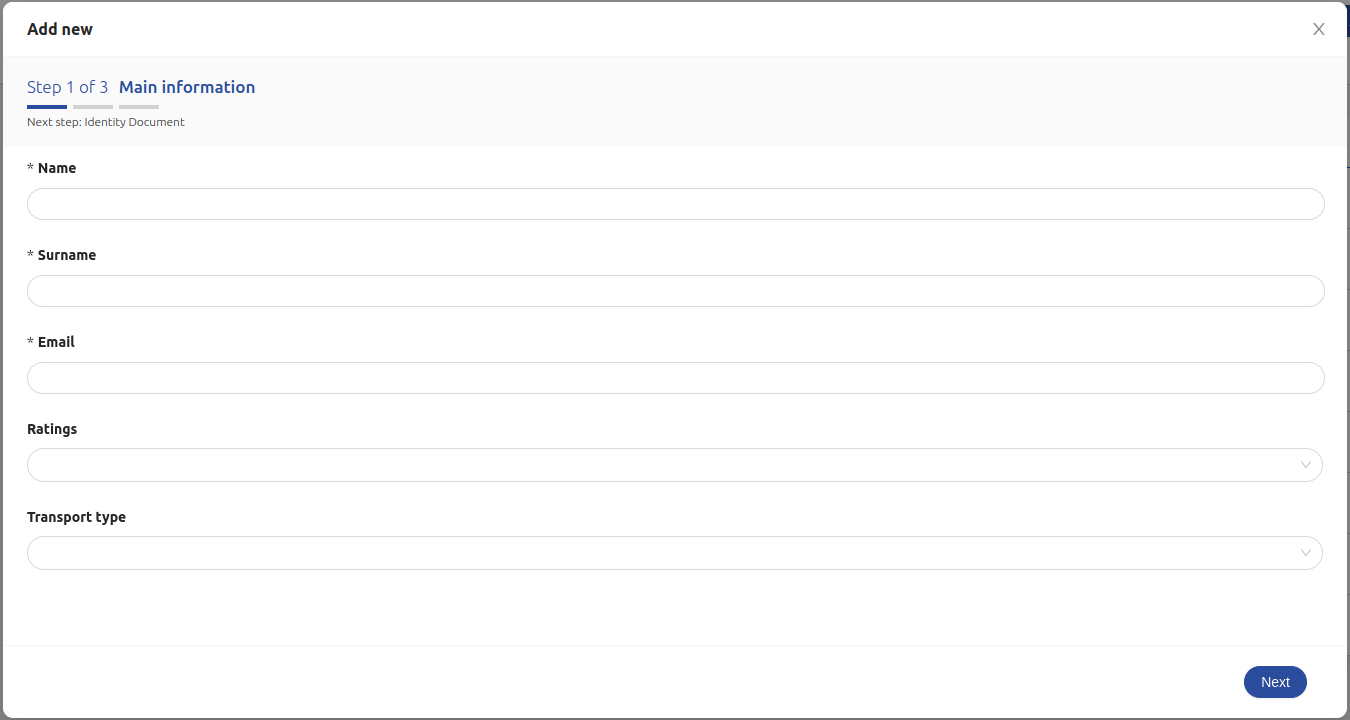
A Form Wizard configured as above results in a wizard with three steps.
- the first step displays a form with fields "id", "__STATE_", "name", "price"
- the second step displays a form with fields "red", "green", "blue"
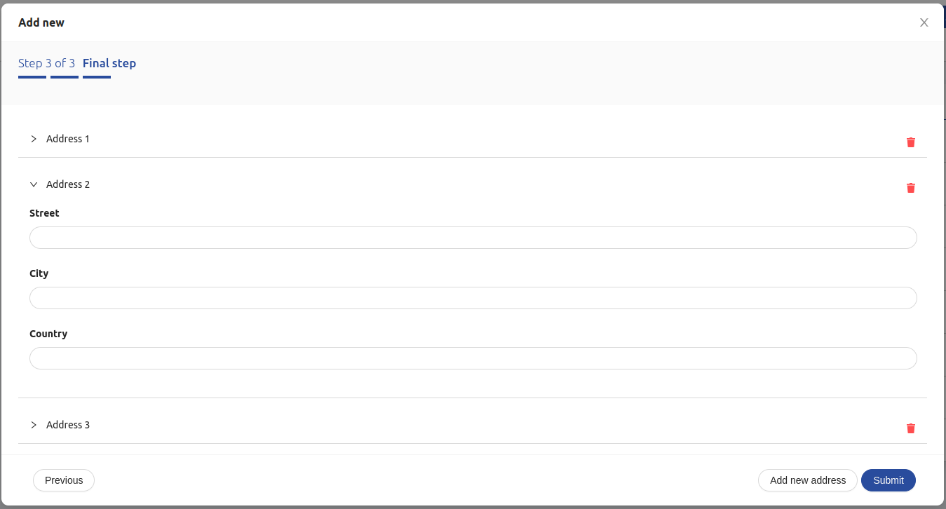
- the third step displays an accordion of forms, each one with fields "shape", "size"
The Form Wizard can be opened in two different modes, just like the Dynamic Form Modal:
- insert: submitting the form signals the need for an item creation. This mode is activated upon listening to an add-new event
- edit: submitting the form signals the need for an item creation. This mode is activated upon listening to an selected-data event
Customize wizard steps
Property wizard allows to configure each step specifying an array of objects with three properties, keys, labels, asForm.
type WizardStepSchema = {
  keys: string[],
  labels: {
    wizardNext?: LocalizedText
    wizardPrevious?: LocalizedText
    wizardAddNew?: LocalizedText
    stepperTitle?: LocalizedText
    stepperSubtitle?: LocalizedText
    accordionHeader?: LocalizedText
    accordionEmptyComponent?: LocalizedText
  }
  asForm?: boolean
}
Each such element maps to a step of the wizard as follows:
| property | description |
|---|---|
keys | fields to display in the step |
labels | localized labels with the text to show |
asForm | whether to visualize nested objects as a form, or nested arrays as an accordion of forms. Step must include one field. Defaults to true. |
If a step meets the following requirements:
- only includes one field
- the field is of type
objectorarrayand has a propertydataSchema asFormis set to true (as per default)
Then the field will be displayed as a form in case of an object field, or as an accordion of forms in case of an array field.
labels are mapped to displayed text as follows:
| key | description |
|---|---|
wizardNext | Button for going to next step |
wizardPrevious | Button for going back to previous step |
wizardAddNew | Button for adding a new element to an array, when displayed as an accordion |
wizardSubmit | Button for submitting the form in the final step |
stepperTitle | Title of the stepper component |
stepperSubtitle | Subtitle of the stepper component |
accordionHeader | Title of the accordion panel. An incremental is automatically added as panels are added to the accordion |
accordionEmptyComponent | Text to display when the accordion is empty |
Dynamic Context
Analogously to the Dynamic Form Modal, several properties of the Wizard Form allow dynamic configurations.
By default, such properties are parsed with handlebars, injecting the current state of the whole wizard as context through key values, and the state of the current step through key step, as well as other information.
{
  values: Record<string, any> // aggregated values of all steps
  step: Record<string, any> // values of current step
  currentUser: Record<string, any> // information on currently logged user, if available
}
After Submission
The Form Wizard supports properties onSuccess and onFail, that allow to append extra tasks to be executed after the successful or unsuccessful submission of the wizard, just like the Dynamic Form Modal.
Extra context key step is available in context injected into onSuccess and onFail actions:
{
  currentUser: Record<string, any>
  values: Record<string, any>
  step: Record<string, any>
  response: Record<string, any>
}
where step is the state of the form of the current step, values is the aggregated values of all steps, response contains an object representation of the content of the payload of the success event linked to the submission request.
Footer Buttons
By deafult, the footer of the modal rendered by Form Wizard includes the following buttons:
- two buttons for navigating through the wizard steps,
- a button to add a new form to an accordion of forms, in case the current step includes a single field of type array of objects,
- in case the current step is the last step of the wizard, a submit button. This can be used for signaling the need to add or edit an item in CRUD collection, depending on the operating mode.
Extra buttons
Other than the default buttons included in the modal footer, extra buttons can be specified to be included in the modal footer, using property actions, just like the Dynamic Form Modal.
Extra buttons are added to the footer of the modal for each step of the wizard.
Omitting submit button
It is possible to omit the default submission button by setting property omitSubmit to true.
Confirmation dialog on save and on close
It is possible to ask for confirmation on close and/or on save, and also customize the confirmation dialog texts.
This is achieved with property requireConfirm, analogously to the Dynamic Form Modal.
Integrate custom labels
Just like the Dynamic Form Modal, custom labels can be specified as localized text, controlling copies within the Form Wizard. Additionally, extra custom labels can be specified for each wizard step.
Working with Views
Analogously to the Dynamic Form Modal, the Wizard Form is designed to be able to interact with Mia-Platform CRUD Service views.
Conditional Fields
Properties conditionalOptions and conditionalValues can be used to set-up custom form behavior that is conditional to the current state of the wizard, just like for the Dynamic Form Modal.
Locale
The texts of the Form Wizard can be customized through the property customLocale, which accepts an object shaped like the following:
type Locale = {
  create: {
    title: LocalizedText
    ctaLabel: LocalizedText
    unsavedChangesContent: LocalizedText
    saveChangesContent: LocalizedText
    wizardNext?: LocalizedText
    wizardPrevious?: LocalizedText
    wizardAddNew?: LocalizedText
    stepperTitle?: LocalizedText
    stepperSubtitle?: LocalizedText
    accordionHeader?: LocalizedText
    accordionEmptyLabel?: LocalizedText
  }
  update: {
    title: LocalizedText
    ctaLabel: LocalizedText
    unsavedChangesContent: LocalizedText
    saveChangesContent: LocalizedText
    wizardNext?: LocalizedText
    wizardPrevious?: LocalizedText
    wizardAddNew?: LocalizedText
    stepperTitle?: LocalizedText
    stepperSubtitle?: LocalizedText
    accordionHeader?: LocalizedText
    accordionEmptyLabel?: LocalizedText
  },
  form: {
    validationMessages:{
      default: LocalizedText,
      required: LocalizedText,
      enum: LocalizedText,
      whitespace: LocalizedText,
      date:{
        format: LocalizedText,
        parse: LocalizedText,
        invalid: LocalizedText
      },
      types:{
        string: LocalizedText,
        method: LocalizedText,
        array: LocalizedText,
        object: LocalizedText,
        number: LocalizedText,
        date: LocalizedText,
        boolean: LocalizedText,
        integer: LocalizedText,
        float: LocalizedText,
        regexp: LocalizedText,
        email: LocalizedText,
        url: LocalizedText,
        hex: LocalizedText,
        file: LocalizedText
      },
      string:{
        len: LocalizedText,
        min: LocalizedText,
        max: LocalizedText,
        range: LocalizedText
      },
      number:{
        len: LocalizedText,
        min: LocalizedText,
        max: LocalizedText,
        range: LocalizedText
      },
      array:{
        len: LocalizedText,
        min: LocalizedText,
        max: LocalizedText,
        range: LocalizedText,
        unique: LocalizedText
      },
      pattern:{
        mismatch: LocalizedText
      }
    },
    datePicker: {
      lang: {
        locale: LocalizedText,
        placeholder: LocalizedText,
        rangePlaceholder: {
          start: LocalizedText,
          stop: LocalizedText
        },
        today: LocalizedText,
        now: LocalizedText,
        backToToday: LocalizedText,
        ok: LocalizedText,
        clear: LocalizedText,
        month: LocalizedText,
        year: LocalizedText,
        timeSelect: LocalizedText,
        dateSelect: LocalizedText,
        monthSelect: LocalizedText,
        yearSelect: LocalizedText,
        decadeSelect: LocalizedText,
        monthBeforeYear: 'true' | 'false',
        previousMonth: LocalizedText,
        nextMonth: LocalizedText,
        previousYear: LocalizedText,
        nextYear: LocalizedText,
        previousDecade: LocalizedText,
        nextDecade: LocalizedText,
        previousCentury: LocalizedText,
        nextCentury: LocalizedText
      },
      timePickerLocale:{
        placeholder: LocalizedText
      }
    },
    filePicker:{
      drawerTitle: LocalizedText,
      filePickerTitle: LocalizedText,
      dragAndDropCaption: LocalizedText,
      ctaLabel: LocalizedText
    },
    objectEditor:{
      editorView: LocalizedText,
      tableView: LocalizedText
    },
    editor:{
      editorView: LocalizedText,
      rawView: LocalizedText
    },
    htmlEditor: {
      preview: LocalizedText,
      html: LocalizedText
    },
    geopoint:{
      latitude: LocalizedText,
      longitude: LocalizedText,
      phLatitude: LocalizedText,
      phLongitude: LocalizedText
    },
    element: LocalizedText,
    elements: LocalizedText,
    true: LocalizedText,
    false: LocalizedText
  }
}
where LocalizedText is either a string or an object mapping language acronyms to strings.
Examples
Configuration examples for the Dynamic Form Modal also apply to the Form Wizard.
Example: Default Wizard Steps
A Form Wizard configured like the following:
{
  "tag": "bk-form-wizard",
  "properties": {
    "dataSchema": {
      "type": "object",
      "properties": {
        "_id": {
          "type": "string"
        },
        "__STATE__": {
          "type": "string"
        },
        "name": {
          "type": "string"
        },
        "price": {
          "type": "number"
        },
        "color": {
          "type": "object",
          "dataSchema": {
            "type": "object",
            "properties": {
              "red": {"type": "number"},
              "green": {"type": "number"},
              "blue": {"type": "number"}
            }
          }
        },
        "variants": {
          "type": "array",
          "items": {
            "type": "object",
            "properties": {
              "shape": {"type": "string"},
              "size": {"type": "string"}
            }
          }
        }
      }
    }
  }
}
results in a wizard with three steps.
- the first step displays a form with fields "id", "__STATE_", "name", "price"
- the second step displays a form with fields "red", "green", "blue"
- the third step displays an accordion of forms, each one with fields "shape", "size"
Example: Customize Wizard Steps
A Form Wizard configured like the following:
{
  "tag": "bk-form-wizard",
  "properties": {
    "wizard": [
      {
        "keys": [
          "name",
          "color"
        ],
        "labels": {
          "stepperTitle": {
            "en": "Name & Color",
            "it": "Nome & Colore"
          }
        }
      },
      {
        "keys": [
          "variants"
        ],
        "labels": {
          "stepperSubtitle": {
            "en": "Final step",
            "it": "Ultimo step"
          },
          "wizardAddNew": {
            "en": "Add new variant",
            "it": "Aggiungi nuova variante"
          },
          "accordionHeader": {
            "en": "Variant",
            "it": "Variante"
          }
        }
      }
    ],
    "dataSchema": {
      "type": "object",
      "properties": {
        "name": {
          "type": "string"
        },
        "color": {
          "type": "object",
          "dataSchema": {
            "type": "object",
            "properties": {
              "red": {"type": "number"},
              "green": {"type": "number"},
              "blue": {"type": "number"}
            }
          }
        },
        "variants": {
          "type": "array",
          "items": {
            "type": "object",
            "properties": {
              "shape": {"type": "string"},
              "size": {"type": "string"}
            }
          }
        }
      }
    }
  }
}
results in a wizard with two steps:
- the first step displays a form with fields "name", "color". Note that "color" is not displayed as a separate form, but rather as a default object field - which consists of a text editor
- the second step displays an accordion of forms, each one with fields "shape", "size"
Note that custom labels are specified for both steps.
API
Properties & Attributes
| Property | Attribute | Type | Default | Description |
|---|---|---|---|---|
rootElementSelector | root-element-selector | string | - | Selector to specify where the container should be appended |
dataSchema | - | ExtendedJSONSchema7Definition | - | Data schema describing the fields of the collection to filter |
wizard | - | WizardStepSchema | - | Array of options for setting up the wizard steps. A default wizard is utilized is not specified |
width | - | string | number | - | Width of the modal |
height | - | string | number | - | Height of the modal |
omitSubmit | omit-submit | boolean | false | Whether or not to include the default submit button |
actions | - | ButtonWithClose[] | {insert: ButtonWithClose[]; select: ButtonWithClose[]} | - | Actions added as buttons to the footer |
liveSearchItemsLimit | live-search-items-limit | number | 10 | Max items to fetch on regex live search |
customLabels | - | CustomLabels | {insert: CustomLabels, update: CustomLabels} | - | Custom localized texts shown as title and CTA button label |
requireConfirm | - | boolean | RequireConfirmOpts | {onSave: RequireConfirmOpts, onSave: RequireConfirmOpts} | false | Whether or not the component should request confirmation before closing and/or before saving |
onSuccess | - | Action[] | {insert: Action[], update: Action[]} | - | Action executed after successful submit |
onFail | - | Action[] | {insert: Action[], update: Action[]} | - | Action executed after failing submit |
lookupQueries | - | LookupQueries | - | Extra queries when fetching options for lookup fields in views |
conditionalOptions | - | ConditionalOption[] | - | Allows specifying dynamic conditions for form-options (hidden / disabled / readonly) to be applied |
conditionalValues | - | Condition[] | - | Allows specifying dynamic conditions for resetting field |
fileFieldsPreview | file-fields-preview | boolean | - | Enables preview of uploaded files in drag-n-drop file fields |
enableSubmitOnFormUntouched | enable-submit-on-form-untouched | boolean | - | Allows submitting an unedited form |
basePath | - | string | - | The URL base path to which to send HTTP requests, used when fetching options for lookup field in views |
ButtonWithClose
type ButtonWithClose = Partial<BkButton> & {
  closeAfter?: boolean
}
where BkButton references the properties of the Button component.
RequireConfirmOpts
type RequireConfirmOpts = boolean | {
  cancelText?: LocalizedText
  okText?: LocalizedText
  content?: LocalizedText
  title?: LocalizedText
}
where LocalizedText is either a string or an object mapping language acronyms to strings.
CustomLabels
type CustomLabels = {
  title?: LocalizedText
  ctaLabel?: LocalizedText
  saveChangesContent?: LocalizedText
  unsavedChangesContent?: LocalizedText
}
where LocalizedText is either a string or an object mapping language acronyms to strings.
LookupQueries
type LookupQueries = {
  [property: string]: Record<string, unknown> | Record<string, unknown>[]
}
ConditionalOption
type ConditionalOption = {
  property: string
  query: Record<string, unknown>
  option: RHDOptions
}

type RHDOptions = {
    hidden?: boolean;
    hiddenOnUpdate?: boolean;
    hiddenOnInsert?: boolean;
  } & {
    readOnly?: boolean;
    readOnlyOnUpdate?: boolean;
    readOnlyOnInsert?: boolean;
  } & {
    disabled?: boolean;
    disabledOnUpdate?: boolean;
    disabledOnInsert?: boolean;
  }
Condition
type Condition = {
  property: string
  query: Record<string, unknown>
}
Listens to
| event | action |
|---|---|
| add-new | opens the modal to create a new item, potentially applying default fields from data schema or data provided in the payload of the event |
| selected-data | opens the modal to edit a selected item, filling in its fields from the data provided in the payload of the event |
| nested-navigation-state/push | updates internal representation of the current navigation path by adding one step. The wizard is disabled if the user navigated inside a nested field, and renders a single form with fields of the visualized nested object. |
| nested-navigation-state/back | updates internal representation of the current navigation path by removing the specified number of steps. The wizard is disabled if the user navigated inside a nested field, and renders a single form with fields of the visualized nested object. |
| nested-navigation-state/display | updates internal representation of the current navigation and closes the modal. The wizard is disabled if the user navigated inside a nested field, and renders a single form with fields of the visualized nested object. |
| success | notifies correct data update as a result of form submission. Payload holds the response of the associated HTTP call and is accessible by action in onSuccess property via response keyword. |
| error | notifies that something went wrong during form submission. Payload holds the response of the associated HTTP call and is accessible by action in onFail property via response keyword. |
Emits
| event | description |
|---|---|
| configurable event | properties such as onFail, onSuccess or actions allow to emit custom events |
| require-confirm | triggered when trying to close the modal with unsaved data. requireConfirm property allows to customize this behavior |
| create-data | requests data creation |
| update-data | requests data update |
| create-data-with-file | requests data creation and file upload |
| update-data-with-file | requests data update and file upload |