Compose pages
The pages of type compose can be configured in a dedicated section accessible via edit page option in pages context menu.
You can refer the micro-lc documentation on how to properly configure a compose page.
Templates
Compose pages can be created starting from a template, which is a pre-defined configuration carring a set of components.
To learn how to use your own custom templates, read the dedicated documentation.
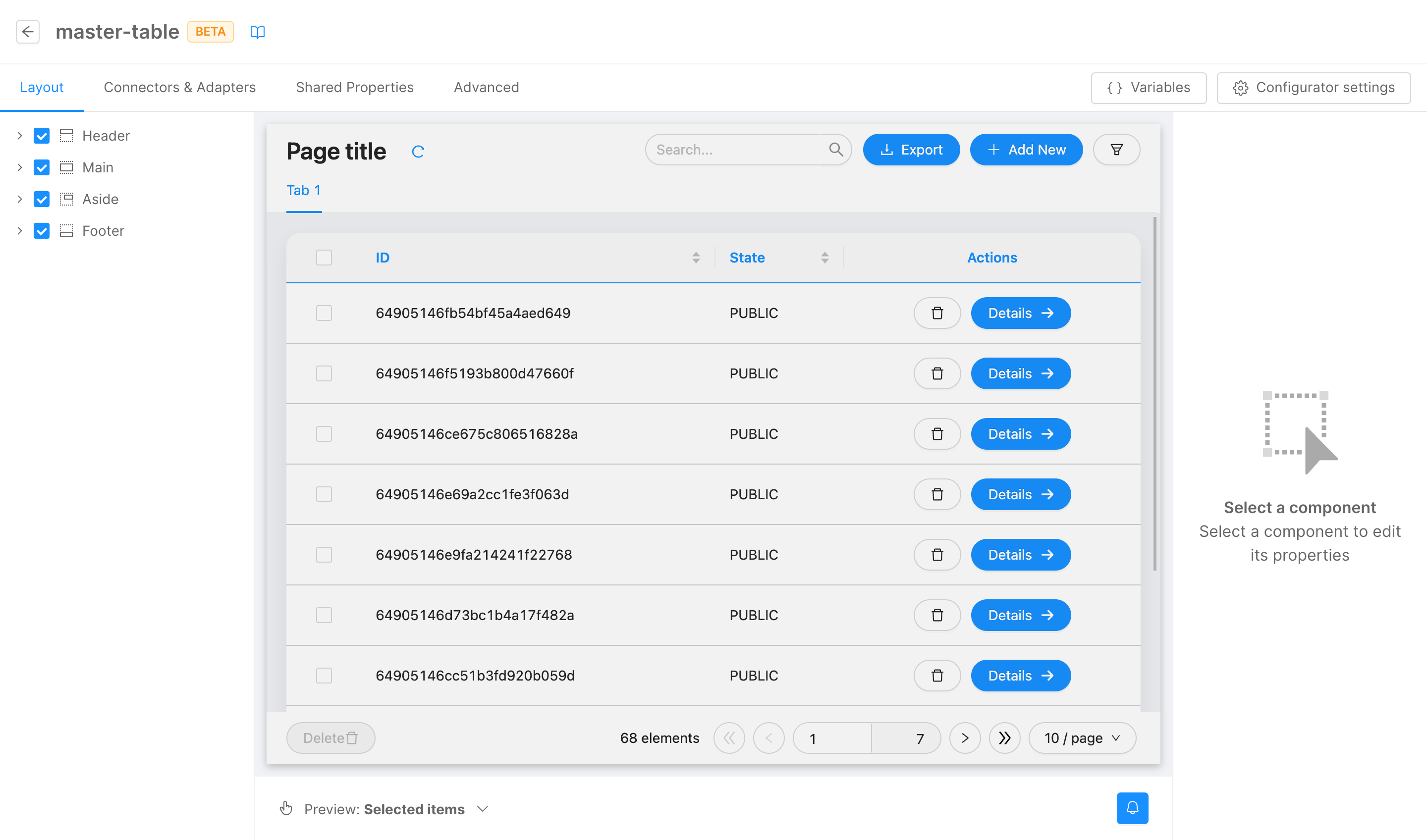
Table: base table
A page built to display an array of data with a tabular view. It provides filtering, exporting, pagination, creation, and editing functionalities.
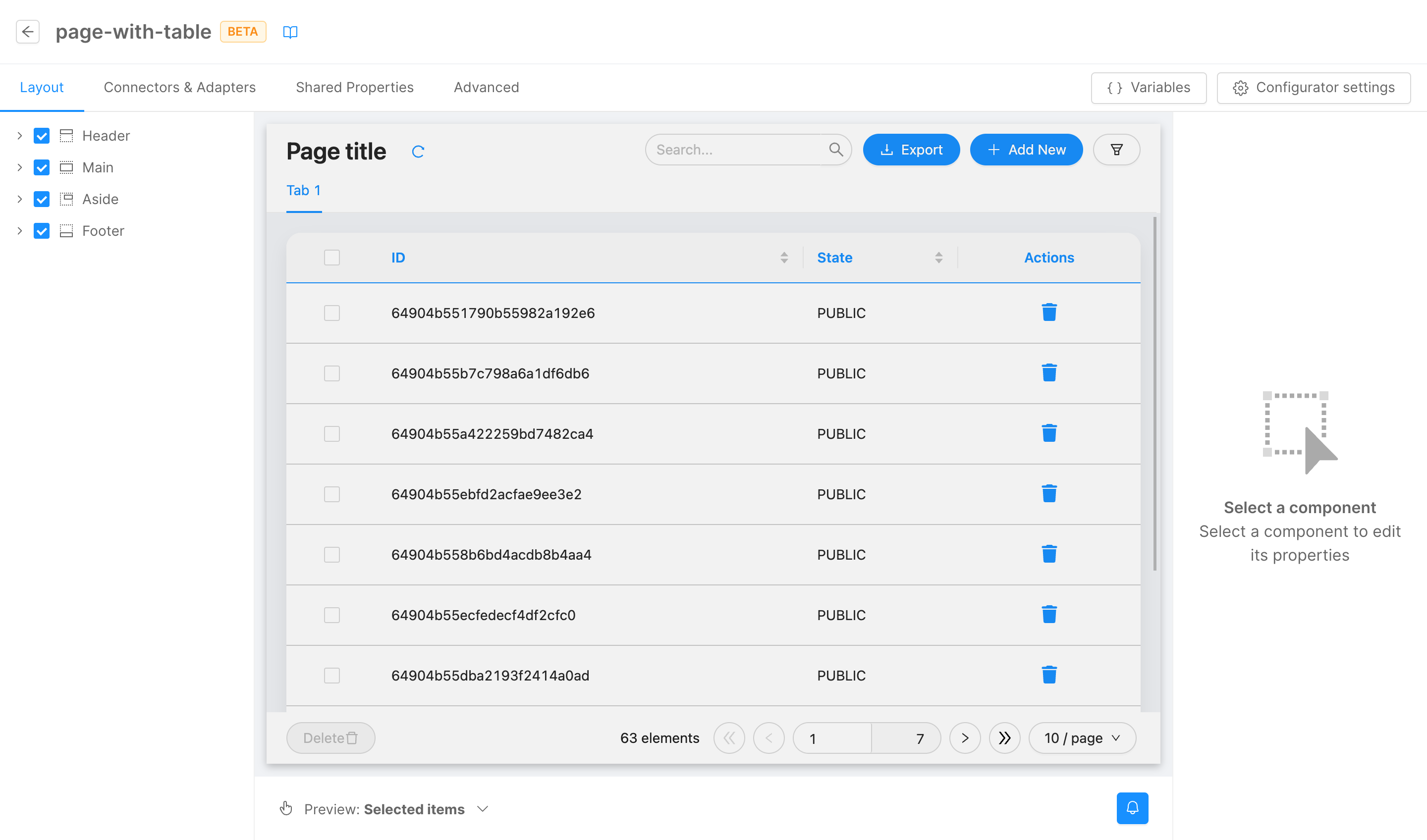
The template should be linked to a data source implementing a CRUD service-compatible interface configuring the base path property of CURD client and CRUD export components in Connectors & Adapters section.
Data shape is defined by dataSchema shared property, that can be edited in a no-code fashion from the dedicated section.
Table: table with file field
A page built to display an array of data carring file fields with a tabular view. Besides filtering, exporting, pagination, creation, and editing functionalities, it provides a way to upload and download files.
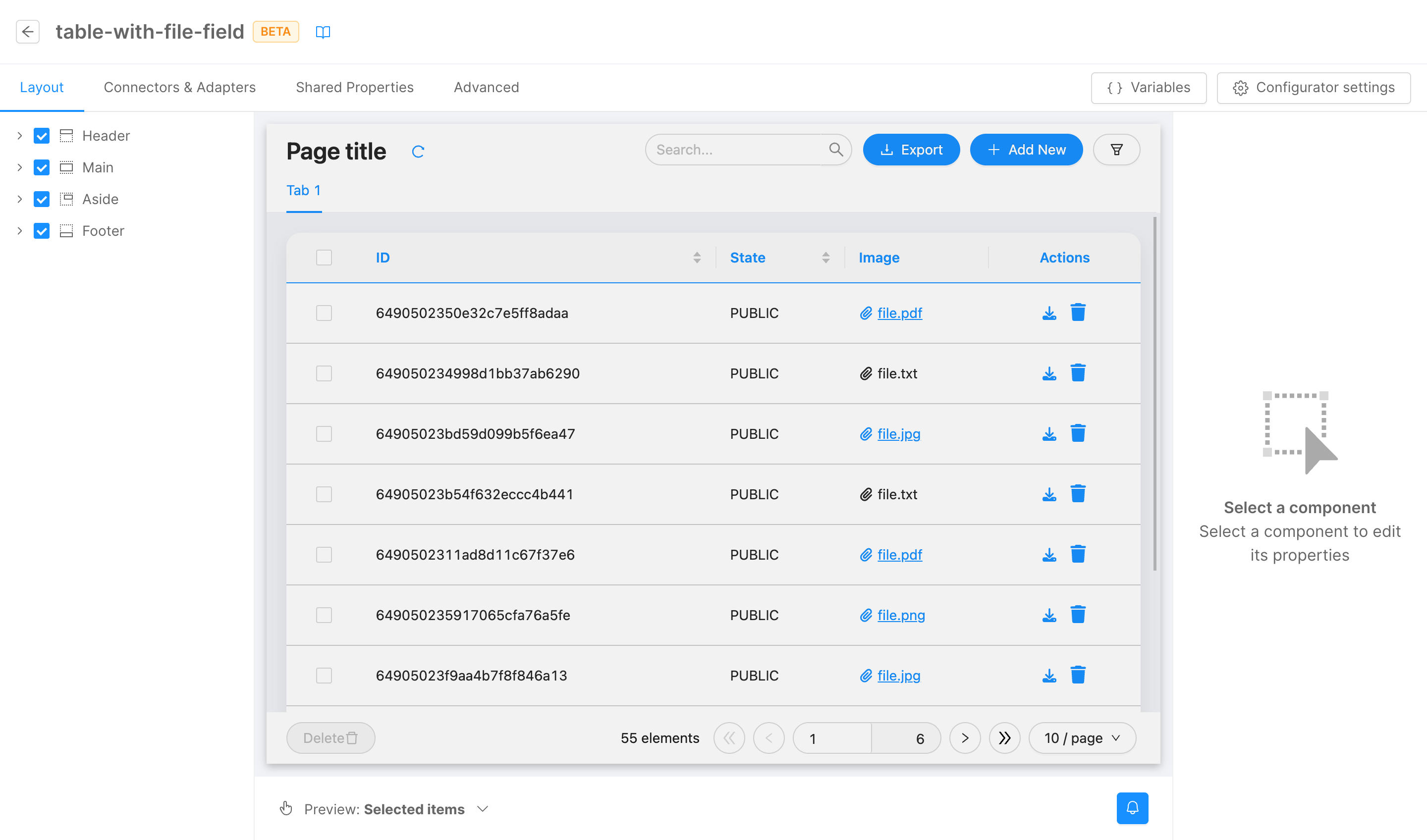
The template should be linked to a data source implementing a CRUD service-compatible interface configuring the base path property of CURD client and CRUD export components in Connectors & Adapters section. Moreover, page should be linked to a files service instance thought the base path property of File service client component in Connectors & Adapters section.
Data shape is defined by dataSchema shared property, that can be edited in a no-code fashion from the dedicated section.
Table: read-only table with nested fields
A page built to display an array of data with a tabular view. Data are read-only and can't be edited or created but they can be filtered and paginated. Moreover, it is already configured to view nested fields.
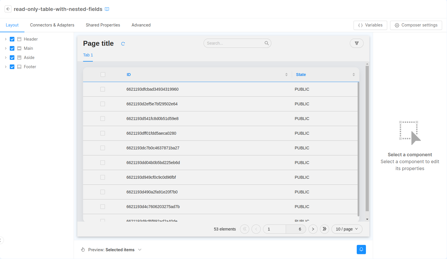
The template should be linked to a data source implementing a CRUD service-compatible interface configuring the base path property of CURD client in Connectors & Adapters section.
Data shape is defined by dataSchema shared property, that can be edited in a no-code fashion from the dedicated section.
Table: base table with navigation button
A table page built to be connected with another page that provides further details on the data.
The page should be connected to a data source just like a base table, and to the correct details page configuring the table customActions property.
Show info/details page
A page built to display a detailed view of data (e.g., a single row of a table) through card components.
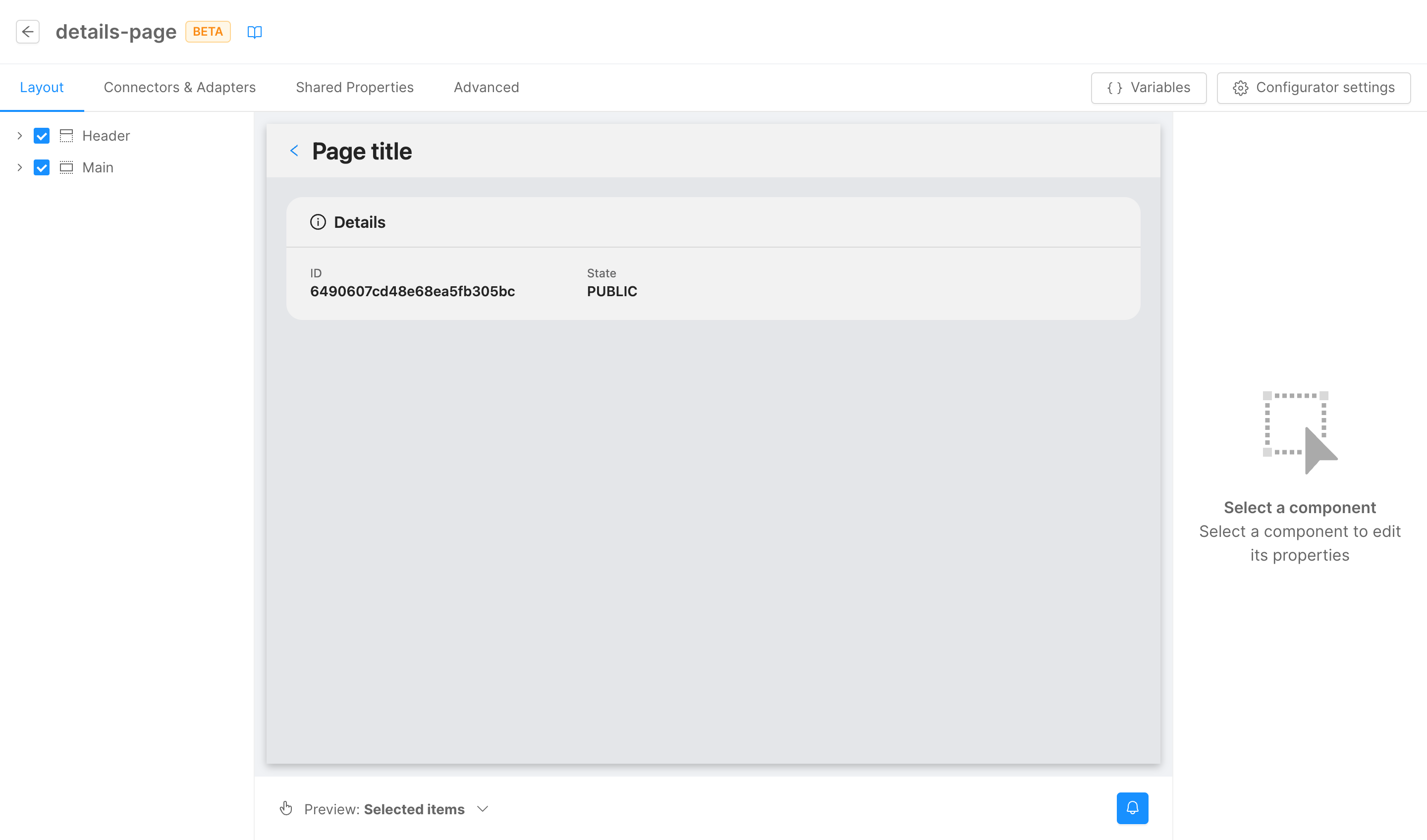
The template should be linked to a data source implementing a CRUD service-compatible interface configuring the base path property of CURD client component in Connectors & Adapters section. Moreover, URL mask property of URL parameters adapter component in Connectors & Adapters should be properly configured to query data correctly.
Data shape is defined by dataSchema shared property, that can be edited in a no-code fashion from the dedicated section.
Calendar view
A page built to visualize data on a calendar. It provides filtering, exporting, pagination, creation, and editing functionalities.
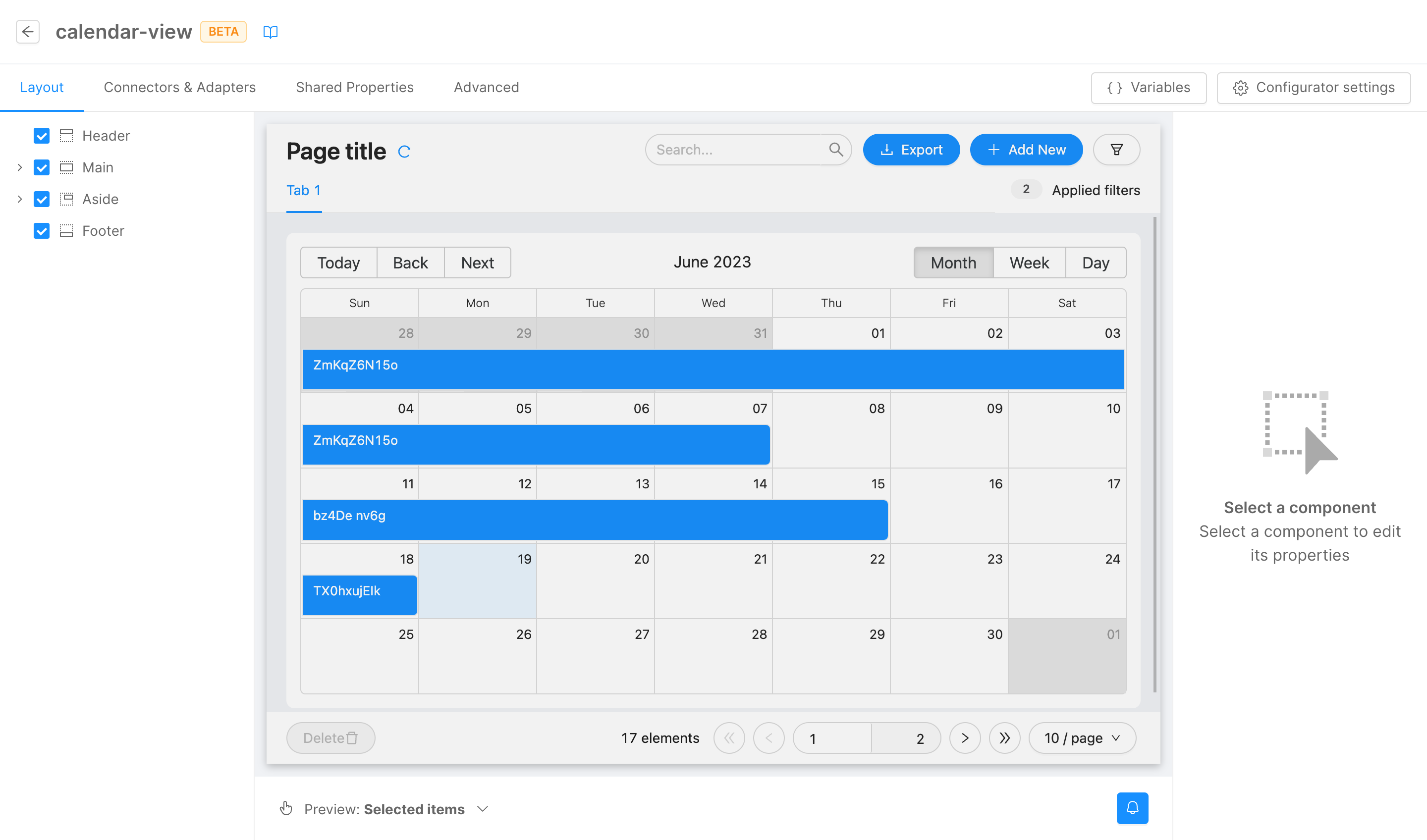
The template should be linked to a data source implementing a CRUD service-compatible interface configuring the base path property of CURD client and CRUD export components in Connectors & Adapters section.
Data shape is defined by dataSchema shared property, that can be edited in a no-code fashion from the dedicated section. Pre-configured schema already has the required fields by the calendar component.
Picture gallery
A page built to visualize image files through a gallery view. Besides filtering, exporting, pagination, creation, and editing functionalities, it provides a way to upload and download files.
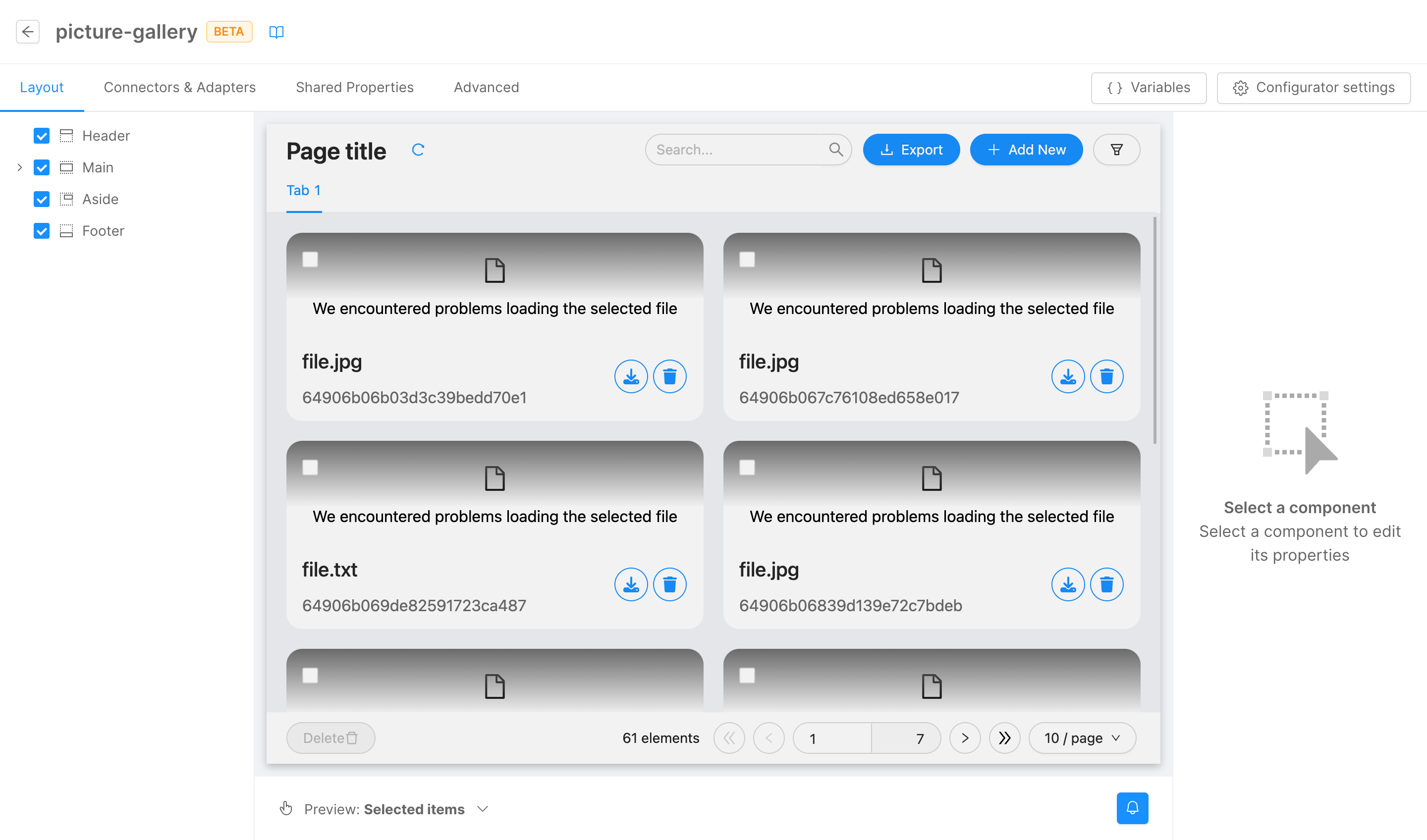
The template should be linked to a data source implementing a CRUD service-compatible interface configuring the base path property of CURD client and CRUD export components in Connectors & Adapters section. Moreover, page should be linked to a files service instance thought the base path property of File service client component in Connectors & Adapters section.
Data shape is defined by dataSchema shared property, that can be edited in a no-code fashion from the dedicated section.
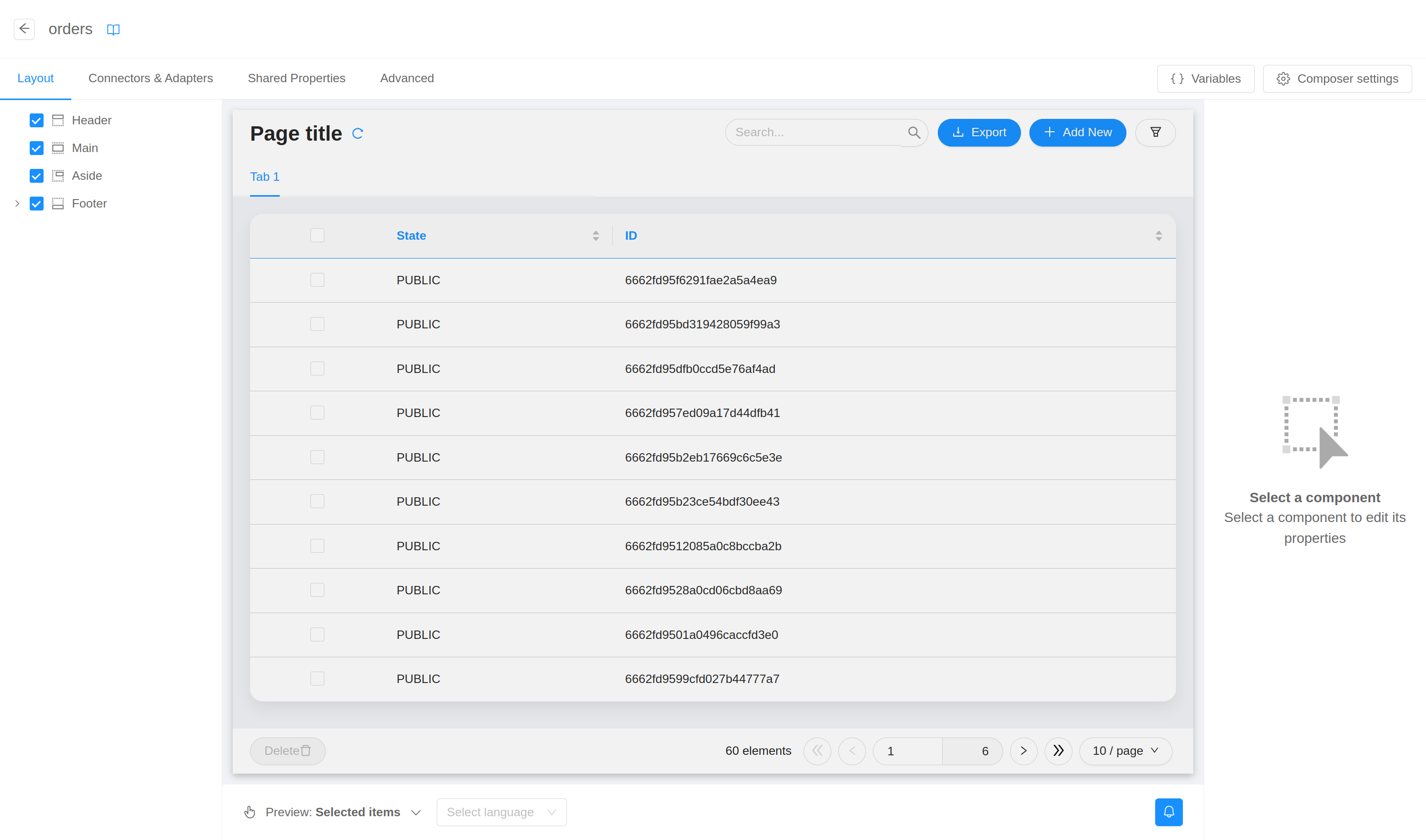
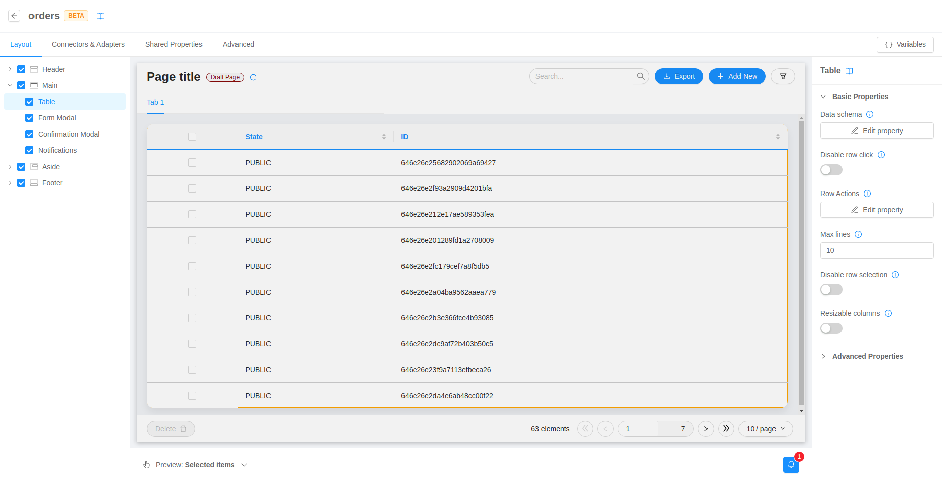
Layout
From the first tab you can configure in a no-code fashion the components that renders something on the page (as opposed to the merely logical components configurable in the connectors & adapters tab).
This section works just as the layout tab: the left menu allows viewing, selecting, and hiding the custom components composing the page, the live central preview shows how the final page will look like, and from the right menu components properties can be consulted and edited.
For more technical insights, visit the Layout section where all the behaviors are explained in deep.
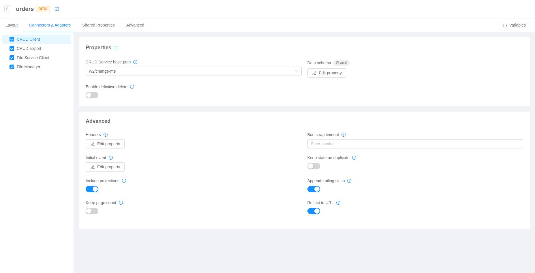
Connectors & Adapters
The second tab is equivalent to the first in terms of functionalities. However, it will show only logical components (i.e., components that do not render anything). For this reason, no live preview will be shown.
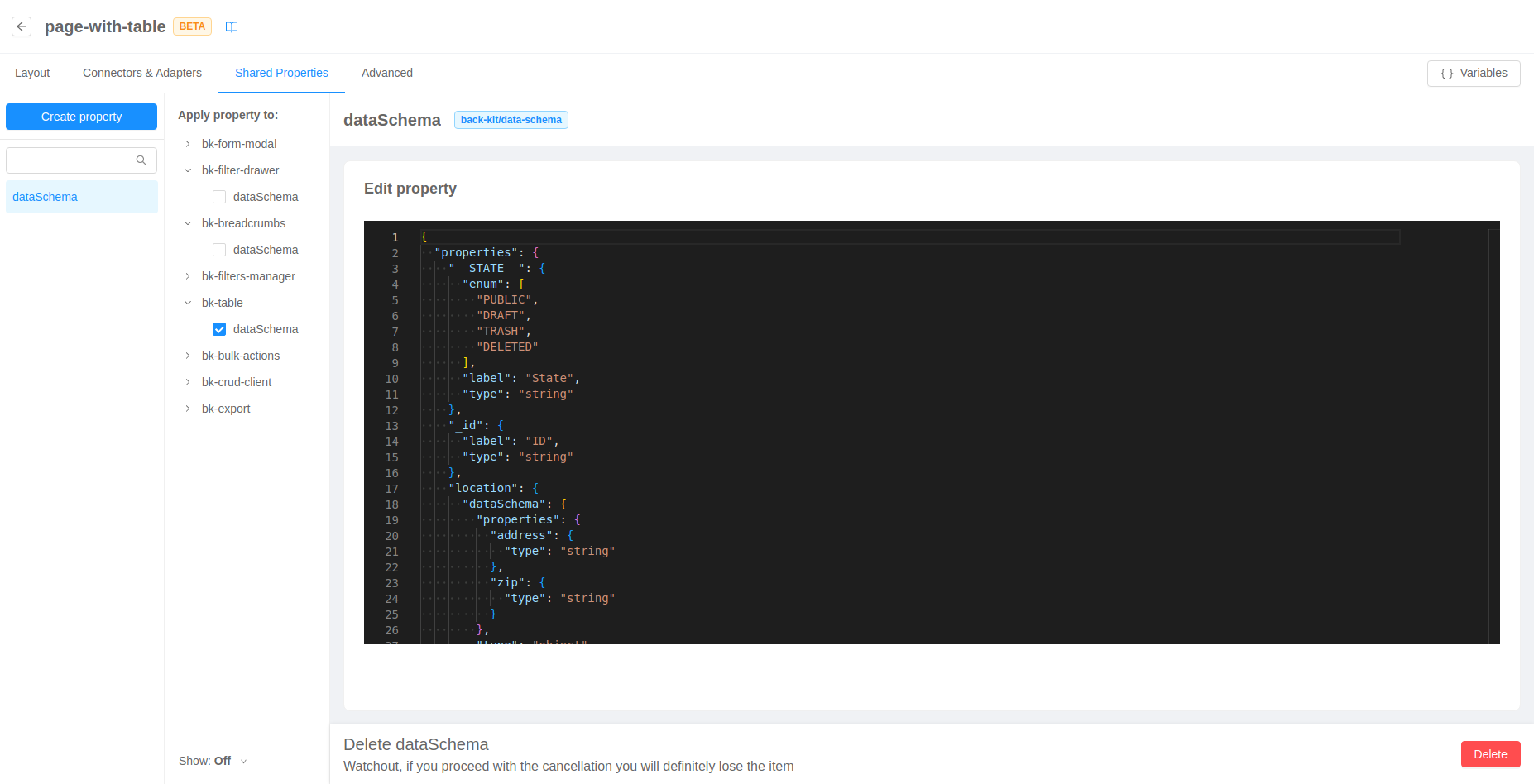
Shared Properties
The third tab allows the user to define custom reusable properties and assign their value to different properties of components on the page. This is useful to centralize important values that can be shared across components and editing them in one place.
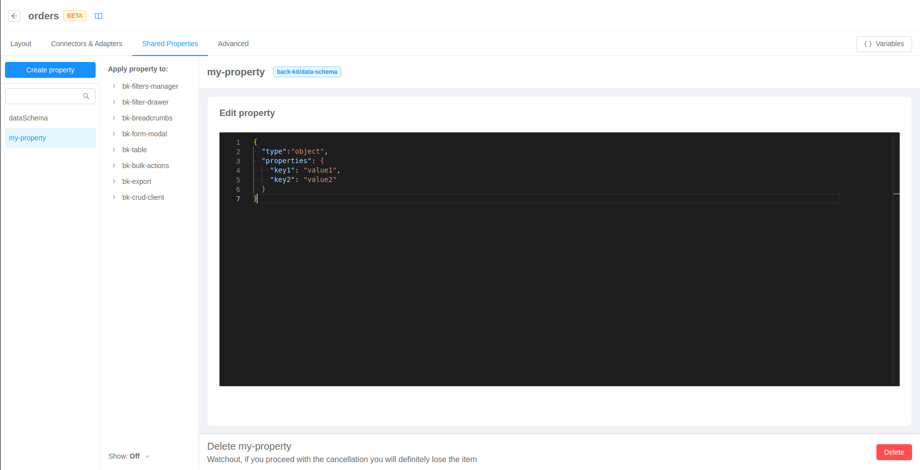
Create and assign shared properties
In order to create a new Shared Property, it is necessary to click on the "Create property" button and fill out the form by assigning a name and a type to the property (if no type is available in the dropdown, it means that no component in the page expects a shared property).
When choosing the name of your new shared property, you can also select any definition that does not have a type assigned. This may be useful for example if you create a definition from the Advanced section and later you want to start editing it in a no-code fashion.
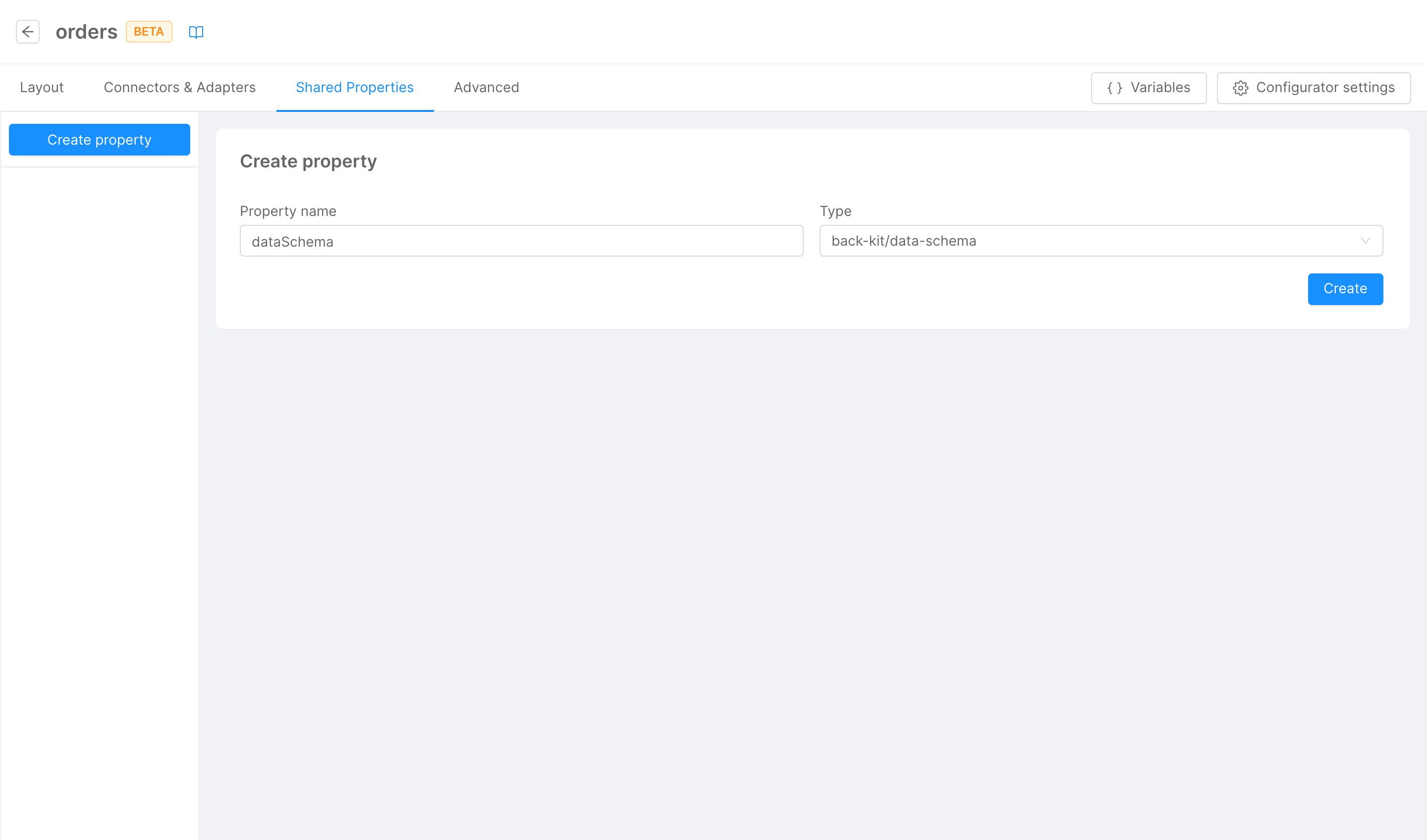
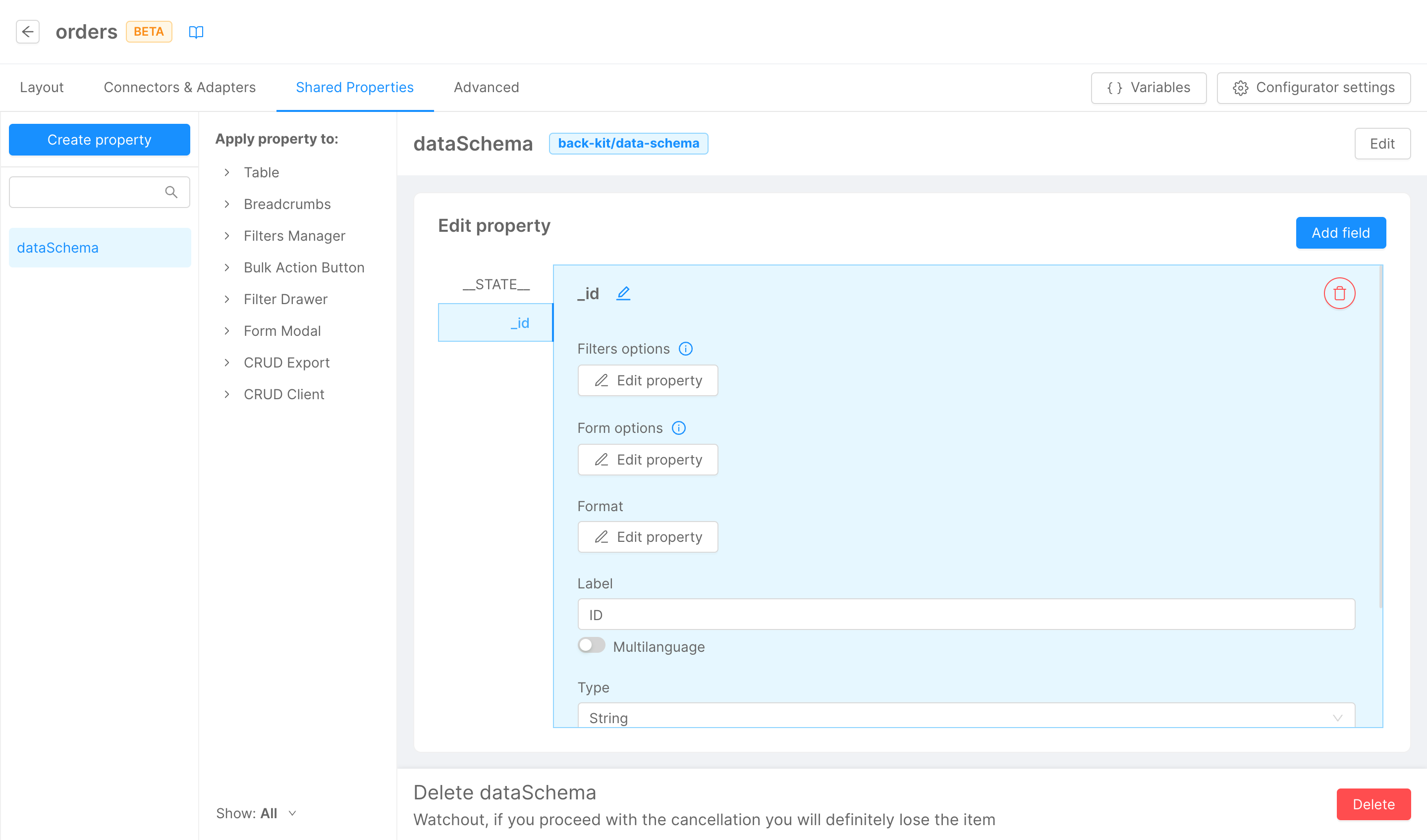
Once that the property has been created, it will be visible in the left side menu. It is possible to assign it to a property of a component in page by selecting it and flagging the checkbox of the relative property.
Alternatively, it is possible to assign a Shared Property to a component property directly in the Component properties editor
Well-known shared properties
Some shared property types are well known by the Configurator, and a no-code editor is available for them.
Back Kit data schema
Properties of type back-kit/data-schema are a core concept of the back-kit web-components library
and can be configured through a graphical interface.
You can add new fields to the schema, choose and edit their name, and set some relevant properties for each of them.
Moreover, data schemas can be automatically generated from CRUD collections. This can be done in specific components that are responsible for CRUD communication (e.g., Curd Client component), with the Generate Schema button.
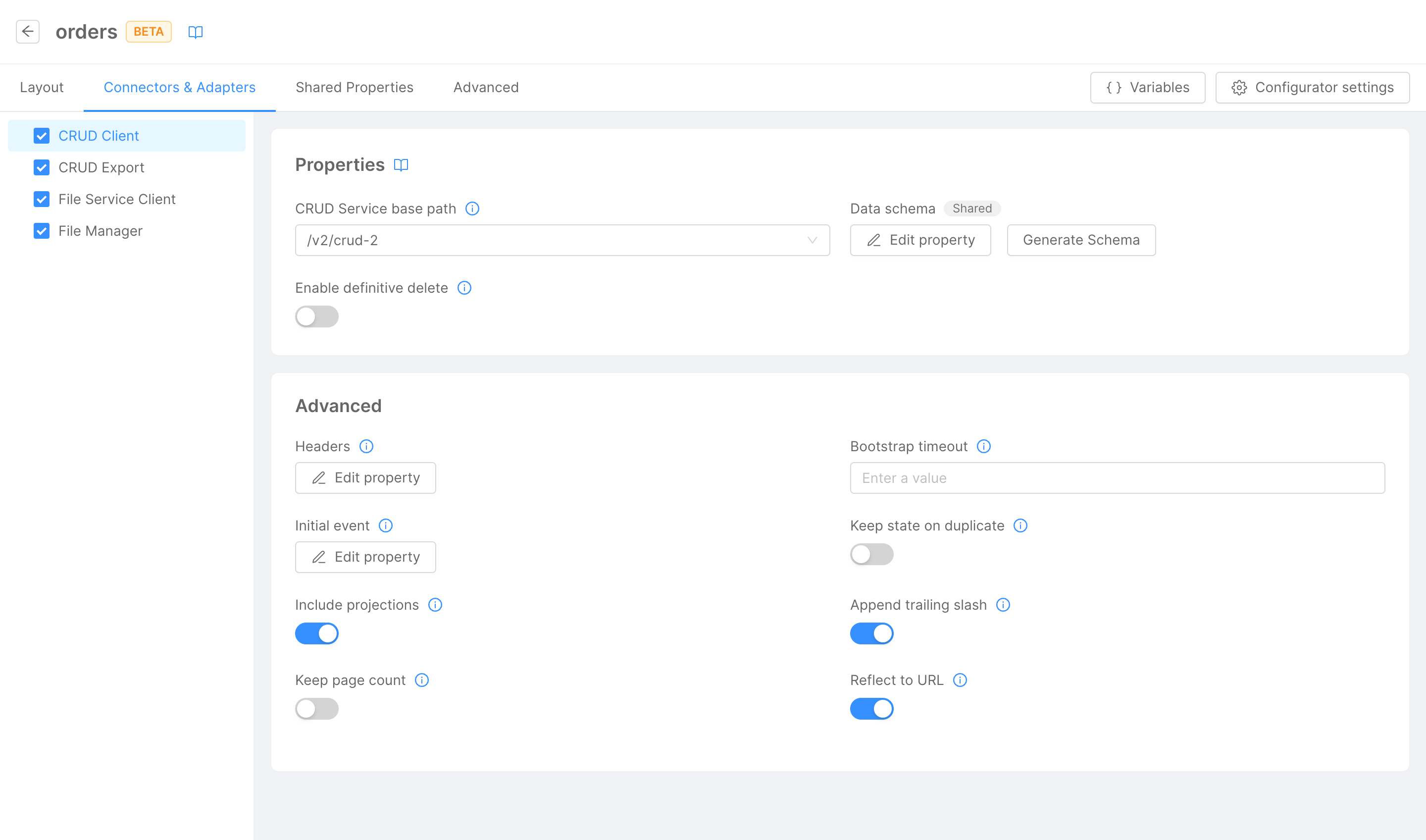
If the component does not have a value for its data schema property, the automatic generation process will create a new shared property, and will assign it to the component. If the component already references a shared property in its data schema property, the shared will be updated.
If the component already references a shared, the generation process will completely overwrite the value of the shared property (this includes any additional field you may have added to the previous data schema).
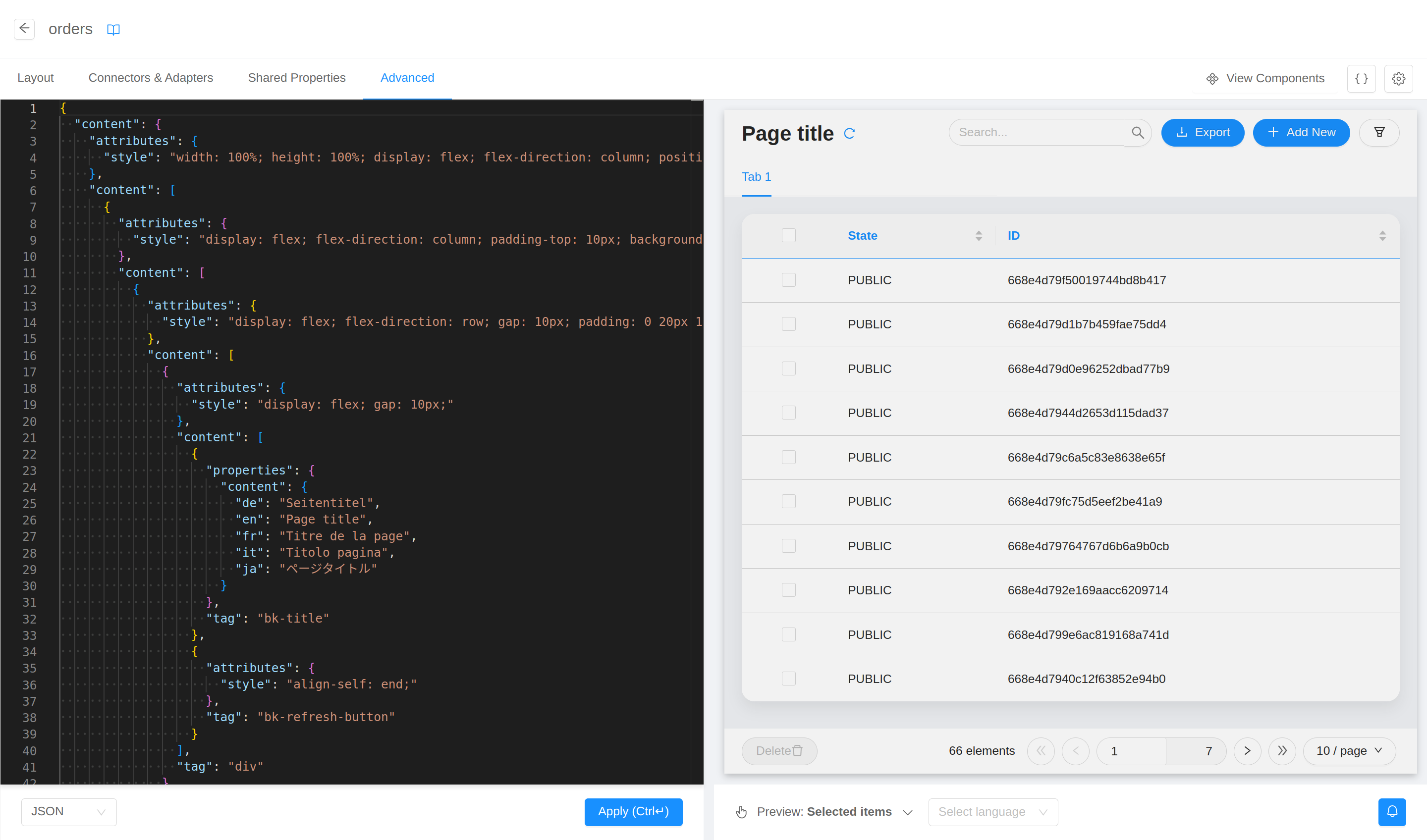
Advanced
The fourth and last tab works like the advanced tab of the structure section: the whole configuration of the page can be edited from a code editor with a live preview on the right.