Timeline
The Timeline Viewer Plugin is a generic frontend available on the Marketplace, which can be used to visualize data on a timeline.

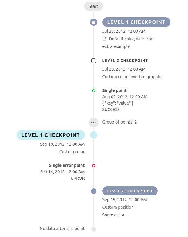
The plugin will show several checkpoints, sorted by ascending time order.

Moreover, it's possible to search the checkpoints over a field, using the search input.

Setup
The timeline viewer plugin is served over the / GET endpoint. Additional parameters needs to be attached over the /#/ fragment identifier.
The timeline can be embedded into the microfrontend-composer as an iFrame.
Resources
This plugin requires that the checkpoints displayed has to be exposed on a dedicated micro-service over the endpoint /:resource/json, where :resource is the name of the data set that will be rendered by the timeline.
It's strongly suggested to use as data-set a CRUD collection, since it can enable the live-search feature.
The checkpoints returned by the micro-service have to comply to the following JSON Schema, which is used by the visualization to display data.
Timeline JSON Schema
{
    "type": "array",
    "items": {"$ref": "#/definitions/node"},
    "required": ["items"],
    "definitions": {
        "node": {
           "oneOf": [
                {"$ref": "#/definitions/point"},
                {"$ref": "#/definitions/checkpoint"},
                {"$ref": "#/definitions/separator"}
            ]
        },
        "checkpoint": {
            "type": "object",
            "properties": {
                "type": {"type": "string", "enum": ["checkpoint"]},
                "level": {
                    "type": "number",
                    "multipleOf": 1.0,
                    "minimum": 1,
                    "maximum": 2,
                    "default": 1
                },
                "style": { "$ref": "#/definitions/checkpointStyle" },
                "data": {
                    "type": "object",
                    "properties": {
                        "name": {"type": "string"},
                        "detail": { "$ref": "#/definitions/dataPoint"}
                    },
                    "additionalProperties": false,
                    "required": ["name"]
                }
            },
            "required": ["type", "data"]
        },
        "point": {
            "type": "object",
            "properties": {
                "type": {"type": "string", "enum": ["point"]},
                "data": {"$ref": "#/definitions/dataPoint"}
            },
            "required": ["type", "data"]
        },
        "separator": {
            "type": "object",
            "properties": {
                "type": {"type": "string", "enum": ["separator"]},
                "data": {
                    "type": "object",
                    "properties": {
                        "name": {"type": "string"},
                        "description": {"type": "string"}
                    },
                    "additionalProperties": false,
                    "required": ["name"]
                }
            },
            "required": ["type", "data"]
        },
        "checkpointStyle": {
            "type": "object",
            "properties": {
                "primaryColor": { "type": "string" },
                "inverted": { "type": "boolean" },
                "icon": { "type": "string" },
                "iconInDescription": { "type": "boolean" },
                "position": {
                    "type": "string" ,
                    "enum": ["left", "right"]
                }
            },
            "additionalProperties": false,
        },
        "dataPoint": {
            "type": "object",
            "properties": {
                "group": {
                    "type": "object",
                    "properties": {
                        "id": {"type": "string"},
                        "description": {"type": "string"}
                    },
                    "required": ["id"]
                },
                "description": {"type": "string"},
                "date": {"type": "string"},
                "status": {
                    "type": "string",
                    "enum":["default", "success", "error", "info", "warn"],
                    "default": "default"
                },
                "extra": {
                    "type": "array",
                    "items": {
                        "type": "string"
                    },
                    "default": []
                }
            },
            "additionalProperties": false,
            "required": ["date"]
        }
    }
}
Timeline JSON Example
The result shown in the picture at the top of this page can be obtained by computing the following array:
[
    {
      "type": "checkpoint",
      "style": {
        "icon": "shopping",
        "iconInDescription": true
      },
      "data": {
        "name": "Level 1 checkpoint",
        "detail": {
          "description": "Default color, with icon",
          "date": new Date("25 July 2012").toISOString(),
          "extra": ["extra example"],
          "status": "success"
        }
      }
    },
    {
      "type": "checkpoint",
      "level": 2,
      "style": {
        "primaryColor": "#41434b",
        "inverted": true
      },
      "data": {
        "name": "Level 2 checkpoint",
        "detail": {
          "description": "Custom color, inverted graphic",
          "date": new Date("28 July 2012").toISOString(),
          "extra": [],
          "status": "success"
        }
      }
    },
    {
      "type": "point",
      "data": {
        "description": "Single point",
        "date": new Date("02 August 2012").toISOString(),
        "extra": ["{ "key": "value" }"],
        "status": "success"
      }
    },
    {
      "type": "point",
      "data": {
        "group": {
          "id": "1234",
          "description": "Group of points"
        },
        "description": "Collapsed, error point",
        "date": new Date("25 August 2012").toISOString(),
        "extra": [],
        "status": "error"
      }
    },
    {
      "type": "point",
      "data": {
        "group": {
          "id": "1234",
          "description": "Group of points"
        },
        "description": "Collapsed, success point",
        "date": new Date("26 August 2012").toISOString(),
        "extra": ["FOO", "BAR"],
        "status": "success"
      }
    },
    {
      "type": "checkpoint",
      "level": 1,
      "style": {
        "primaryColor": "#d0f0f5"
      },
      "data": {
        "name": "Level 1 checkpoint",
        "detail": {
          "description": "Custom color",
          "date": new Date("10 September 2012").toISOString(),
          "extra": [],
          "status": "error"
        }
      }
    },
    {
      "type": "point",
      "data": {
        "description": "Single error point",
        "date": new Date("14 September 2012").toISOString(),
        "extra": [],
        "status": "error"
      }
    },
    {
      "type": "checkpoint",
      "level": 2,
      "style": {
        "position": "right"
      },
      "data": {
        "name": "Level 2 checkpoint",
        "detail": {
          "description": "Custom position",
          "date": new Date("15 September 2012").toISOString(),
          "extra": ["Some extra"],
          "status": "success"
        }
      }
    }
]
You can obtain timeline resources from existing CRUD collections.
Using Node.js Template you can use the following handler to retrieve data from CRUD collections and convert them to timeline data.
'use strict'
const customService = require('@mia-platform/custom-plugin-lib')()

module.exports = customService(async function index(service) {
  service.addRawCustomPlugin('GET', '/timeline/:resource/json', async(request, reply) => {
    const { params: { resource }, log, query: { param } } = request

    const httpClient = request.getHttpClient('http://crud-service')
    const { payload } = await httpClient.get(`/${resource}/?param=${param}`)

    log.info({ payload }, 'Received response from crud')

    return reply.status(200).send(getCheckpoints(resource, payload))
  })
})
Please note that the getCheckpoints function should be implemented to meet the specific requirement of the checkpoint data you want to show through the visualization.
Visualization
The timeline can show different checkpoint views by specifying the proper resource on the endpoint /:resource/:resourceId, where :resourceId represents the resource's field that will be used to filter points.
Allowed query strings are:
selected: used to prefill the input search and automatically search for data;liveSearch: enables live search when set totrue, which means that all available values of the:resourceIdfield will be retrieved from the CRUD collection at/v2/:resource
Every search submitted to the timeline input will generate a GET request to the endpoint /timeline/:resourceCollection/json, which is defined over the custom microservice.
Customization
The default appearance of a checkpoint looks like the image below.
Level
The top-level property level defines the importance of the displayed data. Higher the level, lower the importance and, consequently,
a smaller checkpoint dot and title will be rendered. As of now the available levels are 1 (default) and 2.
Styling
The style of the checkpoint can be customized through the top-level object property style. The property itself and all
of its attributes are optional.
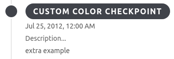
Custom color
The property primaryColor allows to define the main color of the checkpoint. The value has to be a valid hex color
code (for example: #8c96b4).

Inverted graphic
The property inverted allows to specify if the dot and title coloring pattern have to be inverted. The value must be a boolean
(default false).
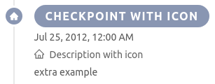
Icons
The property icon allows to define the name of the icon to visualize inside of the checkpoint dot (only for level 1,
by default no icon is rendered).
Through the flag iconInDescription one can specify if the icon has to be displayed also in the description (works for
both level 1 and 2, default false).
The selectable icons are the ones provided by ant.design v3.


Custom positioning
By default, level 1 checkpoints define the positioning of all the following elements with lower importance (the first element of the timeline is on the right).
The property position allows to define a custom position for a checkpoint. If the checkpoint is of level 1, the custom
position will affect all the following elements, while if it is of level 2, the custom position will only affect that
particular element, and the following ones will maintain the default positioning.
Possible values for the property are left or right.